HOME | DD
 iforgotmypassword — envelope scrap 03
Published: 2007-10-29 11:54:46 +0000 UTC; Views: 2527; Favourites: 51; Downloads: 107
Redirect to original
Description
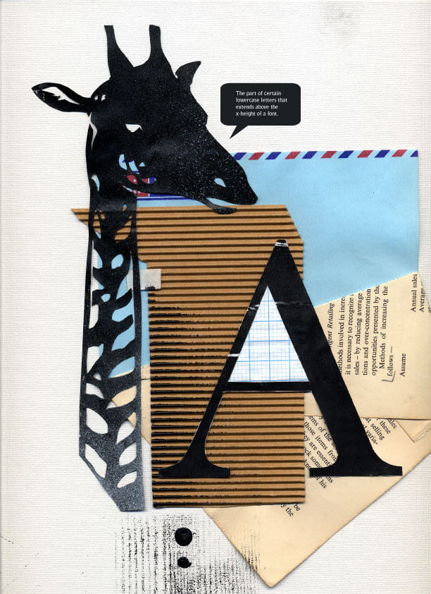
envelope #3A is for Ascender
trad+minor digital (speech bubble only)
i might make my way through a few more typography terms
Related content


Comments: 26


for the last week ive been busting my butt trying to finish assignments before the end of semester and everytime i need fresh inspiration i come here and i look at this picture. i dont even know quiet what i like about it...actually its more about what dont i like. it just feels perfectly composed.
would you mind if i took this idea to play with (the envelope i mean) i mite not ever post it on da neway but thought i shld ask.
👍: 0 ⏩: 1

oh, i'd be glad if you played around with it! there's nothing more wonderful about this field than inspiring someone else to create and i'm so pleased that i could manage to do that
knock yourself out!
👍: 0 ⏩: 2
[link]
thats the finished product. it's different-ish but still very much in tune with your work.
👍: 0 ⏩: 1
oh, very nice!
i absolutely love what you did to the bird

👍: 0 ⏩: 0

Typograhy ftw. ")
By the way, I wonder if you've heard of/are interested in entering the Linden Postcard Show exhibition --> [link]
Byah!
👍: 0 ⏩: 1
lol, thanks man!
yeah, i remember picking up a flyer for that at uni the other day and i was quite interested. HOWEVER, $45+ submission fee omg/brokeness to the extreme D:
👍: 0 ⏩: 1
Totally understand. Not the first competition I've come across that requires a "D:" entry free and thus puts me off entering. ")
I don't see what you're worried about though, you do so well as it is! D: And when you win, I can brag that I know you HAWHAWHAW *gets shot*
PEE-ESS HOLIDAYS SOOOOOOOOON! \8D/
👍: 0 ⏩: 0


You know, this could make for an awesome childrens' frieze.
👍: 0 ⏩: 1
haha
im sure its the giraffe
that animal just seems so ABC
👍: 0 ⏩: 1
")
(I'm really enjoying the envelope scraps, in any case.  (Smile)")
👍: 0 ⏩: 0

Wow all this came just from the "ascender" concept?
👍: 0 ⏩: 1
lol yup!
i'll be doing "leading" next
typography overdose
👍: 0 ⏩: 1
Ey it is always cool to see some creative and original works. Keep them coming.

👍: 0 ⏩: 0

these are getting better the more abstract they get. <3

👍: 0 ⏩: 1
thanks man!
it's so refreshing to experiment a bit
might do a few more soon
👍: 0 ⏩: 0

haha
glad you think so!
giraffe effect

👍: 0 ⏩: 0


