HOME | DD
 Ifus — Film Noir Assignment-Final

Published: 2011-02-24 19:52:16 +0000 UTC; Views: 6261; Favourites: 40; Downloads: 118
Redirect to original
Description
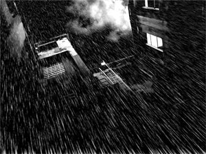
The only thing I personally do not like is the painted text on the window, and I didn't know how to approach that properly. If anyone can give me help/crits for that, that would be AMAZING <333Related content


Comments: 11

This is awesome! I was actually thinking I loved the "Chicago" type.. And then I get what you are saying, that it doesn't go with the rest of the shot... So have you tried just blurring it with the blur tool or dropping the opacity down?
I love the style of it all. And was wondering how you did it? And the car?!?!
👍: 0 ⏩: 1

Thank you! This piece is so old lol! I want to try doing something like it again. I used Google Sketch Up and 3-D models to plot it out and then took a screenshot and used it as reference (not traced though!) I definitely recommend Google Sketch Up when dealing with perspective or modeling your own rooms/backgrounds in a 3-D program when it comes to precise drawing buildings and cars. c:
👍: 0 ⏩: 0


I know this is a bit old, but with typing, the best thing to do is to use a ruler and spacing. You need to study typography which is actually quite fun. If you measure the distance, the curve and all for the letters, as well as the angle of the window and all of that, that's the best way to approach fonts without taking fonts from font sites. Make your own when it comes to doing your own art.
 (Smile)")
👍: 0 ⏩: 1
I've tried to more with typography in my latest pieces, but yeah it's really a weakness I need to work on. Thank you for the tips!
")
👍: 0 ⏩: 1
I love typography myself. It's fun to work with, but I find easier to do so with traditional, since it's easier to measure stuff with a ruler on paper. It's possible with digital, I just find it more complicated. xD;
And no problem!
👍: 0 ⏩: 0

Belated comments are a bit belated, but I can totally help with your type issues!
There are a ton of free font websites out there - dafont.com is one of my favorites - that might help. I would also try using layer effects (like strokes) and the free transform (ideally, the distort or perspective tools) to really get the font to line up with the window when you're all done doctoring it.
👍: 0 ⏩: 1
Oh yeah! I forgot all about dafont.com! <333 your icon.
")
👍: 0 ⏩: 0

Oh wow this is an amazing piece of art.
I'd say if you are trying to improve the text o the window, I would make it a few shades lighter, since most lettering is a slightly opaque white.
If you mean lettering style, then perhaps look at microsoft word and photoshop for a few ideas and play around with the font until you like one ^^.
But this is a truly impressive masterpiece.
👍: 0 ⏩: 1
Thanks for the tips! Maybe I can find a royalty-free font for photoshop that looks like painted letters. But it's hard to get that brush-stroke look unless I do it on my own though too ")
And thank you for the compliment!
👍: 0 ⏩: 1
I know how that goes, where it will only look perfect if you draw it out yourself instead of using font styles.
You are absolutely welcome ^^.
👍: 0 ⏩: 0