HOME | DD

Igasm — Igasm FactoryWall

Published: 2006-12-12 01:03:08 +0000 UTC; Views: 2403; Favourites: 21; Downloads: 25
Redirect to original
Description 
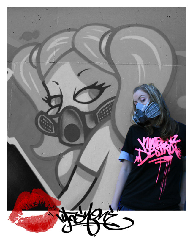
Piece done about a month ago I guess? Came out alright.
Related content
Comments: 43

1INXILE [2007-08-27 08:56:06 +0000 UTC]

nice

👍: 0 ⏩: 0

Suriasys [2007-07-30 17:29:40 +0000 UTC]

we should date

👍: 0 ⏩: 1

Igasm In reply to Suriasys [2007-07-30 21:44:45 +0000 UTC]

That's hot

👍: 0 ⏩: 0

meor [2007-03-05 14:18:04 +0000 UTC]

yeah came out pretty solid!

👍: 0 ⏩: 0

muskioto [2007-01-13 07:50:38 +0000 UTC]

thats what i like to see!

👍: 0 ⏩: 0

creator07 [2006-12-19 11:25:12 +0000 UTC]

Cool colors.

👍: 0 ⏩: 0

Kamakacci [2006-12-16 23:58:50 +0000 UTC]

Great work, this really came out nice. How long did it take you?

👍: 0 ⏩: 1

Igasm In reply to Kamakacci [2006-12-17 02:28:26 +0000 UTC]

ummm 45mins?

👍: 0 ⏩: 1

Kamakacci In reply to Igasm [2006-12-17 17:35:56 +0000 UTC]

That's pretty quick. Then again, I'm just a toy, so what do I know . I really like this piece, though.

👍: 0 ⏩: 0

Liam-Bohemian [2006-12-16 09:51:55 +0000 UTC]

Good work. Definately some fuckin talent there mate.

👍: 0 ⏩: 0

MareMo [2006-12-14 04:08:46 +0000 UTC]

that looks so sick

👍: 0 ⏩: 0

M--A--D--T--A--G [2006-12-13 21:47:34 +0000 UTC]

tiight...

👍: 0 ⏩: 0

UndercoverOne [2006-12-13 14:14:30 +0000 UTC]

dope lines. love em!

👍: 0 ⏩: 0

Cheps-Oner [2006-12-13 14:10:20 +0000 UTC]

Looks clean. That light blue really makes the piece pop. Sick outline as always.

-cheps oner

👍: 0 ⏩: 0

brisker [2006-12-13 04:26:18 +0000 UTC]

nice one igasm, good to see youre still gettin up, I haven't seen new stuff from you in a while...

👍: 0 ⏩: 1

Igasm In reply to brisker [2006-12-13 04:31:31 +0000 UTC]

yeh been painting a bit just not putting a lot on the net

👍: 0 ⏩: 0

kickinalone [2006-12-12 23:47:18 +0000 UTC]

worrrrrrd

👍: 0 ⏩: 0

RietOne [2006-12-12 14:40:46 +0000 UTC]

Nice Work Bro! I really like the style & colors you choose.

👍: 0 ⏩: 0

JDFarrugia [2006-12-12 14:14:54 +0000 UTC]

Very nice...I love the choice of colours. Listen while im at it...how do you make an Avatar like yours? You know with a lot of pictures changing

👍: 0 ⏩: 1

Igasm In reply to JDFarrugia [2006-12-12 20:17:36 +0000 UTC]

with adobe image ready its kinda hard to explain tho

👍: 0 ⏩: 1

JDFarrugia In reply to Igasm [2006-12-12 21:12:50 +0000 UTC]

hmm...dont think i have that programme. never mind then

👍: 0 ⏩: 0

DPA [2006-12-12 11:47:01 +0000 UTC]

nice and tight.

👍: 0 ⏩: 0

thecloud [2006-12-12 08:07:28 +0000 UTC]

Booya! Very hot.

👍: 0 ⏩: 0

Eksitone [2006-12-12 07:15:54 +0000 UTC]

Wow. clean as a whistle. well done. fresh letter forms aswell. I like teh bold outline.

👍: 0 ⏩: 0

Some0ner [2006-12-12 06:44:13 +0000 UTC]

you have been slacking on the updates girl why are you holding out on us...im one to speak about updates though good to see your still alive.

👍: 0 ⏩: 0

Scrps [2006-12-12 06:43:23 +0000 UTC]

thats some hot Stuff!

👍: 0 ⏩: 0

AintOne [2006-12-12 05:26:52 +0000 UTC]

it looks like ur "igas"are goin lower and the the "m" just rises back up, i dislike that S looks wierd lol but thats my opinion..it is very clean and nice colours.

👍: 0 ⏩: 1

Igasm In reply to AintOne [2006-12-12 07:21:22 +0000 UTC]

the m is in line with the with the i like the dot of the i. But I dont like my peices to be straight and with no flow to it but I guess thats just my opinion.

👍: 0 ⏩: 1

AintOne In reply to Igasm [2006-12-12 11:42:26 +0000 UTC]

ye i dunno i just dont relli like that one....
A is cool but thats the fav letter of the piece lol

👍: 0 ⏩: 0

ToyingToys [2006-12-12 05:05:34 +0000 UTC]

Hmm seems ok, but what would i know...

Nah looks better on myspace..jokes

👍: 0 ⏩: 0

SPY2 [2006-12-12 04:32:48 +0000 UTC]

very nice igs i like this alot

👍: 0 ⏩: 0

GavN [2006-12-12 03:49:21 +0000 UTC]

it doesnt even look real..tthats how good this is

keep it up igs

👍: 0 ⏩: 0

nraffi [2006-12-12 03:42:10 +0000 UTC]

nice.. looks hellla clean

👍: 0 ⏩: 0

Itchy-Nox [2006-12-12 03:37:40 +0000 UTC]

Awesome

👍: 0 ⏩: 0

ubsday [2006-12-12 02:45:02 +0000 UTC]

nice..

👍: 0 ⏩: 0

truemarmalade [2006-12-12 02:42:37 +0000 UTC]

Man that's clean, almost looks computer done.

👍: 0 ⏩: 0

e12dollarz [2006-12-12 02:37:18 +0000 UTC]

Looks nice.

👍: 0 ⏩: 0

olysp [2006-12-12 02:29:06 +0000 UTC]

u have some fresh letter shapes ... i really like where your style is progressing ... props

👍: 0 ⏩: 0

DesignsByFro [2006-12-12 02:27:51 +0000 UTC]

i have to say its going to be hard to get any cleaner than that. Nice to see more work from u.

👍: 0 ⏩: 0

snaw [2006-12-12 02:08:25 +0000 UTC]

i seen that on ya myspace...nice work

👍: 0 ⏩: 0

LabelOne [2006-12-12 02:05:06 +0000 UTC]

cleaaaaaaaaan

👍: 0 ⏩: 0

gents-leaf [2006-12-12 01:27:58 +0000 UTC]

thats fresh mate. its the fill and the "a" that really does it for me here.

👍: 0 ⏩: 0

caos-kaos [2006-12-12 01:23:03 +0000 UTC]

cool as

👍: 0 ⏩: 0