HOME | DD
 ik1 — Wasthed hours of time

Published: 2002-08-29 02:11:56 +0000 UTC; Views: 1379; Favourites: 5; Downloads: 160
Redirect to original
Description
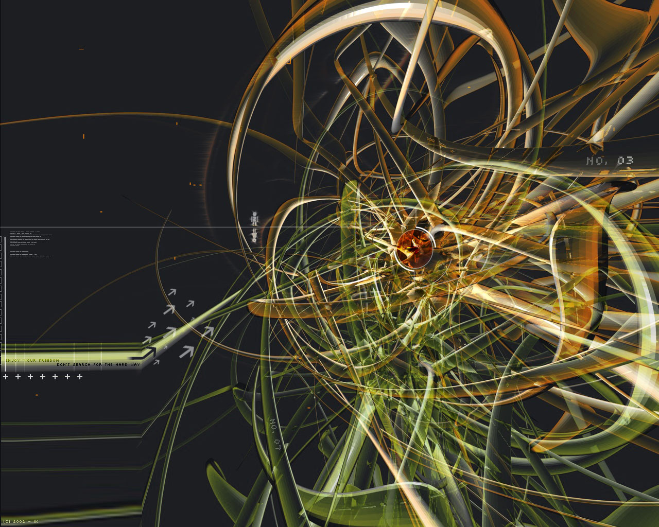
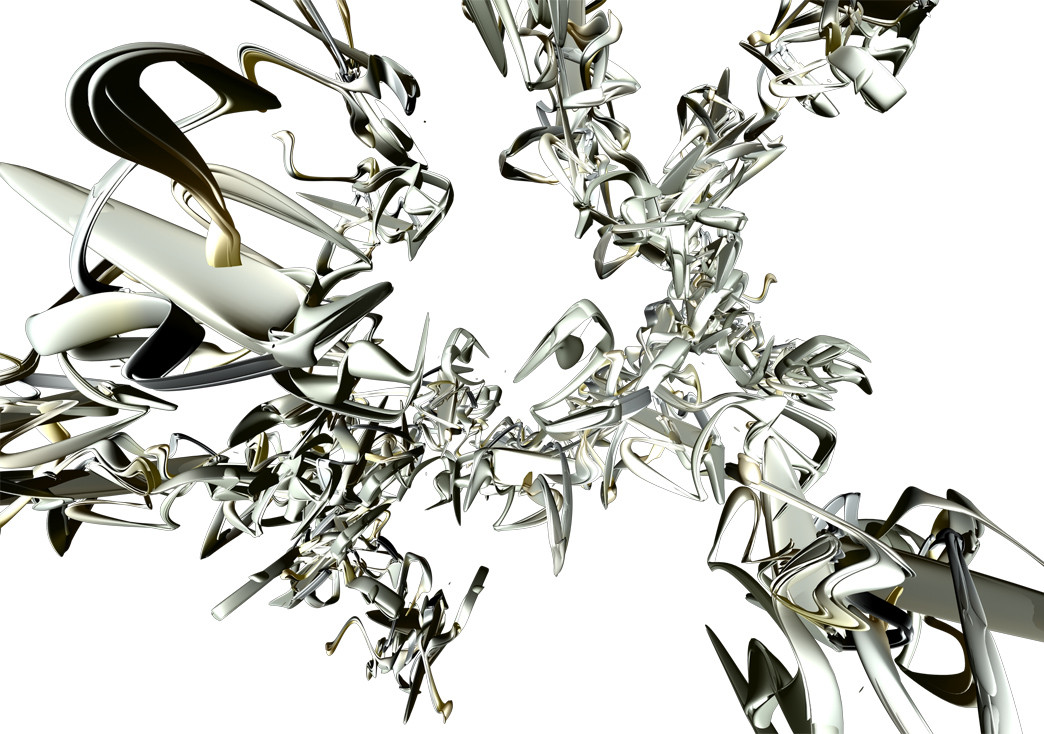
Well agian a new wall of my .. once again done with Cinema 4d and Photoshop .. the title is from a song (trance) idunno the title of it but ok and thnx to Coldfusion [link] for the flower! .. hope you guys/girls like it .. Feedback is welcomeEnjoy
Ik.
Related content


Comments: 15


great organic construction though the only redeeming factor of the flower is its rich colour (which I would have just used for some other abstract shape) - neat though.
👍: 0 ⏩: 0

yes this is excellent, the only complaint i have is that the white bg combined with a dark 3d object just about kills the sense of depth so that it almost looks flat, hmmm... cool in a way though
👍: 0 ⏩: 0

good!
I have a feeling that he meant to typo, cuz the file name is the same as the title
👍: 0 ⏩: 0


cool use of colors, not all from the same shade of a certain color, but definately work well together! NICE WORK!
👍: 0 ⏩: 0


Great work. I am not too sure about those flowers in the background at the upper right, though. They seem not to belong and distract attention from the better parts.
👍: 0 ⏩: 0


good action and movement across the pic. the upper right corner may be a bit heavy though.
👍: 0 ⏩: 0


I like it. The colors really complement each other.
👍: 0 ⏩: 0

I simply love seeing work like this. I have aquired a taste for free form latley, and this does my tastebuds justice. Nice usage of light and arrows, and the flowers in the background give it a nice tone to set off the rest of the picture. Good job .
gg
👍: 0 ⏩: 0

ouch typoage.. "wasthed hours of time"
i really like this tho. i just don't like that green arrow at the bottom center and the gridwork.
nice tho. love the arrow work.
👍: 0 ⏩: 0