HOME | DD
 ikhon — post

Published: 2005-04-07 11:22:08 +0000 UTC; Views: 1071; Favourites: 42; Downloads: 160
Redirect to original
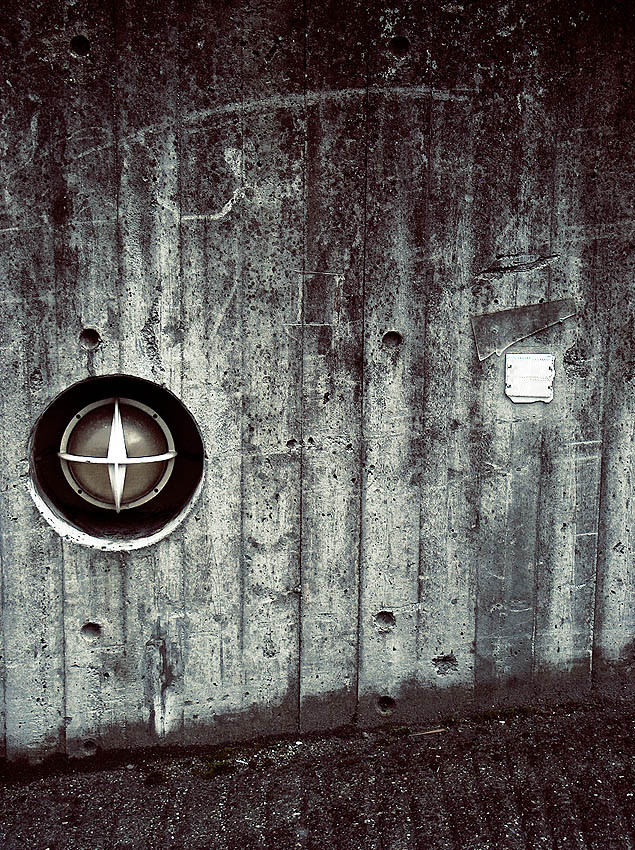
Description
yes.Related content


Comments: 26

Oh this is amazing, I wanna steal this for my gallery.
👍: 0 ⏩: 0


it's all about the colors and the angle
very simple
great job

👍: 0 ⏩: 0


this is quite the interesting photograph, very nice and simple, but complex at the same time. really great.
👍: 0 ⏩: 0


The shadow makes a very good balance to the black stripe.
👍: 0 ⏩: 0

 (Wink)")

I'm glad you have posted it ")
Absolutely stunning minimalistic work, colors, light, composition...excellent.

👍: 0 ⏩: 0

perfect!
i can't say more, but i'll try.. the red. the white. the black. the way they work together.
perfect.
👍: 0 ⏩: 0

it is the shadow, that makes this one very special, i think. great work.

👍: 0 ⏩: 0


I'm starting to think that red, white and black together is your favourite colour scheme 
👍: 0 ⏩: 1

heh, ive thought that myself.
black/white/red is a combination that works so well with minimalism (at least for me).
👍: 0 ⏩: 0

 (Smile)")

classic photo of ikonic proportions. ur color combo is on point bro.
👍: 0 ⏩: 0

very cool how the black colour
of the wall is repeated in this
great shadow of the box.
Just from a colour point of view it
balances the photo for me!
Must have for ~minimalism !
.:.
👍: 0 ⏩: 1


I like the overall feel of these. The red box just stands out so well. ")
👍: 0 ⏩: 0