HOME | DD
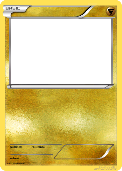
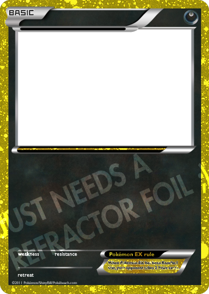
 ILKCMP — BW Basic Ghost

Published: 2013-06-27 00:07:22 +0000 UTC; Views: 596; Favourites: 7; Downloads: 21
Redirect to original
Description
Original blank by aschefield101 Texture and symbol by me.Pokémon © Nintendo/Creatures Inc./GAME FREAK Inc. Pokémon and Pokémon character names are trademarks of Nintendo.
Related content
Comments: 6

That is a sexy Ghost texture right there.
I suggest making the type orb a little bluer and less saturated, though. You might even consider making the type icon just a bit smaller, so it doesn't overlap the highlight, which makes it look a little flat.
👍: 0 ⏩: 1

Thanks Alex!
Regarding the symbol -- both of those things were deliberate on my part. Several of the official symbols (most notably Dragon) look relatively saturated and out-of-place compared to the texture. The icon's size was also intentional; the Fire icon also teeters the edge quite a bit, and many of the symbols look much flatter to me in their HGSS/BW iterations than their earlier counterparts.
👍: 0 ⏩: 1

I looked back at some BW cards and still stick by what I said. The reason some look too saturated is because they borrow from the most saturated part of the texture, but lay against a lighter part of the texture. Fire seems to be a good example of this. Dragon does seem more extreme, but Dragon is also shaded differently, with more of a glassy look. However, if you look closely, the colors in the orb are "splashed" across the texture.
👍: 0 ⏩: 1

I really do appreciate the input, Alex, but I really don't have any plans to change it. If Dragon can be an outlier in its glass-like shading, so can Ghost in its color. Besides, Ghosts have different properties than most Pokémon (able to phase through walls, dimensions, etc). My point regarding Fire wasn't regarding the color, but the size of the icon on the orb. Both lay close to the edge, but due to the shape of Ghost vs Fire, they'll naturally fit the orb differently.
What it really comes down to is that its use will be limited anyway and it isn't a real TCG type so it doesn't have to fit the rules to a T. Plus I designed the symbol way before I had plans to make the blank
👍: 0 ⏩: 1

Did you update the color, or were my eyes just playing tricks on me? Earlier it looked like a really bright purple, but now it seems a little duller and more bluish, quite similar to the fog on the texture. Maybe I just had my screen at a weird angle. I don't know, but I don't have any problems with the color now. Ice, on the other hand, is still bugging me a bit.
Also, sorry for the confusion, but my Fire comment was unrelated to your Fire comment. I was using it as an example for something else.
I looked at the BW cards again and I do not see any instances of the icon overlapping the highlight (though Fighting does touch the edge of the highlight). On the Darkness type orb, the highlight overlaps the symbol. If you were to bring the highlight above the symbols on your type orbs, I think they would look a lot less flat.
Sorry for nitpicking so much. The people I worked under for my internship defined graphic designers (themselves included) as "professional nitpickers." XD
👍: 0 ⏩: 1

Don't apologize for nitpicking! It actually helps (though perhaps moreso if I really ever intended to use these often 
You may be on to something regarding the Ghost-type highlight...Darkness stand out in that regard, and as creatures of the night, shading the Ghost-type symbol similarly might be interesting. Good call!
Don't know quite what to tell you about the Ice, man. Maybe it's my own monitor, but the color doesn't seem to mismatch the texture.
👍: 0 ⏩: 0


