HOME | DD
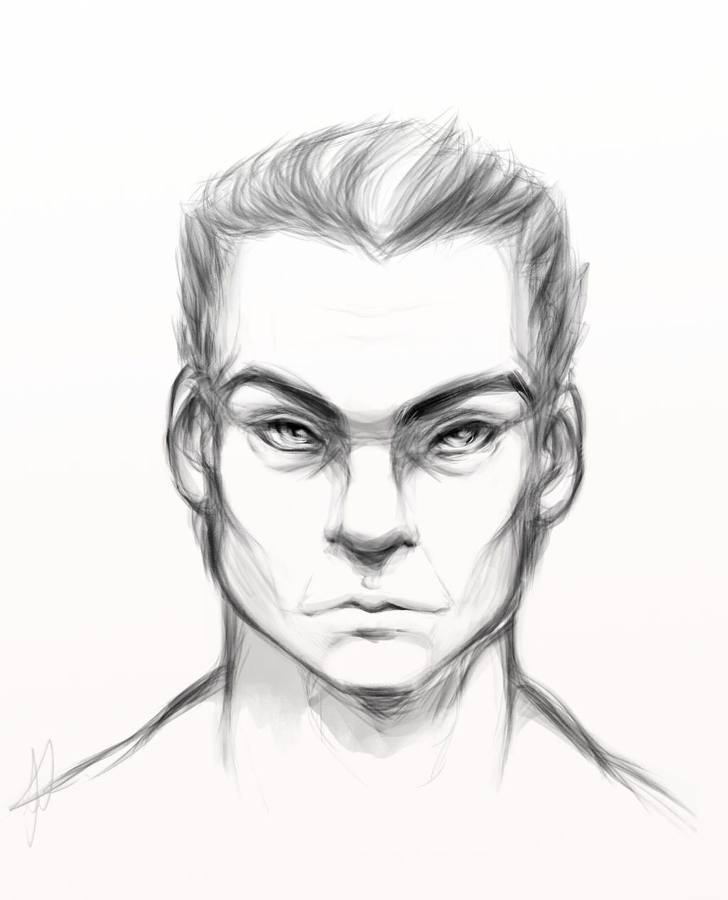
 IllusriArt — Man
Published: 2013-09-01 18:57:45 +0000 UTC; Views: 1720; Favourites: 40; Downloads: 19
Redirect to original
Description
Who doesn't love them some older men?Speed drawing for anatomy practice, you can see I'm desperately trying to grasp the concept of masculine features and the male anatomy in general.
Any helpful feedback, tips and constructive criticism would be deeply valued and appreciated, thank you so much!
Related content


Comments: 84

Thank you very much for the helpful and constructive critique!
I did think the eyes were off while drawing, but my inexperience finally got the upper hand and ended up making him look a bit elvish really.
I thought the jaw was a bit too angular, actually. I was told so as well, so I tried rounding it more. I'mm try to fix those kinks, thank you! ^^
I never actually thought of drawing men from magazines, that's actually a wonderful idea, thank you so much!! You don't know how grateful I am for the help.


👍: 0 ⏩: 1

You're very welcome, anytime! This crap is hard, happy to help all I can ")
That's one of the reasons why I recommend drawing models from magazines, because you get a very interesting mix of features. Those people are often models because their faces are both unique and visually appealing. You have both very masculine men and somewhat feminine men and you can easily see the differences. There are excellent comparisons to be made among models who are all the same "type" of figure but who have interesting differences in features. Hope that makes sense! Cara Delevigne is a great example (albeit a woman) of someone with a mixture of masculine and feminine features, she has such a heavy brow but still an incredibly feminine face. Maybe doing studies of models can help you figure out which traits tend to behave in which way. Anyway, good luck, you are very welcome and I'm looking forward to seeing more of your progress!

👍: 0 ⏩: 1
Ahh, I see! I'd really like to practice variety, so I really need to get a grip on the basics first, that's why I was asking about the angles of the male face. 
But I still need lots of lots of practice, so thank you for taking the time to help me out, I'd love to give back any way I can! Name it and I'll try my best to make it happen.
👍: 0 ⏩: 1
The eyes look much more masculine on that one! Keep going, you'll figure it out
👍: 0 ⏩: 1
I will definitely work more, I'm already on practicing again! Thank you~~ <3
👍: 0 ⏩: 0


I hope I do not seem harsh when I say the thing I see wrong with this is that the ears looks a little off. One ear seems bigger than the other one. Other than that everything else seems ok with me. To me it also looks like this person you drew has a widows peak. You did a great job drawing the lower facial features like the jaw line and the mouth. Let me just said that good luck in the class your taking and keep up the great work. I thank you for asking me to critique your artwork and I hope to get more critique from you.
👍: 0 ⏩: 1
The different in size of the ears was intentional, all the features are different sizes and asymmetrical, but thank you for the well-worded response, I appreciate it! ^_^
👍: 0 ⏩: 1

Overall
Vision
Originality
Technique
Impact
I'm definitely still learning facial anatomy myself (that's not just my opinion either, I've been told my multiple people that my own work has some pretty glaring anatomical mistakes) but I do still see a few problems.
The forehead is a bit large. It looks like you were attempting to give him a bit of a receding hairline, but there isn't enough indication of the scalp rounding towards the background in that area for it to read that way.
The eyes also seem to be slanted at an unnatural angle towards the nose, which coupled with some of the other aspects of the piece make him look a little bit "cat-like." Other contributions to this are how wide the bridge of the nose is (overall area between the eyes) and the bottom of the nose not spreading out much more from this, which is similar to the way a cat's nose works. Human noses usually taper more towards the eyes and widen at the end giving more disparity between the two halves. He actually reminds me a little bit of the Na'vi aliens from Avatar because of the way his nose is so thick and straight. (I don't mean that as an insult though, I actually loved that movie.)
Other than that, everything looks good to me and all of the hard angles look very masculine. I don't think you're far off from being able to draw some near perfect faces. You've demonstrated here that you have a good understanding of the shapes involved with any given facial feature. It's just a matter of spacing and placement at this point which (to me) seems like the easier hurdle to get over than if you had the correct placements but the wrong shapes.
👍: 0 ⏩: 1
Thank you so much for the constructive and helpful feedback!
I do need more practice with male hairlines still, I noticed the forehead was more a window's peak than an actual display of a little hair loss. The cat-like look was a little intentional with the nose, but I didn't do the diagonal, alien-like eyes on purpose, need to work harder there!
Thank you very much, I'll work more on basic shapes for the male face, certainly!

👍: 0 ⏩: 0

Overall
Vision
Originality
Technique
I would like you to take this as an opinion of someone who still has a lot to learn about human proportions.
Overall, I think your drawing is really good, especially considering that this is not your "ordinary" style - you are a bit out of your comfort zone. I like your sketching technique - transparent strokes that don't define the lines too much, and shading.
About proportions - it is good that you didn't try to achieve simmetry of the whole face, because that's just not how the human faces look. But this man's eyes stand somehow diagonal and look almost cat-like as a result. Was that intentional? Also, the nose could be better defined. Now it looks almost like a Na'vi or a cat's nose. The last comment that I have about this man is his jawline. Yes, male jaws are broad, but this individual could use a slightly bigger chin. Now I am probably sounding like I am criticising unimportant details, but these are the things that could use some more work.
But all in all, great job!
👍: 0 ⏩: 1
Thank you so much for the helpful and constructive feedback!
I'm happy you noted the asymmetrical features, I was going for that.
The eyes being so very diagonal was not intentional, and I only noticed it when I was nearly completed, gahh!
I tried to give the man catlike features, but the nose needs work I agree, I'll try to better define my nose shapes in my next go. Thank you for taking the time to help me, it means more than I can ever put into words!


👍: 0 ⏩: 1
No problem! I am looking forward to seeing more of your work!
👍: 0 ⏩: 0

Overall
Vision
Originality
Technique
Impact
I want to start off by saying that this is a definite change from some of your other stuff that I've seen- not necessarily a bad thing though! e.deviantart.net/emoticons/l/l… " width="15" height="15" alt="

Now, onto the critique. The thing that is most prominently obvious is the shape of the head. Although it doesn't look alien as such, the head is very square and just looks a liittle bit off.
As for the facial structure, it's a little confusing. The eyes are very slanted, almost elf-like, which although aesthetically pleasing, rarely occurs at such an angle. e.deviantart.net/emoticons/g/g… " width="17" height="15" alt="

The last little thing that I notice is the cheekbones. They're lovely-- and again-- aesthetically pleasing, but I can think of very few people with such prominent cheekbones! e.deviantart.net/emoticons/l/l… " width="15" height="15" alt="
You said it was an older man- you've done well in accentuating the undereye bags and the smile lines but another common place for wrinkles is the forehead. Just a tip e.deviantart.net/emoticons/w/w… " width="15" height="15" alt="

Overall, you've done a lovely job on this and you definitely succeeded in drawing a manleh man e.deviantart.net/emoticons/w/w… " width="15" height="15" alt="
👍: 0 ⏩: 1
Ahh, I'm so grateful for this, thank you so much for taking the time out to write me these pointers and words of support!
Ahh, the head. I realized it may have been too angular, as I seem to always imagine 'macho' men as being box-like, some of it leaked onto my drawing.
I did try to add forehead wrinkles, but they're still too light dammit!! Must practice more!!!
Ahh yes, I fully agree with the eyes, I thought they looked off but I couldn't pinpoint it - the eyes looked fine to me, until I was nearing the finishing touches, I'll definitely keep this in mind for my next attempt!
Thank you!!! ^_^

👍: 0 ⏩: 1
Of course!!
Yeah, it might just be to do with my screen being too ligght, hence why I didnt see them...
👍: 0 ⏩: 1
I'll make them clearer if I can, if I can't then I'll keep it in mind for next time. It's a great help either way. ^-^
👍: 0 ⏩: 1


As the first face of men's figure is not bad. In my opinion the most conspicuous are proportions. The lower part of the face is too short in relation to the forehead. (Including nose), eyes differ, I mean mainly the iris (converging towards each other). Hairline, neck and shoulders looks very cool.
Sory my opinion was too short for a critique XD
👍: 0 ⏩: 1
Ahh, I see! I'll try for longer proportions and I'm learning to balance out the shapes in the face now, thank you so much for your words of advice!
👍: 0 ⏩: 1
Np ^w^ I hope that was helpful.
👍: 0 ⏩: 1
It was, thank you so very much!!
👍: 0 ⏩: 1

👍: 0 ⏩: 0

wow i absolutely love the chiseled look to this! it's greatly defined and i love the shadowing around the eyes  (Smile)")
👍: 0 ⏩: 1

Its nice to see once and awhile that people actually draw male, the only thing I spontaneously feelia that the jaw wasn't even more further down.
I definatly hope this won't bring you down.
👍: 0 ⏩: 1
I'm sure many artists draw males, it's just a first for me.
👍: 0 ⏩: 1
It's imbarressing to say this.... but you have done better job on your first time then what I've seen some other people doing multiple times.
👍: 0 ⏩: 1
That's a wonderfully positive comment, thank you much for saying so!
👍: 0 ⏩: 0

Awesome manleh man! I really like his high proeminent cheekbones, it gives more personality to the character. I don't have any critique to add, most of it has been covered by the humans below me. But I have a tip! If you are going to draw another manleh man next time, draw him with long hair. That's my fetish.
👍: 0 ⏩: 1
Thank you so much, I like high cheekbones myself, they make a man look very haughty and powerful, I think.
Haha, I might dabble in a little long-haired men-drawing some time, I'll keep it in mind!
👍: 0 ⏩: 1

You did a really awesome job on this! I love the techniques you used! The only issue I see is his lips look a little too feminine and his jaw looks a little too short and wide. The techniques used make up for it, though!

Awesome job!
👍: 0 ⏩: 1
Ahh, thank you so much for your kind and helpful feedback! I didn't realize the lips were feminine, it's very likely though because I'm not used to drawing 'harder' features.
I will work better on the proportions, thank you!
👍: 0 ⏩: 1
I think the thing that made them look feminine was the sharp point in the middle. ^^ Give it a little less shape and I think it will be perfect!
I'm glad I could help! ^^ it looks great!
👍: 0 ⏩: 1
Ahh, I see now! I wanted to give him a cupid's bow-type lips form, but perhaps harder lips would suit him better. Thank you again, your words are a great help always!
👍: 0 ⏩: 1
I'm really glad to help! 
👍: 0 ⏩: 0

I like the detail to his hair-how it seems soft yet masculine at the same time. Good definition of cheek bones. The only thing that I can point out that seems a little off is his eyes. They seem a little strange somehow. Just not natural. I like the picture overall.
👍: 0 ⏩: 1
Thank you!
Ahh yes, I realized how slanted and diagonal the eyes were RIGHT when I finished and was polishing it.
I'll work to better the problem in my next practice! ^^
👍: 0 ⏩: 2

"Ahh yes, I realized how slanted and diagonal the eyes were RIGHT when I finished and was polishing it."
I did this with my last upload. It drove me so crazy I fixed the issue and uploaded it again
👍: 0 ⏩: 1
Ahh, I see! I just drew another picture with the eyes fixed, I tried to work with that you told me.
👍: 0 ⏩: 0
Oh, that sucks. It looks good, though. You're welcome. It is nice over all.^^
👍: 0 ⏩: 1
Thank you again for the kind words.
👍: 0 ⏩: 1

Male anatomy...so hard.
Great job on this sketch!
👍: 0 ⏩: 1
I'm still learning a LOT, I have to learn to soften up on male features, as I tend to vew men as box-people rather than a lot of shapes together.
Thank you!!
👍: 0 ⏩: 0
| Next =>