HOME | DD
 imadesign — pixels STUDIOS - Stationery
by-nc-nd
imadesign — pixels STUDIOS - Stationery
by-nc-nd
Published: 2008-05-05 19:25:39 +0000 UTC; Views: 5434; Favourites: 28; Downloads: 256
Redirect to original
Description
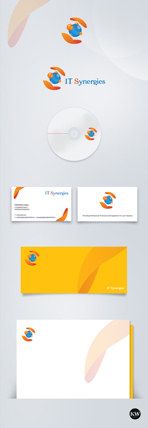
Logo & Stationery Design for pixels-studios.Related content


Comments: 16


appreciated
 (Smile)")
")
👍: 0 ⏩: 0

mmmmm tasty
nice work imad
raby yuwafiqak
almslool ^_+
👍: 0 ⏩: 1
thank you, glad u liked it
yewafig il jamee3 insha2allah

👍: 0 ⏩: 0

i am wondering ... why these 3 colors ?
great work ... loved it
👍: 0 ⏩: 1
the three colors are chosen to show how creativity pixels can be. and they are very strong colors and there is much contrast yet they are metnasqeen !
plus .. to show the variety of pixels services
insha2allah i have answered ur Q.s
and thank you very much
👍: 0 ⏩: 0


thank you bro ..
much appreciated
 (Wink)")
👍: 0 ⏩: 1

thank you sis
glad to hear that
ye7f'6ich rabbi

👍: 0 ⏩: 0

Awesome!
I like the colors, the cleaness, and the effects added inside the espheres. I hope it looks the same printed.
(You can use squares instead circles, maybe)
👍: 0 ⏩: 1
thank you .. glad u liked it
well its not 100% the same when printed .. but it turned very nice and clean .. i liked it
(yeah we thought about the squares, but it was too normal for us, we wanted something new, smooth and clean !!)
thank you again Alberto
👍: 0 ⏩: 0