HOME | DD
 Immp — Help
Published: 2006-05-13 05:41:01 +0000 UTC; Views: 1049; Favourites: 17; Downloads: 98
Redirect to original
Description
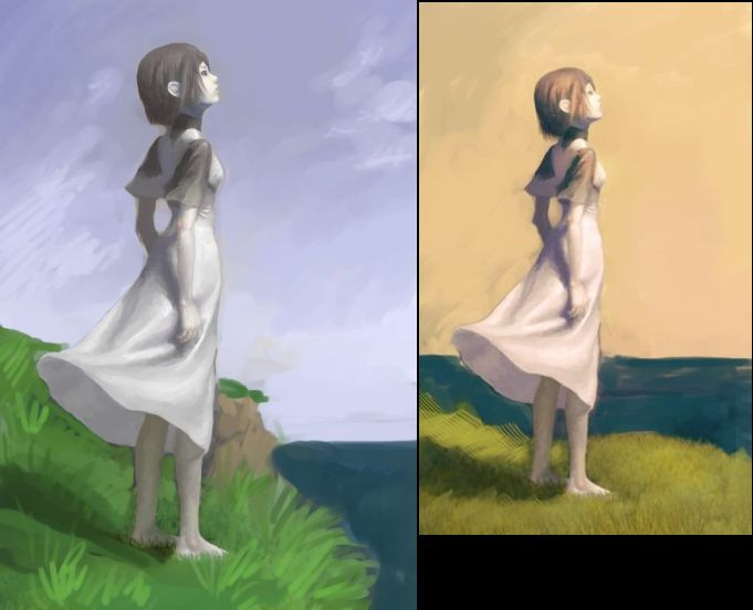
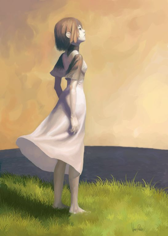
Ok I need opinions here. Which works better and why? Should I carry over certain elements from one into the other ...or like..what? Hmmmmmz?!Related content


Comments: 14

")

In the cool comp she is lost but in the warmer atmosphere she stands out more and seeing as she is the main focus of the painting using all the elemts to do so would be the best..... so warm it is i say.
-ko
👍: 0 ⏩: 1
Really.....well I tried..hows summer?
-ko
👍: 0 ⏩: 0

i like the one on the right because the colors are richer. this concept seems to be all about atmosphere and the right one has much more than the left. i find the composition to be more pleasing as well.
👍: 0 ⏩: 0

I think the green and blue of the left picture serve to wash out the character, instead of making her stand out, as the right one does. They are also very unbelievable colors, where as the world often is shaded in warmth, as in the right picture, at certain tmes of the day and especially before storms (which is why the movement of her dress is so fitting). also, it's a more comfortable angle for the viewer to see the girl in the right picture - on the left, it places on directly on the edge, or just over it, and leaves this unconfortable "we should be paying more attention to not falling off than the rest of the picture". I think the right one just suits what I percieve to be the girl's mood better, because he is cold on a middling cool background on the left, where as she is warm on a warm background on the right. I also just prefer the grass color on the right  (Wink)")
glee! I like it so much!
👍: 0 ⏩: 0

I like the right one because it's warmer and even though the colors may not be as realistic as the first, it still looks realistic (if that makes sense). Also, it feels like she is immersed in the drawing, like she more a part of the drawing.
Yorda? I love you! ^-^
👍: 0 ⏩: 0

I thik the tones are more beauty on the right draw.
One more thing, I think I tell you before, but I don´t remenber well X_D . THis fanrt of Yorda is totally awesome. Thank you so much for this great work ;_; XDDDDDDDDDDDDDDDDDDD
👍: 0 ⏩: 0

The right one, it looks much warmer  (Smile)")
👍: 0 ⏩: 0

right one. Light looks better and color combination is much more paint-like. Thw only thing is that the face on yellow bg isn't as good seen as on the left one. You shoul work a bit more on this bg, like on the left one make it darker on the top and even brighter on the bottom than it originally is now.
This are just a thoughts @@ and my english ie poor, sorry
👍: 0 ⏩: 1

Thanks for replying so quickly. Hmm I see what you mean, I'll have to play around with that a little bit.
👍: 0 ⏩: 0

i think the one to the right is better
seriously though, they're both really good
so it was a hard decision
👍: 0 ⏩: 1
Thanks for the quick response time =O
I think you're right, now I'm wondering if I should add the same landscape as the left one.
👍: 0 ⏩: 0