HOME | DD
 Impostor1 — Taki - from the shadows

Published: 2008-11-18 21:00:21 +0000 UTC; Views: 1797; Favourites: 19; Downloads: 33
Redirect to original
Description
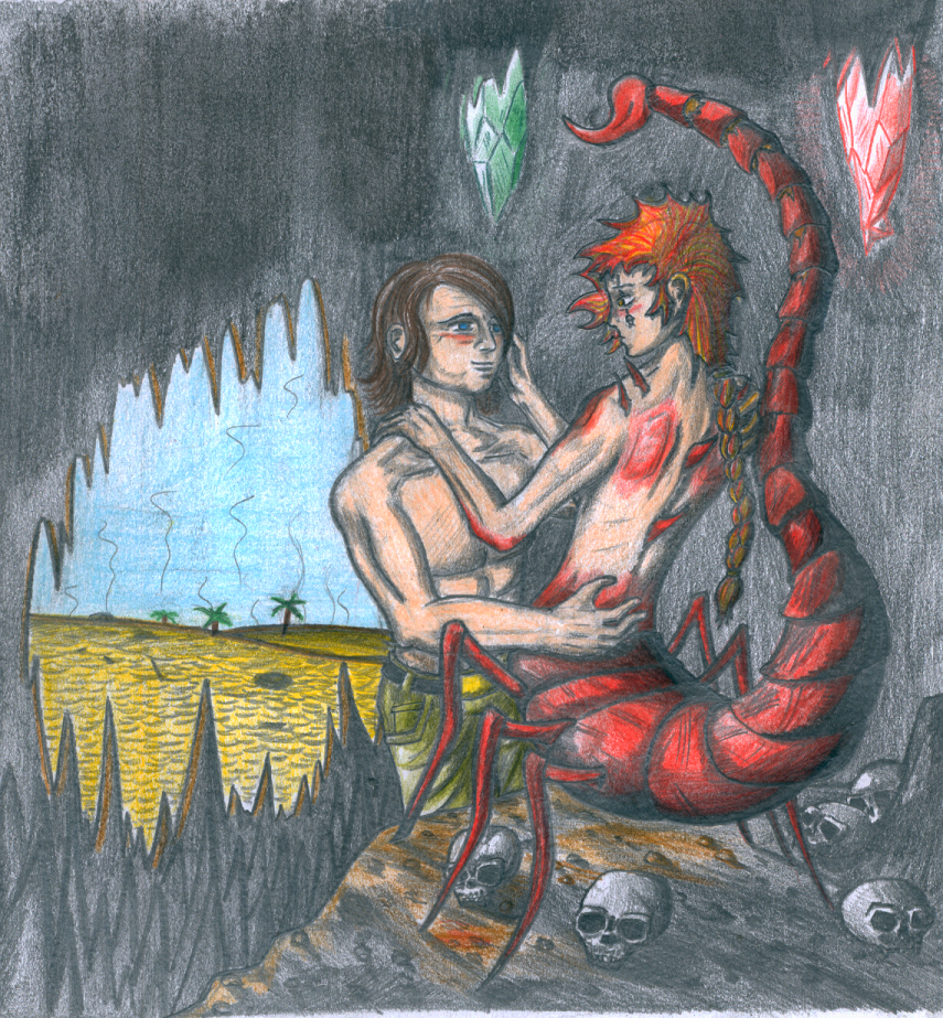
Here we have Taki, from Soul Calibur seriesI was drawing that picture for really, really long time xD My beloved helped me a lot with it
 (Smile)") She helped me choosing colors, making it look better... and simply, she did a lot
She helped me choosing colors, making it look better... and simply, she did a lot
Related content


Comments: 40


Mogę zabrzmieć trywialnie,
ale..cóż,to dobry trybut dla fajnej bohaterki,który zrobiłeś,chłopie.
Jestem pod wrażeniem.
Dobre cieniowanie,oddaje naturę Taki i jej pracy (ciężką  (Wink)")
Bah...no need for words here...
**************************
Doceniam Twe zdolności i oto prezent dla ciebie.
Enjoy
[link]


👍: 0 ⏩: 1

Jej, dzięki, miło mi
Choć już myślałem nad wieloma poprawkami do mojego rysunku. Jest tu zawalony kontrast pomiędzy tłem dalszym (ofiary) a pierwszym planem... Może jakbym coś zrobił w fotoszopie? o_o
ne, nieważne xD
dzięki jeszcze raz
👍: 0 ⏩: 1
To zależy od ciebie-ja tam twardo się trzymam tradycyjnych narzędzi do rysowania i tutoriali z Waneko.
To chyba moja słabośc-
nie umiem tego robić w photoshopie...

👍: 0 ⏩: 1
E, ja też tylko kredki i ołówek xD ale czasami muszę się wspierać elektroniką by przyciemnić/rozjaśnić jakiś rysunek, czy częściowo zwiększyć kontrasty... To jest niezbędne, bo na monitorze tradycyjny rysunek nigdy nie wygląda tak dobrze jak na papierze
👍: 0 ⏩: 1
Dokładnie 
[link]
życzę dobrej zabawy
I dzięki za info.


👍: 0 ⏩: 0

The proportions on the background characters could use some work, but overall I like it.
👍: 0 ⏩: 1
Please tell me about those proportions
and thanks
👍: 0 ⏩: 1
The legs of the girl closest to Taki look a tad unnatural and baloon-y. The man's hands looks large enough that he could hold the woman's entire head in a closed fist.
You fix those things and the rest of it should be just fine.
👍: 0 ⏩: 1
yep, you're secod person telling me about those legs, but i cannot agree about hands. They were meant to look that big. It somehow shows he's kind of gross, groping those girls like that with big and fat hands
👍: 0 ⏩: 1
Point taken, however they could stand to be just a tad smaller, I think.
👍: 0 ⏩: 0

I give you mad kudos for using colored pencils. I can't use colored pencils that well.
👍: 0 ⏩: 1
Thanks
👍: 0 ⏩: 0

GLORK! I swear I was one of first ones to comment :'<
But then dA got into that effing maintenance
I had written sth like...
"Jåå! Your coloring skills are growing for every picture you make!
Really nice work
But what are those thick dark brown lines on the roofs?
If they are meant to show the shape of them, it's kinda... They just look weird...
The skincolors feel very pink and somehow plastic to me still, so try mixing in some brown and blues in the shades ^^
And finally, you see now that you shouldn't be afraid to experiment with the colors, colorpencils can be blended too.

")

👍: 0 ⏩: 1
Those lines on rooftops are simply markings of lines between big "parts" of that roof surface o_o
👍: 0 ⏩: 1

")

"Popatrzcie, dziewczyny! Idę zabić tą niewinną ukrywającą się za rogiem dziewczynę w niebieskich geterkach koktajlem Mołotowa!" xD
👍: 0 ⏩: 1
Aż dziwne że na żadne drewniaki nie zwróciłeś uwagi 
👍: 0 ⏩: 1
Drewniaki klimatyzowane xD
👍: 0 ⏩: 0
I meant, only i was drawing, i got criticism and advices from xD
But thank you
👍: 0 ⏩: 1

Lol oh..woops.
But youre welcome
👍: 0 ⏩: 0

Whoa... VERY nice.
She going to assassinate someone? If anyone could do it, she could. <3
👍: 0 ⏩: 1
Yep, that fat guy looks like good victim (target? ;> )
👍: 0 ⏩: 1

Looks really awesome, great colors and details. She looks really nice. ^_^
👍: 0 ⏩: 1
Thanks!
👍: 0 ⏩: 1

ten pan po lewej marnotrawi alkohol xD
ogólnie bardzo zacnie, jeno pytanie mam (pewnie się już pytałam, ale skleroza nie boli), jakich kredek używasz?
👍: 0 ⏩: 1
Koh-i-Noor POLYCOLOR używam, pomieszanych z jakimiś Conte (ale nie tymi "niełamiącymi")
niedłygo te polycolory wyprą te stare conte, bo na sztuki dokupuję i uzupełniam zużyte :>
👍: 0 ⏩: 1
ja mam gdzieś jeszcze kilka starych conte tropicolors, to były kredki... teraz się bawię Koh-i-Noor Progresso, bo mam najczęściej lekkiego jobla, żeby dokładnie pokryć kartkę kolorem.
👍: 0 ⏩: 1
a rysunków kolorowych nigdy nie uploadujesz
")
👍: 0 ⏩: 1
jop. acz kilka kolorowych gdzieś się pod/na biurku wala.
👍: 0 ⏩: 1
niech żyją posprzątane biurka xD
Ja moje porządkuję kiedy dolna warstwa przypomina ściółkę leśną xD
👍: 0 ⏩: 1
a ja kiedy nie mogę znaleźć ołówka :>
👍: 0 ⏩: 1
wycwaniłem się i ołówki trzymam na małej półeczce nad biurkiem xD
👍: 0 ⏩: 0