HOME | DD
 indigo-chan99 — Color Palette Tutorial!!!

#color #digital #animedrawing #colorscheme #pallette #tutorialhowto
Published: 2015-09-27 20:49:17 +0000 UTC; Views: 1228; Favourites: 17; Downloads: 0
Redirect to original
Description
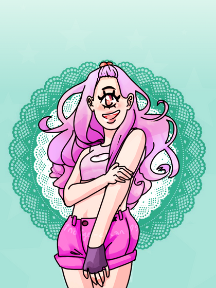
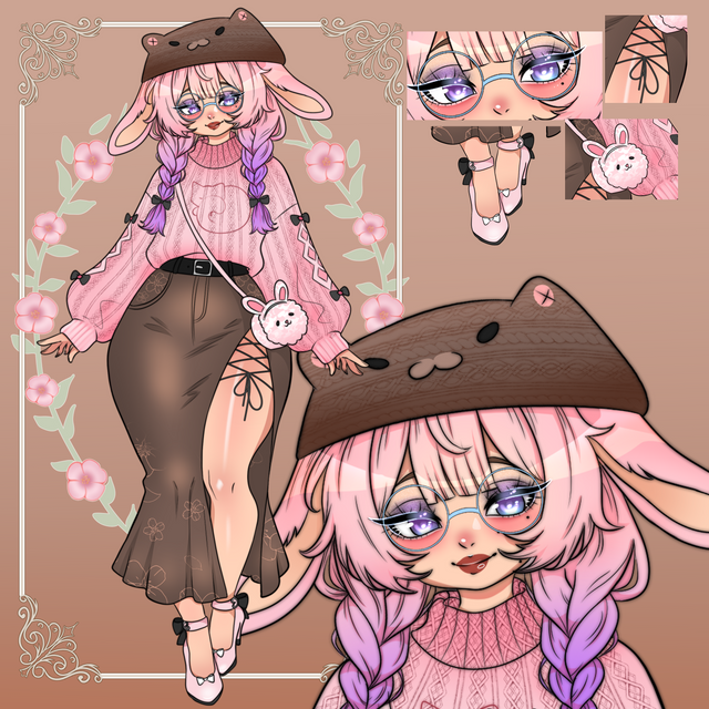
this is a method I use to make my color schemes look... trippier? Generally just more interesting.The example image is , I don't necessarily feel proud about it except for this color technique that i started using at that time.
Let's get started!
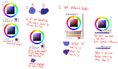
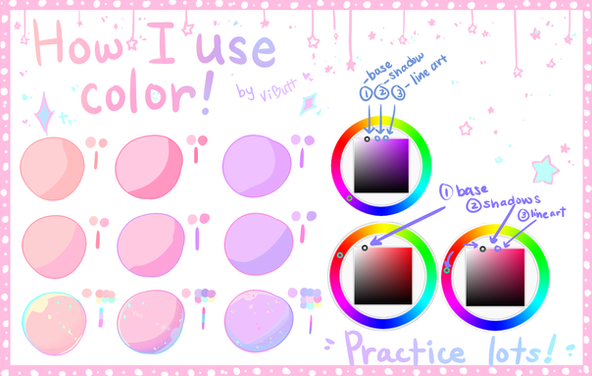
In the center is the color wheel, or at least how it appears in the GIMP. (This tutorial still applies to other drawing programs) The way that this particular wheel works is there is a wheel of saturated hues with a triangle in the middle. One corner of the triangle points to the color you set it on, one is pure black and one is pure white. That being said, one side of the triangle will always hold the grey tones! I will not be discussing saturation in this tutorial or any other nuances that come along with shading and color picking but feel free to ask me about them in the comments!


The "1" colors are not getting any greyer than the base, but they may seem like it because there is no variety! They do not change hues and only change in value (how light or dark they are)
The "2" colors are what i used here. to choose the darker shades, you choose the darker value that you want from the base shade, and then you click on the color wheel slightly clockwise of your staring position! If your original shade was yellow or orange you would be moving towards the reds, and if your original was in the reds you would be moving towards magenta and purple! Make sense?
For choosing lighter tones, do the opposite! Move the wheel counter-clockwise. This means that if you were working with a yellow/orange hue like the skin here, you would go towards yellow (or maybe even towards green, depends on what look you want)
Speaking of skin, however does one choose blush tones with different skin colors??? This is a perfect opportunity to explain it!Blush tones should be darker than the base skin color, as it is a concentration of blood! Shading with pastel pink is wrong(unless the character has very pale skin) and would only happen if someone applied their makeup rather carelessly. To choose blush tones, take your darker skin shade and then drag the wheel over so that it is closer to red!
Keep in mind that this works for characters with all sorts of skin tones (even blue!) You don't have to put it all the way at red, just move it as much as you do to make your #2 shades different from #1
That being said, the #3 colors are exaggerated versions of #2. I wouldn't use them with my current system of shading, but if you find that you don't use effects like light and shadow overlays often and you want to give your pieces more contrast then by all means give colors like #3 a try!
Thanks for reading and I hope you find it useful! Feel free to reverse this and go counter-clockwise for the darks and clockwise for the lights, sometimes that fits the mood of the picture better.


If something doesn't make sense or you run into trouble while testing it out then please ask me, I wouldn't make these tutorials if I didn't want to help people! ;v;
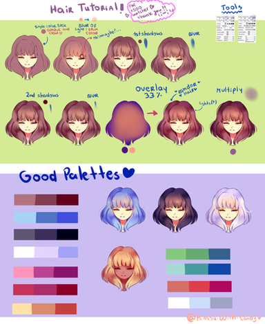
My other tutorials: In order those are Overlay/Multiply Effects, Hair shading and linearting. To request more tutorials leave a vote and a comment on my poll!: indigo-chan99.deviantart.com/j…
Watch me for more in the future!


Related content
Comments: 2

No problem, I'm glad that it helped someone ;v;
👍: 0 ⏩: 0


