HOME | DD
 IndigoMetropolis — Differentiating Styles (Reference)

#comparison #design #samone #style #colorpalette #reference
Published: 2017-06-01 08:26:53 +0000 UTC; Views: 214; Favourites: 5; Downloads: 0
Redirect to original
Description
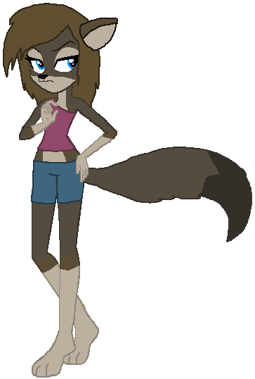
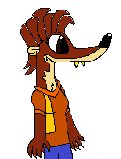
The style on the left is one that KnightTheFox and I have been working on recently. I personally like it, although I didn't portray it the best digitally. Soon, I'll have images up to show you the physical drawings he and I did on a table at the local DQ. The biggest change is taking human anatomy/proportions and applying them here to Samone. Most evident, the jawline is much more defined, but I've also messed with the head and shoulder size. Eyes are more accurately represented as well. Also, the signature "three-prong" tail was altered to more of a tuft.The style on the right is a hybrid between a older style KnightTheFox and I collaborated on, and a design style similar to JAMDrawsStuff 's. We still have a bit of a protruding jawline (this was the previous "humanoid" design style), but the head to shoulder proportions aren't as dramatic, and the eyes are attached to the muzzle like many design styles. Tail is in its original design.
Another thing you might notice here is the different color pallets between the two versions. This is or less to portray the progression in Samone's color scheme. When he was first recreated (I might explain this better later, but the original design for Samone was lost and could not be replicated. As such, I almost abandoned the character until KnightTheFox helped me create a design to replace the old one) he was bright with shining colors.
Later on though, I found that this design more and more began to be something that almost hurt the eyes with the vibrant lime green, silver, and orange. As such, the new colors are more forest green, grey, and burnt orange/amber. Muzzle has also taken a grey hue, and the ears are somewhat of a peach color.
Related content


Comments: 11

Interesting! the eyes and ears could use a little work, but other than that I like the design! ^^
👍: 0 ⏩: 1

Which style are you referring to?
If it is the one on the right, the issue with design portrayed are simply because I didn't spend as much time on this design compared to the other one
If it is the one on the left, the issues are because this is the first time I have used this style digitally, while I have used it a few times on paper. Eyes are meant to be more humanoid, and ears are meant to "hug"/stay close to the head. What specifically appeared to need work about these?
👍: 0 ⏩: 1
On the left. ^^ the main thing with the ears is that they're not curved. (Don't worry, almost no one I know starts off making curved ears) but to make them look more realistic and closer to the real thing, make one side mostly straight and and just gently curve the other (if you need a reference most of my OCs ears look this way). It just makes the ears look more organic, instead of robotic or mechanical.
As far as the eyes go, I can see what you meant by humanoid, and the style is fine, I'd just go look at how anime eyes look to get more of a feel for how the iris and pupil work together. Don't worry, it takes a LONG time to get right.
No worries, practice makes perfect, ya know? ^^
👍: 0 ⏩: 1
I was always told that straight lines were more robotic/mechanical than curves which were the organic ones. I guess the teacher was wrong? 0-0
From what they told me, an animal's ear is like a semi-cone (split in half from the vertex to the base). The viewer, viewing the animal face-on, sees the semi-cone face on as well, making the ear appear to be a triangle with two rounded sides. Both sides would be rounded because the curved face of the cone would meet up to the flat face where the cone was split.
With the way you described it, the semi-cone would be split in half (a fourth of a cone). This would give the appearance of a triangle with one curved side and two straight edges, as the curved face of the cone would meet with the face where it was first split, and the other side that was once curved - was cut off, leaving a flat face resembling a straight edge from a face-on perspective
I'm not really looking for an 'anime' eye style, and I also still want the eyes to have some resemblance to their mobian/zefaran counterparts. Also, the reason the pupils aren't shown here is because the eyes were to small in this picture to draw them... and I was too lazy to scale the picture up to the proper size to be able to make them fit

👍: 0 ⏩: 0
Which style are you referring to?
The one on the right (new), or one on the left (less new, experimental)
👍: 0 ⏩: 1

i enjoy both of them the right one is cool and has good proportion! and the left one is cool too keep experimenting with it i like to see more ideas for the design
👍: 0 ⏩: 1
You would like to see more ideas of specifically the right design, or both?
👍: 0 ⏩: 1
both would be neat
👍: 0 ⏩: 1