HOME | DD
 Infinite705 — DARK Source
Published: 2011-04-22 20:14:28 +0000 UTC; Views: 7421; Favourites: 178; Downloads: 939
Redirect to original
Description
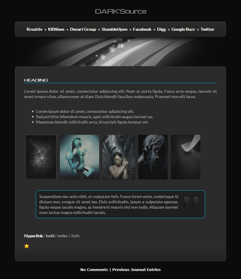
- DARK'Source
FREE TO USE
(for subscribed users only)
#// Live view: Click Here
+ 7 Images (roundness, grads, reflux)
+ CSS2 used + CSS 3 (won't work in IE)
+ Best viewed in Firefox.
+ Date, Mood, Listening to etc removed.
+ Black, Grey, Blue & White.
How To Use:
Install..
Edit links via css header, don't remove any tags.
You can use other symbols like / | - between the links, i've just used dots to make it look good.
Titles -
Blockquote -
text here....
If you need more help just ask! i don't bite.
Header image is my own: RefluxDUAL 2
Comments welcome ^^
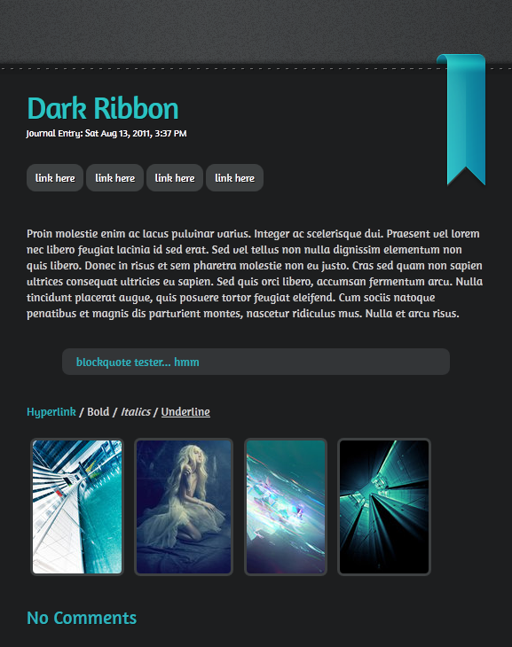
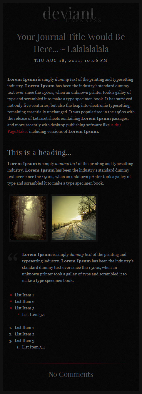
See more skins here

Related content


Comments: 53


How do you change the links? I can't change them.
👍: 0 ⏩: 0
You are a mad genius for making this! It helped make my page look much better!
👍: 0 ⏩: 0

I used a slightly altered version of this skin here: DeviantArtist Questionnaire .
👍: 0 ⏩: 1

Thanks for letting me know

👍: 0 ⏩: 0

I love it
But the first title I put in my post seems to make the whole post use that font.
If I have some plain text at the beginning and use the title style later on, then it works o.0
My code:
elementaryOS Luna beta 1 released
elementary is a project built on providing a simple, beautiful, and reliable Linux experience
The project has its own desktop environment, called Pantheon
The next version, called Luna, had its first beta release a few days ago
You can download it here, for 64 or 32 bit, with direct downloads or torrents
👍: 0 ⏩: 1
Not really sure what you are telling me..
👍: 0 ⏩: 1
If I use the "title" style right at the beginning of my post, then for some reason the whole post uses that font. If I use some plain text at the beginning, then the "title" style, then it works fine.
👍: 0 ⏩: 1
please remember to close the tags!! in the title it uses div tags, read the description again.. thanks
👍: 0 ⏩: 1
Hmm, I'm pretty sure I did, but I must have missed one then. Okay, thanks, works now ^^
👍: 0 ⏩: 0

its a wonderful journal skin, but, i haven't a use for the links. is there a way you could give me the header without the links?
👍: 0 ⏩: 0

I've featured your journal in my journal here: [link]
👍: 0 ⏩: 1

Hello,
I used your journal in my last entry. Thank you for this beautiful and dark journal.
[link]
👍: 0 ⏩: 1


not sure where to change the color of the line under the headers. Can you point in the right direction? Thank you for your time - and if you don't have enough time to get to this that's cool too.
👍: 0 ⏩: 1
you should change the links in the nav too btw
- edit links via css header, just don't remove any div tags.
- border colour is in Skin CSS, scroll down til you see ".journaltext .title" and edit the # Hex of "border-bottom:1px solid #00bdf1;"
change center to left, or right etc.
👍: 0 ⏩: 1
off hand you wouldn't happen to know the code for dark red? On that - if I know the code from photoshop will it be the same? And thx so much for the reply and info.
👍: 0 ⏩: 1
the hex from photoshop would be the same as that hex  (Smile)")
👍: 0 ⏩: 1
sweet - thank you! gonna have to follow you more closely since you put out such handy stuff - hehe
👍: 0 ⏩: 1
Is there a way I can center all the text? With and without the headers doing the same? You do great work, thanks for sharing with us - kudos

👍: 0 ⏩: 1
")

You've been featured here . Please consider faving the news article.

👍: 0 ⏩: 1


Oh god this is gorgeous. I've closed so many other ones because the image quality just wasn't good enough to go into my Web Design collection in my favorites. But this definitely fits in there. I love how high quality the images are, and how well done they look, how crisp and ripe they look, how brigme (pronounced 'Brime')and simple they look, while still dark and clean. It just works, totally works. Thanks for sharing and thank you for making one with high quality images, like I did. There needs to be more high quality images in journal skins.
👍: 0 ⏩: 1
thankyou! yes i know right.. i like HQ images in my work
👍: 0 ⏩: 0


Really nice journal skin. Good colors, and I like the thumbs (with opacity effect) too.
👍: 0 ⏩: 1


This looks so awesome! I´ll surely be using it.
♥
Pd: one little thing though, a bit of color on the waves, I think, would lovely match the rest of blue touches.
👍: 0 ⏩: 1
mm yeah i should of added something to that!.. thanks though
👍: 0 ⏩: 0
| Next =>