HOME | DD
 InfinityCreature — Ahrien Icon Commssion
Published: 2011-12-02 01:42:35 +0000 UTC; Views: 544; Favourites: 25; Downloads: 5
Redirect to original
Description
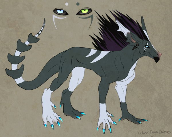
Icon commission for =TwilitTigerTwili! WHY YOUR CHARACTER SO CONTRASTY!? WHYYY!?
DO NOT USE!
Related content


Comments: 6

PS Lolol, as I come back to this to fave it, one of my favorite songs is playing. It's called Moonlight.
👍: 0 ⏩: 0
MY CHAR SO CONTRASTY CAUSE HE AWESOME. Seriously man, you made this amaaaaaaaaaaaazing 
So like January I guess LOL
Thank you <333
Also, is his right (left whatever) pupil black? It's supposed to be a slight darker blue than the iris color, but I guess it looks black on the ref because I used pen on there when I shouldn't have xD
👍: 0 ⏩: 0

FFFFFFFFFF I just wrote a really long comment on my PHONE, and it decided to do 'error in posting comment' FFF *explodes*
I'm gonna try to remember what I put, so this might end up becoming really spazzy:
"BullSHIT!! This is awesome!! I think you've made a leap already (ok, I've completely forgotten what I had put >w<), and I think that this can be a big learning curve for you. Though I know that the contrast is mainly because the fur is different colours, it works so well, that actually, it looks like the fur 'could' be the same colour. And this is because the picture has depth, and things that are closer to the viewer will tend to have a stronger contrast (there is a term for this, but I can't remember >w<). And it's not just that, but the fur looks better too, it looks softer, and more full, it does still need work of course, but my word it's bloody well getting there! <3
My only criticism would be on the hair, it doesn't seem to look like part of the same picture, I have the EXACT same problem, and I have no idea how to fix it, so I'm afraid that I can't be of any help there :/ Though you can see the difference hair-wise here in DIW's picture [link] It seems softer, and it falls more naturally, I wish I could do that >w<
Actually, there is one more thing, I do feel that your fur doesn't 'clump' enough, like in this, you can see the small clumps (also, I somehow haven't seen this before, and I think I orgasmed when I clicked it) [link]
Anywho, I am gonna leave it there, they're just a couple of things for you to mull over, you're getting REALLY good at these, and I love to help people improve, even if I can't do it so well myself <3
👍: 0 ⏩: 0

Is that high contrast or both sides have different fur color?
👍: 0 ⏩: 1

Both sides of the face have a different fur color :3
👍: 0 ⏩: 0

Yet again you have impressed me with your awesome-ness.
And yay! Another icon done! I hope you make more!

 (Smile)")
👍: 0 ⏩: 0