HOME | DD
 inkartluis — Conan colors
Published: 2012-10-05 08:30:43 +0000 UTC; Views: 2976; Favourites: 25; Downloads: 65
Redirect to original
Description
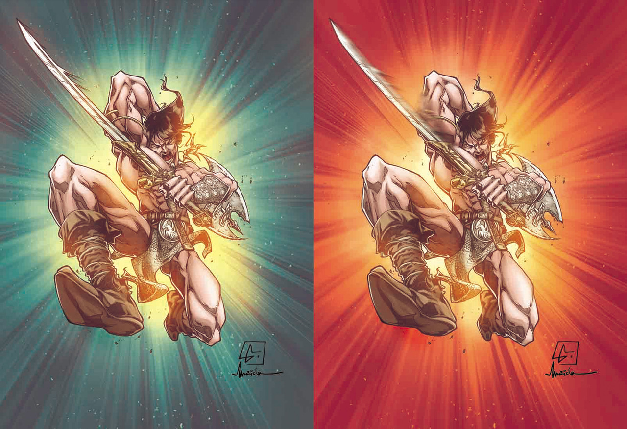
Hey guys whats up? How is everything?On the other day I had a nice susprise and at the same time very quick: MArcelo Maiolo colored my Conan, the one I did for him, in just few hours! It was so fast that I dont even expect that!
Great great colors! He decided to give me two version of him, so I would like to know which one u prefer the most! I like to know what u think guys
 (Wink)")
Take care and let me know
Related content


Comments: 17

")

Ahahah two votes for the red one
Thanks for your opinion
👍: 0 ⏩: 1


Yeah dude! Me too! I like more the left one! Even if my favorite color is red
👍: 0 ⏩: 0

They both look superb, but I prefer the one on the left. To me the one on the left seems to have more detail then the one on the right.
👍: 0 ⏩: 1
Exactly! The same here
Thanks for the opinion
👍: 0 ⏩: 1

Well the right one is blurred a bit near his sword, so Geo is right in saying the green one is a little more detailed.  (Smile)")
👍: 0 ⏩: 1
Yes, that bit of blur near the sword in the right image did pop-out at me, but both renderings are very well done.
I've use the same type of background when coloring this image... [link] , it's a very effective way of making an image look more dynamic.
👍: 0 ⏩: 0
