HOME | DD
 InspectorIroh — Inspector Iroh - 12
by-nc-nd
InspectorIroh — Inspector Iroh - 12
by-nc-nd
Published: 2007-10-11 21:46:22 +0000 UTC; Views: 7583; Favourites: 24; Downloads: 27
Redirect to original
Description
Art: ~theartrixWriting: ~theartrix
Lettering: ~theartrix
First | Next
Related content


Comments: 16

oh man. first off, I love the longer page.
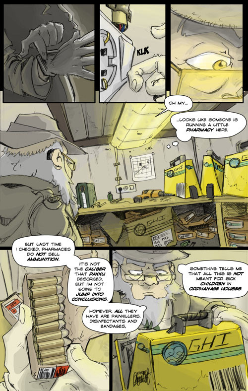
that back shot of Uncle? oh man. thats a great panel. We see the whole room and Uncle and the light from the ceiling is perfect. I also like the glow coming off of Irohs glasses. The GHI cases are awesome.... goodness. this is getting interesting.
may I ask what font you're using? its awesome
*heres the part where you tell me you write the words by hand XD*
")
👍: 0 ⏩: 1

I'd like to know what resolution you draw at. All mine either lag the system really badly or are too small for detail...
👍: 0 ⏩: 1
I always draw at 300 dpi. its industry standard but also its a really great dpi res to draw at. keeps things large and crisp. then you can modify the size once you're done.
👍: 0 ⏩: 1
How d'ya set that in Photoshop? D:
<------- is n00by
👍: 0 ⏩: 2
listen to the artrix. 'datguyswise', as the ewok would say
and noobys are great!! they make the rest of us feel better!!


👍: 0 ⏩: 0

DPI stands for dots per inch, which implies that we're dealing with a physical size. In most cases, setting your scanner to scan at 300dpi will suffice. Since you seem to work digitally, you have to simulate this by entering "physical" values in inches.
Simply press ctrl+N in Photoshop, and a window for a new document will appear, you will be allowed to specify the physical size in inches or your preferred unit of measurement, and the resolution you wish to use. Note that while entering the size in pixels is a perfectly good method, it renders the resolution useless (well, not completely, but I'm not going to make things overly complicated).
👍: 0 ⏩: 1
hey. thats exactly what I was going to say
you in my head or something??


👍: 0 ⏩: 1
I was, until security kicked me out :[
👍: 0 ⏩: 0
The only thing that would improve this is FULL STOPS, DAMNIT. ARTRIX WHERE IS MY PUNCTUATION?!?!?!?!
Other than that, wootwoot. Plot thickens.
👍: 0 ⏩: 1
I actually saw other comics do the same thing: using proper punctuation except for the end of the balloon, because the text balloon itself more or less replaces it's function.
But I do see that I'm not consistent here, and that some sentences are, indeed, unnecessarily long.
When I first joined English-speaking communities back in 2000, my English was pretty bad. I didn't really notice until others pointed it out. At the moment, I consider it to be good compared to the average non-native English speaker, but I still run into mistakes every day.
This is why I'm happy with feedback like this, because I can't know how my writing is perceived unless it is being pointed out to me.
👍: 0 ⏩: 1
It's just that full-stops convey a pause in the conversation much more effectively then simply ending the sentence does. Otherwise it feels... incomplete.
👍: 0 ⏩: 1
Oh, and bolding random words? GENIUS.
(It's all part of the Round Robin, man!)
👍: 0 ⏩: 1
Actually, making keywords and emphasized words bold is a pretty common practice in comics, especially American comics.
(Or you're implying something else that has to to with it being part of a round robin project).
👍: 0 ⏩: 1
No, I mean that in American Comics generally the emphasis is placed on certain words. For instance, the emphasis in the last sentence reads as "Something tells me that this is NOT mean for SICK CHILDREN in ORPHANAGE HOUSES." The trick is to only emphasise the words that seriously seriously need it. Iroh doesn't seem the sort of character to emphasise words to himself, however much of a film noir detective he is. The first phrase - where only '
The Round Robin thing is how the emphasis style changes throughout the Round Robin comic, by virtue of being, indeed, a Round Robin comic.
👍: 0 ⏩: 1
That's a pretty solid argument that I really should take into account for my future work. When I study other comics, I do come to the conclusion that the emphasis is used much more sparingly than I perceived.
Thanks for taking your time to elaborate your argument, stuff like this is what really helps us artists evolve.
👍: 0 ⏩: 0

Glad to see that the frequency of the updates is growing faster. the plot continues to thicken! Excellent work all around.
👍: 0 ⏩: 0