HOME | DD
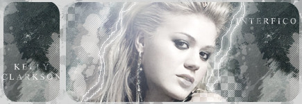
 Interfico — Kelly Clarkson
Published: 2006-08-22 05:08:23 +0000 UTC; Views: 1217; Favourites: 20; Downloads: 4
Redirect to original
Description
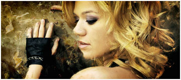
A simple signature about Kelly Clarkson.Related content


Comments: 30


Simple? It is sexy! Really good Artwork! So nice and beautiful. I love that.
👍: 0 ⏩: 0


 (Smile)")

I'm like Ramona.. I have no idea how signatures like these are done either. But I like this. It has a nice clean, uncluttered look to it, nice blending, and the muted tones work well in my opinion. (I'm not a Kelly Clarkson fan either but I think you've flattered her well here)
👍: 0 ⏩: 1

nice style, i like the mixing and colors here
good work dude
")
👍: 0 ⏩: 1

Thanks!! And thanks for the +fav!
👍: 0 ⏩: 1

So, explain to me the process of signature work. I love what you did, but don't know how much of it is yours. Did you brush the background, the lightning? Forgive me my ignorance, but I'm new to the digital world.
👍: 0 ⏩: 1
First I got an image of a wall.
I placed a render of Kelly Clarkson on it.
I added a few effects with filters, and I copied the layer a few times and I smudged them a bit.
I downloaded 'Spatter Brushes' which can be found here at deviantart.
And I used them in a few different grayscales.
Added some shapes, contrast, etc..
And, very important, lightning and coloring of the signature.
At the end I added text and then I was finished.
Thanks for your interest.
👍: 0 ⏩: 1
Very cool. Thanks for the explanation
👍: 0 ⏩: 0


Can you comment the sig not the person that's on it?
👍: 0 ⏩: 1

The sig was ok.
You need a bit more brush work, and the colors were not well suited.
👍: 0 ⏩: 1
There isn't any brushing nor coloring involved in the sig, that's the style of the sig ._.
👍: 0 ⏩: 2

If you want criticism, feed of it, dont reply and try to explain yourself, deal with it, that's how you become better.
👍: 0 ⏩: 0
It just makes it look a little bland.
👍: 0 ⏩: 0

