HOME | DD
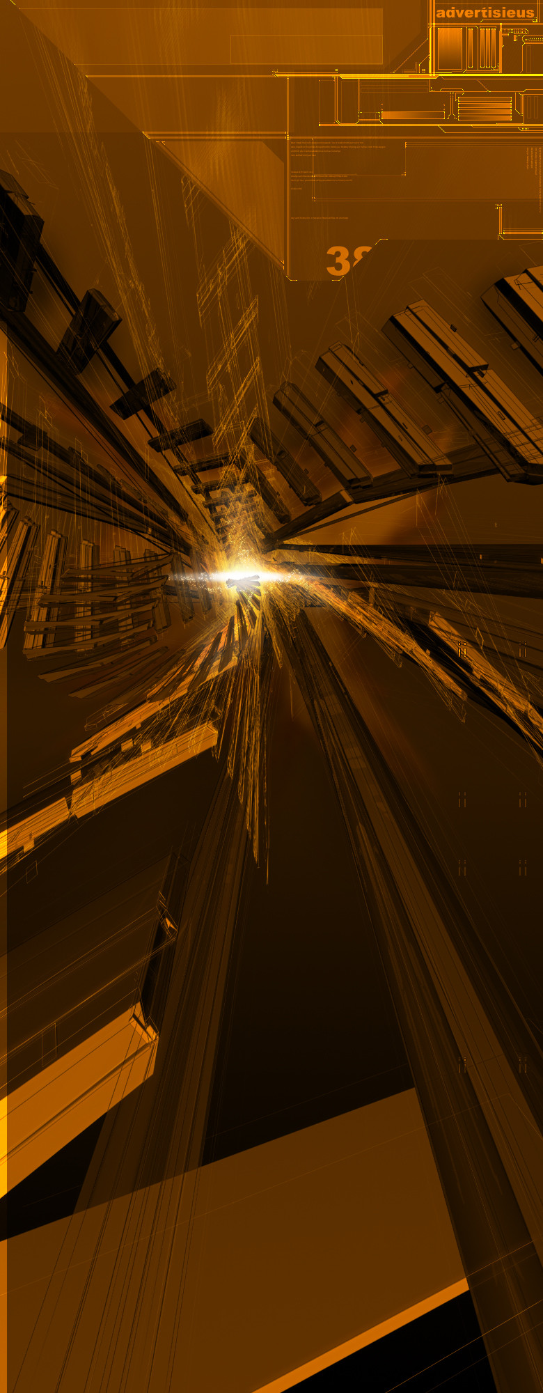
 intervul — InnerDepth

Published: 2003-06-06 22:33:39 +0000 UTC; Views: 635; Favourites: 6; Downloads: 113
Redirect to original
Description
InnerDepthprograms used:
+3d Studio Max
+Photoshop 6
Time:
estimated about 2.5 hours
this one has a little bit of a older twist of me in it... used alot of my older techniqes... comments are welcome
Related content


Comments: 27

")

wow, absolutely fantastic, I love the blueness of it, very good
👍: 0 ⏩: 1

thanx man, glad to see ur interested in my work
👍: 0 ⏩: 1
Always a pleasure ^-^ I just love ur style
")
👍: 0 ⏩: 0


 (Smile)")


This looks great. Nice sense of depth and detail, while not being too overpowering. Excellent job.
👍: 0 ⏩: 0


Wow. I'm really liking the renders here.
Very beautiful depth and colors.
Awesome work overall.
👍: 0 ⏩: 0


i still think it looks like ram chips nice job much props + fav
👍: 0 ⏩: 0

the 3d owns man! be really awesome with some reflections
👍: 0 ⏩: 0

Nice work on the 3d and brushing! Only 2,5h work on this ?! thats impressive i would like to see a image you have worked on for 5h
that would pwn! keep up the cool work
👍: 0 ⏩: 0

sweet 3d, really love it! very nice lighting too
gj!
👍: 0 ⏩: 0

Wow, this is hot. although i think the typo could use some work.
👍: 0 ⏩: 0


woah! that perspective is great and the 3d OWNS! good job man
👍: 0 ⏩: 0

Of course the jagginess is always an issue in 3D sometime and it'd be even better if there were none. Nice feel to it, a bit trendy but good
👍: 0 ⏩: 0

some of the walls look jagged up near the top but its pretty damn good.
👍: 0 ⏩: 0

kick ass structure, nice brushing as well..i don't see too many structural pieces with those style colors..and if you do its usually purdy dark..great looking in my opinion i have no complaints heh
👍: 0 ⏩: 0

i really like the typography here. the 3d work is great, too. properly executed in a trendy style. me likes.
👍: 0 ⏩: 0

nice job. i dont really like the text but the rest of the typo and 3d is sweet
👍: 0 ⏩: 0

amazing....shaweet...the blue light brings the piece to life...good work keep em commin
[]D
👍: 0 ⏩: 0

i like the 3d a lot
2d needs a bit work
keep it up man
👍: 0 ⏩: 0