HOME | DD
 InvaderSaik — Fragment III- Redone

Published: 2010-10-24 10:15:30 +0000 UTC; Views: 1233; Favourites: 21; Downloads: 19
Redirect to original
Description
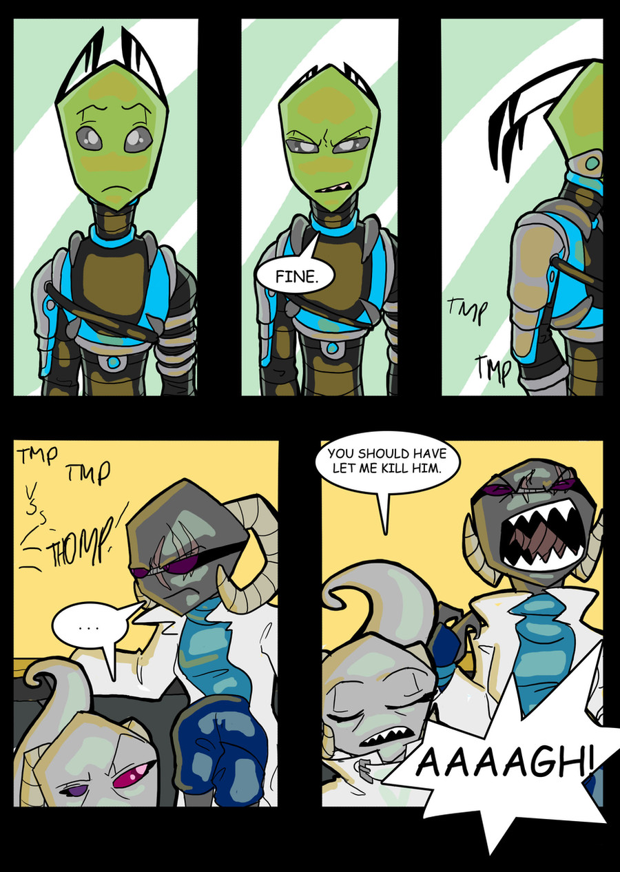
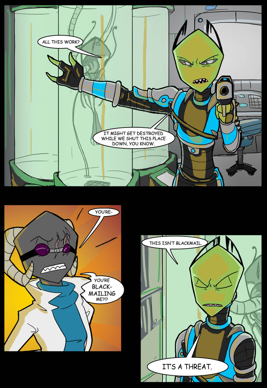
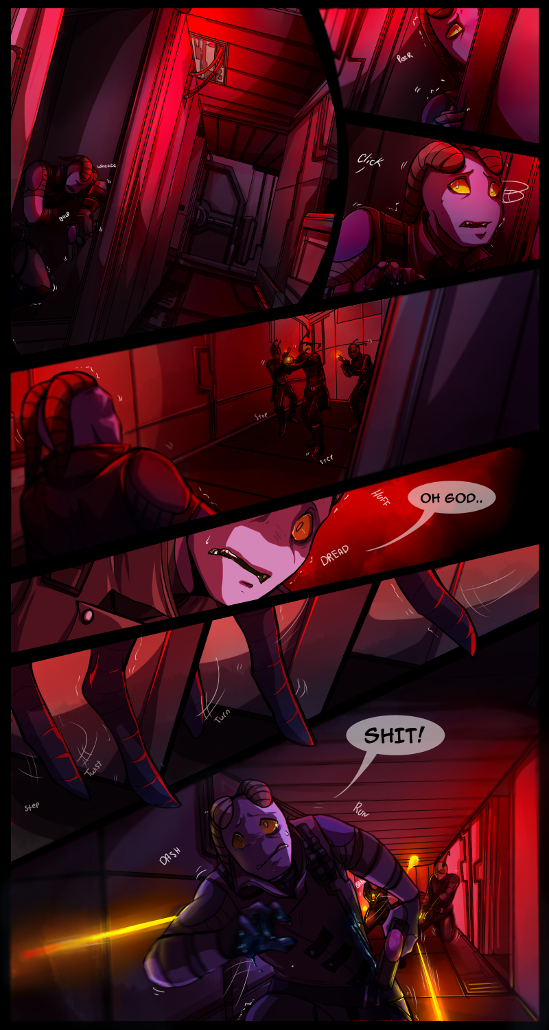
The third and last fragment I had gotten around to doing. From here, you'll be seeing some new material CBOriginal here---> [link] (it was later and slightly better, but still pretty crappy XD)
Saik and Betelgeuse C me.
Related content


Comments: 18

AGAIN.. I say...amazing colors, just stunning. D>
poor Bet... I know what's coming next. :C
I do think the blue on the right side there was out-of-place...too toned-down for the overall intense feel of this page.
👍: 0 ⏩: 1

Thanks C:>
...Yeah... He gets over it XD
Really? It was originally the same colour as everything else, but I thought that if I made it blue it would make the other panels stand out more. Hrmmm...
👍: 0 ⏩: 1
O' course.
Amazing kid. <3 Him and Thymel, man...muh favs.
Well it does...but not in a good way. It's like...panel panel panel wait..random blue?
👍: 0 ⏩: 1
Hmm, I see what you mean, now D:
👍: 0 ⏩: 1
good. c: Keep a lookout for it in the future.
👍: 0 ⏩: 0

Amazing! The difference is HUGE!...
👍: 0 ⏩: 1
... *should really pay more attention to details like that but doesn't* But thanks XD
👍: 0 ⏩: 0

The poses, the shading the coloring EVERYTHING about this is WAY better - not to mention creepier and more effective at getting the point across.
👍: 0 ⏩: 1
Hee, that's good. I'd be a bit freaked out if it hadn't improved much XD
👍: 0 ⏩: 1

thats just so beautiful...i love the almost hellish evening sky, its a magnifiscent touch! the expressions, the poses, the aciyons...its all amazing...well done Saik : )
👍: 0 ⏩: 1
Thanks, hee. I did like that sky, so kept it over from the first piece CB
Thanks dude, I've really been working at all that over the last year since the original ;D
👍: 0 ⏩: 1
well, i must say a comic about the past is jsut as interesting as the one about hte present and future XD
👍: 0 ⏩: 0

The differences are so staggering. XD; Yet these revamps look completely awesome. : ) The paneling is interesting and dynamic, and I love all the facial and body expressions; especially Saik's in the second panel. I simply adore the coloring as well, the way you've created the lighting of a sunset. Fantastic work.
")
👍: 0 ⏩: 1
C: Thanks XD I've tried to make it all a bit more dynamic CB
The second panel turned out pretty well, I think C:
Thank you!
👍: 0 ⏩: 1

wow, your cell shading in here is getting really good ^_^ I like the unique blend of sickly yellow and greens, as well as poses and dynamics of it, especially top right hand panel (brilliant smile, evil yet reserved)
👍: 0 ⏩: 1