HOME | DD
 ioco — Karo
Published: 2001-04-18 20:41:34 +0000 UTC; Views: 694; Favourites: 0; Downloads: 97
Redirect to original
Description
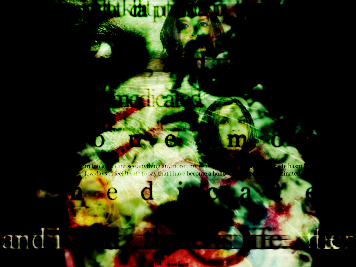
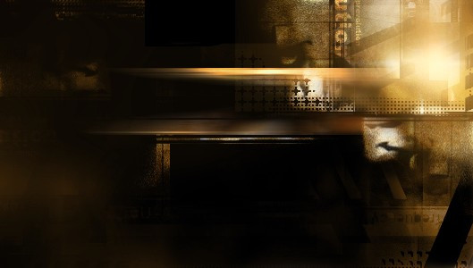
Something so beautiful , so sleek , whispering beauty from the mind.Related content


Comments: 17

i'm going to have to agree with the colors not looking right here. i do however, like how the faces attract the eye. it's like, you look at this piece and then see the layering and the way that the faces immediately draw your eye to them. but ish on the colors papi.
when confronted with hate and ignorance, one must liquify.
👍: 0 ⏩: 0

Red and green are complimentary, so they're supposed to go well together...but on this one they don't go so well. Must be the high contrast. I like the image, though, just not the coloring.
-Liquisoft
👍: 0 ⏩: 0

??? an how come i am always tha last one to know when kar0 is tha subject of a deviation!!! shesh.. anyhow.. nice i like tha way its all put together...
--- [idlejam] --- [iji] ---
👍: 0 ⏩: 0

Excellent composition of layers loco, it all flows together really well! Nice use of typography too..looks kina eroded. the colours are the only thing that put me off, they seem to merge quite well in places, but seem more convuluted in other parts.
Nice Job.
Nice subject matter.
Nice!
👍: 0 ⏩: 0


nice wall, but i dont think the colours go well together, but that IMO
👍: 0 ⏩: 0

coolness i like the distorted feeling it brings out
Nicolas (Cype)
nicolas@dmusic.com
👍: 0 ⏩: 0

Wait, I see pics of Kar0 in there... 'least I think it's Kar0.... hmmmm...
Anyway, not sure what else to say that hasn't already been said. I like the composition of this... kinda trickles from the top and then spills open as you get closer to the bottom... nice positioning of your elements, good interaction of layers, and also a nice use of type for visual purposes more so then informative ones. I also like the color. Spooky, grimy, filth under a flourescent bulb filth kinda look. Nice all around. I dig this.
👍: 0 ⏩: 0

Ha, Kar0, i thought this was you too, that's why i clicked on it, ha, cool pic man
👍: 0 ⏩: 0


very very very nice..colors are lovely and the typogrgapht is great as well
👍: 0 ⏩: 0

i like everything but the color and the transitions of color. not saying its bad..i just dont like the color
DIGI
http://www.awedigi.com/optic
👍: 0 ⏩: 0

it's dark indeed, very indy, and a very good yooze of text yoozed as a texture.
👍: 0 ⏩: 0

this thing is really spooky man... pretty good all the same though
--
[Please consult a physician if subsequent exposure to Skrath results in terminal epilepsy or cardiac expulsion]
👍: 0 ⏩: 0

heh, so pretty!! ..not cuz it's me.. lol. there's someone else in there.. that's not me.. *points*.. yeah that's not me.. lol. anyways.. yeah.. it's a little dark, but it looks really nice.. wooo thanks for using red.. it looks beautiful.. great job! (as always) ;D
I wasn't gonna grade.. cuz it's about me.. but I always grade your art.. so bleh
👍: 0 ⏩: 0
