HOME | DD
 irving-zero — Light and Dust

Published: 2009-05-04 00:42:29 +0000 UTC; Views: 9154; Favourites: 368; Downloads: 494
Redirect to original
Description
digital painting practice made with a previous lineart. first color version is done last 2008 ---[link] please comment on differences. ^_^this was for an art trade with the idea of odin allfather as a valkyrie chic. anyway, the pose is referenced, though not completely.
Related content


Comments: 34


thats supposed to be a female Odin right? the spear, her clothing...the EYE!
👍: 0 ⏩: 0

very sexy and powerful ^^ the traces of your works are high skilled dude...
👍: 0 ⏩: 0

While I like the clarity this one has, as opposed to the previous version, I liked the positioning and flair the older one had.
Good work, none-the-less.
")
")
👍: 0 ⏩: 0

Very nice. Shoulders = Awesome. I love everything Armor.
👍: 0 ⏩: 0

Your colouring looks as though it has become more detailed(more depth) when compared to the previous picture.
👍: 0 ⏩: 0

 (Smile)")

practice lang to? wow~
amazing~
I started watching you because of your traditional art, but I'm loving your digital works too

👍: 0 ⏩: 0

asteeeg!
wait, that's a female version of odin as a valkyrie right? wasn't odin injured eye the right one? o_o
👍: 0 ⏩: 1

ewan. magulo mga references.

👍: 0 ⏩: 1

this is obviously cleaner and more neat, but the original had more style in a metalgearish way. better impact so to say... I don't think other is superior to other, but they both have their places. I would put this in a game/animation, but the original in a poster.
👍: 0 ⏩: 1
yeah, totally. my own expectation was that because this was totally a different style it would overwhelm and be a lot superior than what I did before, but when I went for a second look, the first one had its stronger points, though it was a bit rougher, but still. some originals really put their worth before the remakes, huh.
👍: 0 ⏩: 0


hmm i love valkyries, and odin rules so, odin+valkyrie= Awesome,
wheres that fave button...
👍: 0 ⏩: 0


fit talaga yung armor sa chickababes. ang angas at ang sexy... hehe
👍: 0 ⏩: 0

I still love her. You have changed a lot. I don't think you were doing a bad job at all back then but it was definitively different. The contrast is now under control, although I loved the wild way you used light before. Anyway, it's all good and I hope you're finding your real style.
PS. I would really, really like it if you made another traditional media piece. I loved the delicious texture you gave to your pictures.
👍: 0 ⏩: 0


you would think a warrior wouldn't want to wear something so ... thin... but i guess it does add as distraction to foes
👍: 0 ⏩: 1
I'd go for aesthetics than practicality in my presentation. I can go for the more logical layer-after-layer of armors and chainmails that would look more bulky than attractive, though there are really only quite a few times that I favor that.
👍: 0 ⏩: 1
don't worry i know that... wasn't a serious comment
👍: 0 ⏩: 0

as usual serr, hindi pa din kami napapahiya sa mga gawa mo...BANGIS!!!...
👍: 0 ⏩: 0

I like the colouring job but I think the anatomy is overly distorted. It looks a bit weird.
👍: 0 ⏩: 1
oh? in what way? I know I made a mistake in making the thighs a bit wide apart but other than that I think it looks fine...
👍: 0 ⏩: 2
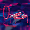
it looks fine as that is why this is "ANIME" style. and yea anime has perfect bodies boobs like that and thighs like that. i don't agree with ~codecyros about taking anatomy classes to be better artist or any of the sort it's your style it's awesome keep at it. and about the two version this one looks way better the only thing i guess that needs just a lil bit of shine is the armor depending if it's a shining armor or not aside that, awesome !!
👍: 0 ⏩: 1
if it's about actual anatomy I wouldn't use it here, but maybe in live drawings or life representations. and, yeah. I definitely agree about the shiny thingie. I forgot to consider that as the breastplate looks leathery. I seem to get used to soft coloring, and I may need to learn other techniques like, how to make things metallic. ^_^
👍: 0 ⏩: 1
yeah , well i also have to learn about metallic coloring XD
👍: 0 ⏩: 0
First off, maybe this was your intention but it looks like she has breast implants. Pelvises don't really work like that either, some reference would have helped there. It also looks like she's undergone some kind of bizarre waist-thinning procedure - maybe you haven't seen many real women though so I won't blame you.
👍: 0 ⏩: 1
yeah it might sound weird to you but I had those into consideration. though it might not been at most what I intended to do it was at least that close. anyway, I'm still adhering to that notion as I'm not really drawing a realistic image anyway. and, no, I have seen more real women than you think. thanks for the insight anyway. ^_^
👍: 0 ⏩: 1
No problem. If you ever feel like becoming a better artist I recommend some life drawing classes. Anyway, have a nice day.
👍: 0 ⏩: 0

Difficult to tell which one looks better. @_@ You're really improving with that tablet!
👍: 0 ⏩: 1
getting used to it is one thing, but I have to learn more about maximizing its use, though. ^_^
👍: 0 ⏩: 0