HOME | DD
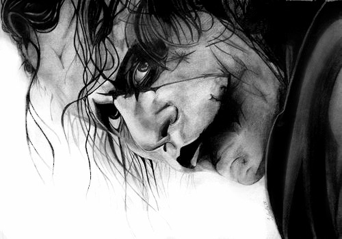
 IsabelIntangible — Johnny Depp with Tutorial

Published: 2010-07-28 13:08:54 +0000 UTC; Views: 1772; Favourites: 27; Downloads: 30
Redirect to original
Description
Ladies and gentlemen")
I'm proud to present Mr. Johnny Depp

So I finally managed to get a proper capture of it.
 (Smile)")
It comes along with a tutorial I might want to look at
I really hope you like it
Stuff I used:
- 3H, H, F, 3B, 5B and 8B pencils
- 0,5 HB mechanical pencil
- eyeliner
- white charcoal
- Nostalgia paper
- pencil eraser, kneaded eraser
- reference picture
Time spent: I don't know exactly but I think about 20 hours
Related content


Comments: 9


Vision

Hats off! this portrait looks pretty real!
I really like the love for detail - especially his beard and eyes. You drew like every single hair, lash and all that with a pretty good shading that it makes me think its real.. which is a good thing!
There are a few proportional critique points though. His hand for example seems way to small. I think its just to dark and that is what make it seem smaller than it really is. The hand itself is very good drawn - I love the 'movement folds' and how the knuckles stick out. That looks pretty good.
His face looks a little too skinny. I think here its the same like with the hand.. the shading behind and underneath the cheek bone and his forehead is a little to dark. Plus his hat seems a little too wide (to the right side) which makes his head seem a little skinny too!
His nose is not enough shaded. It looks a little flat because of the missing darker shading at the left and right side.
All in all this is a stunning portrait and like I already said it looks pretty real! You have an awesome talent to give the drawing a real touch AND emotion! His facial expression looks more like he would think about something than in the original photo of him and I think that is pretty hard to do. I like the picture alot!
👍: 0 ⏩: 1

Thanks a lot for your critique
I realized the proportion problem while drawing but it was hard to fix. So I did my best and try to improve the next drawing
👍: 0 ⏩: 1
Youre welcome
Yeah with pencil/ charcoal drawings that kind of stuff is hard to fix.. thats why im afraid to give it a try
Keep up your work. Its pretty good!

👍: 0 ⏩: 1
Yeah it's really hard to fix something thats out of proportion.
Just have a try
Thanks
 (Wink)")
👍: 0 ⏩: 0


Seems slightly out of proportion, but excellent nonetheless. It might just be the angle.
👍: 0 ⏩: 0

It is so amazing, and you are so talented!!!
👍: 0 ⏩: 1