HOME | DD
 IsaiahStephens — Redraw: James and Lily

Published: 2012-09-30 15:26:04 +0000 UTC; Views: 27961; Favourites: 491; Downloads: 197
Redirect to original
Description
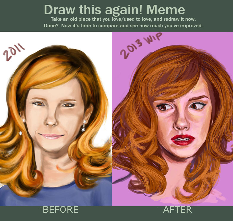
This is insane!I knew that i had improved, but seeing the two pieces side by side is kind of intense! it really makes me wonder what my work will look like in another 4 years. Or another 10 years for that matter!
It's true what they say! The only way to get better at drawing, is to keep drawing!!!
Old version: [link]
New version: [link]
Related content


Comments: 140


I feel like in 2012, the man finally shaved. He looks cleaner. lol I like both of them in difference respects.
👍: 0 ⏩: 0


I think that before version is a lot better... it has character and spirit, lines are not artificially smoothed, you can feel magic in James and Lily's eyes, light&dark places are more natural and mysterious. Sorry but "after" version is really affected and... blank
👍: 0 ⏩: 0

Honestly I love both versions! You are truly amazing!
👍: 0 ⏩: 0


I like both drawings, but I have to incline towards the 2009 one. In all honesty, they look more realistic in the 2009 drawing than the 2012.
The latter one reminds me more of a cartoonish style of drawing. And they don't look real. I don't have any other way to put it.
Great work either way.
👍: 0 ⏩: 1


its not so much an improvement but a different style or way of drawing in my opinion, the first looks more detailed and the second just looks more refined and smooth. both excellent
👍: 0 ⏩: 0

Maybe I'm one of those few that actually prefer the style of the first picture.
I'm not so far clean styled tones, I love it a bit rough, where you see it is clearly pencil
👍: 0 ⏩: 0


The left one is better in the way that it looks more down to earth and not so... perfect. The ones on the right is flawless, which, idk, to me, is wrong. But there was definitely a lot of improvement!
👍: 0 ⏩: 0

Lots of improvement but i think the original is more accurate on James .. the messier hair and the at least slightly more rectangular glasses
")
👍: 0 ⏩: 0

I love the shading and color improvements in the second one, especially the softness of Lily's hair and how visible the character's features are. Lily does seem more relateable and real in the first one, though, based on her features. I guess I just like girls/women who don't look model-y/teenage barbie >.< Idk, maybe in the second one, although I love love love her hair, she's too perfect for me? What the hell, it's great! Ignore me ")
👍: 0 ⏩: 0

I agree with Arendar because the shading is way better and it is more realistic. Yet yes, you have improved for certain. Just I believe one must not fall for the wonders of technology. They look like Sims chars in the second one.
👍: 0 ⏩: 0

They both look amazing, but I can definitely see how much you've improved. Excellent job!
👍: 0 ⏩: 0

I think the first is better, is more real and I prefer this sytle of drawing
👍: 0 ⏩: 0

I actually think some aspects of the older drawing are better. Like James' hair? Looks too clean and orderly. It says specifically that his hair is unruly, like harry's, and you depicted that well in the first. Lily's hair is much better in the second though. The shading is better in the second, but Lily's face(had it been properly shaded) is much better in the first.
👍: 0 ⏩: 0

My best friend who got me into drawing used to always tell me when I complained about how much better she was than be "Practise, practise, practise, practise, practise, practise, practise and more PRACTISE!". Your work is beautiful.
👍: 0 ⏩: 0


I've collected HP fanart for years, and really loved the original version of this picture when you first came out with it. Got to say though, the new version is amazing. I think they are both truly fantastic depictions, but I think I may prefer the older version, because they seem more flawed, and therefore more human.
👍: 0 ⏩: 0

i love the 2009 girl's face............
2012 looks good still......
👍: 0 ⏩: 0


They are both really good, I like the older James though.
👍: 0 ⏩: 0

I like the previous one better. The new one is too ''clean'' they look like a couple of perfect looking dolls
👍: 0 ⏩: 0

Love the improvement.
I'm digging, James from the older one though. But I like the lily from the new one. Both are great though : D
👍: 0 ⏩: 0


wow beautiful, its almost like the second drawing is radiant!
👍: 0 ⏩: 0

Your Lily is jsut miles ahead isn't she, how lovely. I almost want to see it in colour to get the blaze of her hair and the glint in her eyes.
Though I'd have preferred to see them in regular clothes, as Hogwarts students wear regular outfits under their robes - only the films brought in uniform, for some reason. Still, an irrelevant nitpick.
👍: 0 ⏩: 0


ha lol I doubt though if I keep drawing that my drawings will look this good
👍: 0 ⏩: 0


I am not too into sketch drawing of portraits, but this is two splendid works of the same image or idea...the first one shows me a loose pose and rough in an abstract style, and the new is more precise with a more precision hand which leads it closer to a photo shot rather than a drawing...not an improvement but two excellent works where you can see a learned and advanced talent! Great works, keep it up!

👍: 0 ⏩: 0


👍: 0 ⏩: 1

no problem  (Smile)")
👍: 0 ⏩: 0

Wow! The old work was great, and just when you think there's no room for improvement--BAM! Awesome job, can't wait to see in a few more years.
👍: 0 ⏩: 1
👍: 0 ⏩: 0

Ah!!! This is so cool! It's funny I never want to draw because it's so frustrating and I feel that I'm always stuck on a certain level. But this kind of puts things into perspective.... so thank you : )
👍: 0 ⏩: 1
👍: 0 ⏩: 0

👍: 0 ⏩: 1

The later one is prettier, but the older one is more realistic to me. It's more that the characters look imperfect in the old one than that the drawing looks imperfect. I like both versions a lot, for different reasons.
👍: 0 ⏩: 1
| Next =>