HOME | DD
 Isara-La — Draw this again Linebeck
Published: 2012-09-09 20:01:23 +0000 UTC; Views: 6167; Favourites: 130; Downloads: 25
Redirect to original
Description
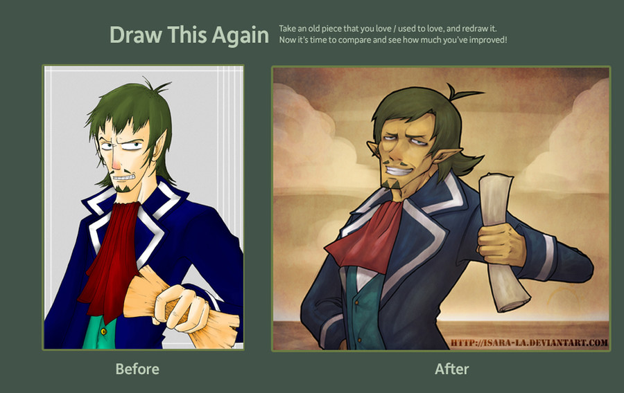
I really enjoyed doing this ^_^I've spent about 5/6 hours in it, i'm really proud of myself ^^
Hope you like it!
If you want to see the picture in the right in a big size you can search me at FB [link] , Twitter [link] or Tumblr [link]
Related content


Comments: 46

new one looks like a portrait painting! sooo cool :3
👍: 0 ⏩: 1
")

You're very welcome! The colours are amazing, I'm really a big fan of the browish tint you put on the new Linebeck. Huge fan of that game too ^_^
👍: 0 ⏩: 0

Se nota mucho la mejora ¿Cuántos años tiene el primer dibujo?
👍: 0 ⏩: 1

Creo que tiene unos 5 añitos ^^
👍: 0 ⏩: 0


holy quackamoley!
It's friggin' Linebeck!
yaaay! LINEBEEECK!

👍: 0 ⏩: 0

i love the pirate's attitude in the new drawing. :3
👍: 0 ⏩: 0

Oh my. He's actually quite handsome in both drawings but more like a captain and prideful in the new one. *u*
👍: 0 ⏩: 0


I remember when the first one came out and wow---I am really left speechless. While there was nothing wrong with the first one, the overall composition is much improved in the new one! I like the feeling you get from the second one with the more muted colors. Truly impressive!
👍: 0 ⏩: 1
I feel very happy reading this! It means a lot for me *^__^*
Thank you so muuch!!!
👍: 0 ⏩: 0

Se nota la mejora, se nota 

👍: 0 ⏩: 1
Yo pensaba que no se iba a notar tantísimo cuando cogí el dibujo viejuno xDDD
¡Seguro que si te pones uno de los tuyos y lo renuevas queda de maravilla!
Por cierto, muchas gracias *^__^*
👍: 0 ⏩: 0


")
Great work!
👍: 0 ⏩: 1


I think its a big improvement in every way! The expression, the pose, the lighting, the anatomy and the beautiful bg! Great job!
If you want, you can check out my entry! [link]
👍: 0 ⏩: 1
Thank you so much! ^__^
Your entry is great! *.*
👍: 0 ⏩: 0


DAT LINEBECK
He is looking quite dashing, good sir
Really love the change in styles you went through. Definitely loving the more "worn" color scheme on the right, and the rendering is great
👍: 0 ⏩: 1

I have to say this: The "Before" Linebeck looks diabolical and the "After" Linebeck looks more devious. Twin Evil Brothers! LOL
👍: 0 ⏩: 1

Oh my God, I love Linebeck. XD He is the best ever. Hahaha.
I like how stylistic the new version is. Like on an old map or something.
 (Smile)")
👍: 0 ⏩: 1

That's so awesome with the amount of improvement! The colours, form, composition, that's really incredible!
👍: 0 ⏩: 1


His expression... It's so sinister. I guess it's fitting, but still.
👍: 0 ⏩: 0