HOME | DD
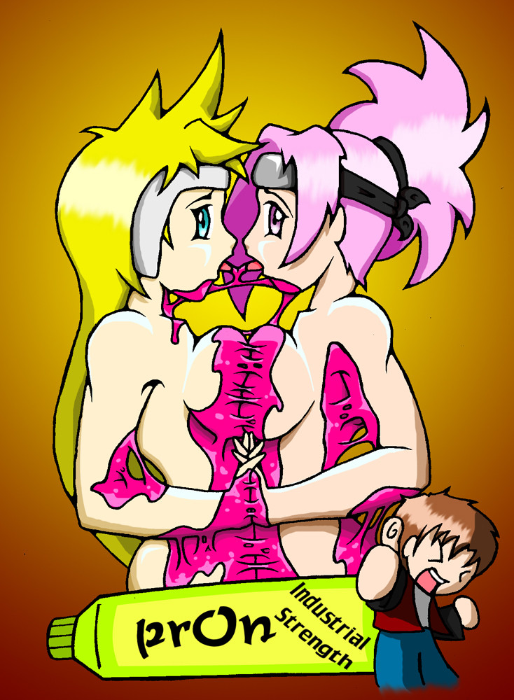
 IshaNee — Line and Shade Experiment 2

Published: 2007-04-04 19:12:06 +0000 UTC; Views: 973; Favourites: 14; Downloads: 23
Redirect to original
Description
As stated aboveTweaked the lines and made them thicker for added definition.
with shading I played with opacity and blurring parts, dunno if that worked though >.>
as for tinting line art, I used soft brushes for a gradient effect.
and fixed the facial proportion and shading as well for anti- cheek puff ^^
look!! hair strands!!
")
yes, I know, Im a pervert, sheesh -.-
I plan to repay dooley for all the posing I use her avi in.
CRITIQUES WANTED!!
Full View is also there if you need it ^^
Related content


Comments: 21


NUDE DOOLEY AGAIN! XD isha you wait for my time with you!
👍: 0 ⏩: 1

Yay! Progressive shading! I congratulate you. 
Figurative and drawing style
I much prefer this figure to the previous because I felt the last one was actually a little too muscular. Hmm, I disagree with you when you say drawing style not suitable for shading technique (reply to one of the comments) Well, obviously some adjustments have to be made just so you don't have a terribly contrast-y art piece but a drawing style is unique to each artist... and incorporating shading into it shouldn't be a problem! The problem- lies somewhere else. 0:
The face
I guess you could lose some chubbiness but I think it's mainly the eyes you need to learn how to shade now. 0: At the moment, they're coming across as a blurry-blur, out of focus and not captivating. And the thick black eyelid doesn't compliment it too well. Eyes... hmm, it's quite difficult to pick a shading technique for eyes... so many ways. >> But basically, you're going to have to do a lot more on the eyes than you normally do for your cellshades if and when you're doing progressive shading! Just remember, it needs to be more focused and less flat. Eyes are pretty much the most important feature in a face-- look at this [link] It's soft, all in the same tone but the eyes stand out and they're sharp despite the whole thing being shaded so softly. Maybe not the clearest example but I'm too lazy to search. XD
The nose is a little odd but your proportions are pretty much always perfect so I'll pass it off as a too lazy to correct mistake.
Hair strands
Totally working this picture. It looks like hair now. Now experiment with levels of shine (white or extremely light colour of hair) to give it a more glossy, healthy feel! ...I know you're not selling a hair shampoo. >> -gonk- Shoosh! I don't actually know how that'll turn out but experiment anyway... because now that your hair looks like hair, you should make dooley a hair model too!
Outlining
Better but still needs a bit of work. I'm not sure if the outlining for the hair is too thick. Hmmm, I can't decide. If it's thinner, it'll look too strandy, but at the moment, I feel it's a bit on the thick side. Specifically the fringe bit.. Just a bit thinner, and perhaps have a bit of the same dark colour in the hair around the edges so that the outline isn't so harsh and defining.
Also, gradient can be even smoother! I can totally see the change in colour on Dooley's right arm! ")
Next- some lines.. might not need to be there? ;_; Things like when the tip is white- such as Dooley's left part of the face- that line... is darker than the face itself and since you're using a diminishing outline technique.. that line should just disappear, in a smooth manner of course. OR be very thin. Whichever works better. If lines disappear each time there's a bright spot, I think that'll look far too realistic. >> Do whatever suits?
Anyway, great work on the progressive shading! *shuts up now*
👍: 0 ⏩: 0

ooooh rather sexy. o; Mmmm. 8)
Critique!:
~Try and figure out her face before you draw it. o: At the moment it's all over the place - you need to draw a basic template, which you can work on. That'll keep everything in proportion. :3
~The skin shading is very nice here! A good idea with soft shading is to put the brush on about 50%, soft, then go over the parts and build up the shadow. It gives a really smooth and realistic effect. :3
~I really like your soft hair shading here! Hmm. See if you can make the strands on the head more specific, rather than just purple. o: Will add a lot of body to it. :3 And hair is very good at catching light - a little shine wouldn't go amiss! n_____n
I hope I helped~ 

👍: 0 ⏩: 2
Body! That was the word I was looking for. xD xD Adding body to the hair with the shines~
.
Ignore my shampoo rant Isha!
👍: 0 ⏩: 0

I think the reason your art looks rather odd in this style is that the soft shading and minimized lines imply a more realistic style. You, on the other hand, have a very stylized way of drawing, which I've always felt the strength of is in the quality and the flow of the lines. Reducing their emphasis seems (to me) to detract from the drawing.
To put it concisely: I feel that your lineart is your strength, and you should use a method that works with the lines, instead of around them.
The shading itself though I think is very well done, especially the skin. The shadows and highlights are placed well, and the blending is excellent. :3 Perhaps try a less well-defined shadow on the nose, to make it look a little less flat and pointed. Noses are widest at the BOTTOM, remember. ;O
👍: 0 ⏩: 1

You cant blame a girl for trying to expand her repetoire ^^
but yea, I always try to make my statement with lines, so this is a bit of a stretch for me ._.
👍: 0 ⏩: 1
The fact that you're trying lots of different things is good. 8) I wasn't suggesting you stick to your normal method of colouring so much as you try to work out some of these new ideas into a method that still lets the lineart share some of the spotlight. Experimenting is fun! *thumbs up*
👍: 0 ⏩: 0

That does look a little better than last time. :3 *can't think of what else to say right now*
👍: 0 ⏩: 0

I really like this style. The hair looks very pretty. I would just work on the highlighting on the hair, though. It doesn't look as neat as the rest of the picture.
👍: 0 ⏩: 0

Better than last one.
Why always the perverted stuff? .__.
👍: 0 ⏩: 1
Practical Answer: Less clothes = less colors to shade
The Other Answer: A convo in Gaia made me do it ._.
👍: 0 ⏩: 0

The only thing I can truly complain about on this is that with this style the hair will need to follow the shape of the head more. Right now I feel the urge to pour water over that hair to see if the hair spray was strong enough. xD
👍: 0 ⏩: 1
Ill try that with the next experiment.
one which involves... CLOTHING!!!
=dun dun dunnnnn=
👍: 0 ⏩: 1
Well I cant keep on drawing ye half nekkid all the time >.>
👍: 0 ⏩: 0

Much better @w@ Face still looks odd, though >w<
FIRST :3
👍: 0 ⏩: 1
as predicted, my drawing style is not suitable for ths type of shading ¦D
more tweaking!!
thanks ^^
👍: 0 ⏩: 1