HOME | DD
 isip-bata — crap

Published: 2004-05-24 10:32:26 +0000 UTC; Views: 2066; Favourites: 57; Downloads: 132
Redirect to original
Description
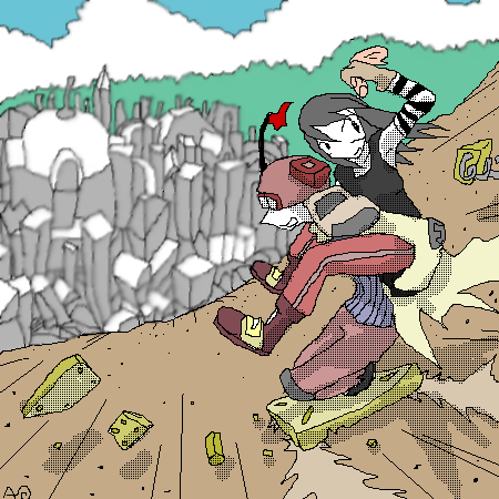
this aint a scrap. its a crap.i think its crappy. i had problems with the layers and sum stuffs. it didnt turn out the way id like it to look like.
oh well, finished this before goin home coz im the only person left in this f@ckin building.

i ran out of ideas for the text, crappy all and all.
old sketch.
experimental colors.
radial blur and eraser.
do i still have to say this?
++FULL VIEW PLEES!!!+
thanks!
+++++EDIT+++++++
after submitin it here, it doesnt look crappy afterall. or was it just me. looks better on thumbnails though.
Related content


Comments: 56

")


")

Its very good isip you need to stop smokin its ruinin your eye site lol
👍: 0 ⏩: 1


gandah parin kahit crap~! 
👍: 0 ⏩: 1


i hope i can make one. thanks!
👍: 0 ⏩: 0

nice pose and effects!
"the adventure of isip-bata"? 

👍: 0 ⏩: 1

Malutong ang dating ng CRAP !!! 
Gawan mo ng indie yung buhay mo dude
👍: 0 ⏩: 1
heres the plot.
...
ayun ang plot, ganun lagi. wala namang nagbabago, xcept, it getting colder each night.hmm...or sumthing like that.
medyo emo ung dating..
or just a lame excuse kasi im just lazy.
👍: 0 ⏩: 0

Crap!? Aw come on man! My adobe kung fu is crap compared to your adobe kung fu!
👍: 0 ⏩: 1
my adobe kung fu is lame.. just happy accidents i think.
👍: 0 ⏩: 0

Are you out of your mind?! This is nothing like crap!
👍: 0 ⏩: 1


oi! ayos! ganda ng colors,lineart, pati ung blur effect, saktong,sakto!!! damang dama ung CRAP
👍: 0 ⏩: 1

its not crap at all, dude... it's really good! love the simple effect of the background to the overall impact of the entire piece!
👍: 0 ⏩: 1
you think so?...
well, geee, thanks. i had a hard time coliring the bg, but latter radial blurred it anyway, then ive thought how stupid i was on doin that.
come to think of it, ive spent 1/3 of the time shading the bg, but i blurred it anyway...how stupid. heheeh.
thanks again!
👍: 0 ⏩: 1
it's ok naman eh... maganda naman yung overall impact ng whole piece eh!
👍: 0 ⏩: 0


dude i dont know what you were smoking at the time to think this sucked......this kicks ass....the fonts are a great choice..the background looks cool and the giant pencil is soo badass fav
👍: 0 ⏩: 1
hmmm, i never tried smokin. its just me i guez. i always feel like i can do better when i really cant.
yup, i love the giant pencil too.*pokes to you*
thanks!
👍: 0 ⏩: 0
omg I love this ! love the pose, and definatly love giant pencils now lol
👍: 0 ⏩: 1
thanks!
i have this defect on drawing where the first sketch always is the best. i tried 4 different versions but the first always was the best drawing. si i kinda inked it out. i hope i get over it so i can much better..
thanks again!
👍: 0 ⏩: 0

Astig!.. 
👍: 0 ⏩: 1
Nothing specific.. ^.^ it's just your style looks like a comic book style.. it's great..
👍: 0 ⏩: 1


lol i can hear a certain theme song in the background.... ^^
👍: 0 ⏩: 1
superman ^^lol ahahahahaha ^^
👍: 0 ⏩: 1

Neat stuff. Paper, pencil, and the kid all remind me of school, and then that huge "CRAP" caption's like going rebel! Anyway, that's just what I think. But nice work, really...no, I mean GREAT work!
hm...just curious, isip-bata...are you Filipino?
 (Smile)")
👍: 0 ⏩: 1
| Next =>