HOME | DD
 itirep — Grip

Published: 2001-09-14 06:34:25 +0000 UTC; Views: 326; Favourites: 2; Downloads: 96
Redirect to original
Description
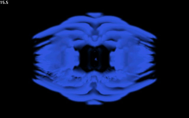
this is the first time i've ever had to explain one of my wallpapers.firs t off-VIEW IT FULL!there is tons of detail,texture and meaning in this piece.I wanted to do a piece that somehow might help me get a grip on my thoughts and feelings over the past few days.spik es for pain,ice blue for cold,insects eating away for disgust and revulsion,random geometric shapes and textures for the millions of thoughts running through my head and the concrete wall that keeps me separated from it all...looks good on both 1280x960 and 1280x1024 res...tile it at 1280x1024 and it gives it a cool depth effect.
enjoy!
comments are cool...
Related content


Comments: 10

damn boy! this shit bad as fuck !
http://www.awedigi.com
aweDIGI
👍: 0 ⏩: 0

Good Stuff (tm). It's going to have to wait until I take Old Glory off my desktop before it can go on, but this piece reaches me.
👍: 0 ⏩: 0

wooh...i like the lines, the details, the expression, and the effort. great work.
shit happens,
just flush it.
👍: 0 ⏩: 0

your emotions come through clearly here, good piece.
-\ekud/-
👍: 0 ⏩: 0


yes, very intense.. may we all find our peace soon.
👍: 0 ⏩: 0

My prev comment was just about the image, not really taking its meaning into account. It does mean more now.
The thumbnail has a good quality to it, I just noticed. More... depth.
http://www.giantpeanutenterprises.20m.co m - [GPE]
👍: 0 ⏩: 0
Lots of interesting layered details, nice colour, cool spiders, boring comment. Sorry.
The only thing that doesn't look quite right to me is that some of those stalag-tight things seem to be starting halfway down. That's probably because they’re not stalag-tights, but that's how I saw it.
The top & bottom edges are good for a bit of contrast, but the whole thing doesn't really have the depth I think it could.
http://www.giantpeanutenterprises.20m.co m - [GPE]
👍: 0 ⏩: 0

whoa, that's pretty intense man, i hope you find your peace soon.
:: paroxysm ::
Visit the Hub of Creativity http://www.digitexturia.com/
👍: 0 ⏩: 0

Holy!... hmm.. i would say something constructive.. but. like..... damn.. das nice ..
..eks..
👍: 0 ⏩: 0