HOME | DD
 Ito-Saith-Webb — Duke Leto Atreides

Published: 2008-12-31 09:01:48 +0000 UTC; Views: 8378; Favourites: 56; Downloads: 171
Redirect to original
Description
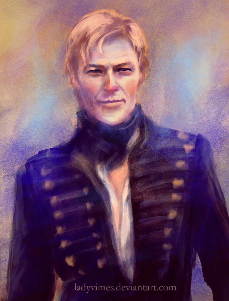
After my last two compositions I thought it might be a good idea if I got some portrait practice in. This is William Hurt as Duke Leto Atreides from Frank Herbert's Dune.Hope you like it.
Photoshop CS4
5 hours more or less of work
Related content


Comments: 35


I'm a huge fan of the Dune saga. I was completely into it during my teenager period.
Great job!
👍: 0 ⏩: 1

First i thought it was a sculpture...awesome work!
👍: 0 ⏩: 0

May the blessings of Mau-dib be upon your household.
👍: 0 ⏩: 0


Amazing portrait. I love that little bit of light in his eye, its very well done because its not too shiny and not too subtle. Really, truly beautiful.
👍: 0 ⏩: 0


")


This is The-Order-Of-The-Artists qritique.
In my opinion this is one of your best works so far. The subtle hue/tone shifts work well with the soft shades and the texture adds a nice sense of realism. You have also managed to create a good sense of soul and story in this piece.
There are a couple of things that could have been done a bit differently in my opinion. First of all, the jacket looks a bit rushed. I know it's not the center of attention here but it's still part of the canvas and could have supported the realism of the face a bit more if you had spent some more time with it. Same goes for the ear. There are also some outer lines that I don't like that much like the gray outline on the cheek and the smudgy outline on the nose.
These are however small negatives compared to the overall quality of this deviation. You have definitely improved.
If you would like some comments on how much it resembles the character, please drop a link to the reference photo in case you used one.
👍: 0 ⏩: 1

Thanks for the good Critique
👍: 0 ⏩: 1
No problemo and thanks for correcting the slip. I owe you one
 (Wink)")
👍: 0 ⏩: 0

Here's a critique from ~The-Order-of-Artists :
Wow-ee! This is SO much better than your last portrait. Let's start off with the good points (and there are a lot of them). First, the facial structure is pretty solid. everything seems to fit and work together, I can believe it's a real person's face. Second, the texture is excellent particularly on his nose. You didn't make it too smooth and plastic-looking. At first I didn't care for the scribbly way you painted his hair, but after looking for a minute I really like it now. Keep working with that to make it a little smoother so he doesn't look like he's wearing a wig.
What could be improved: there's no real connection between his head and his jacket. It looks kind of creepy; this floating head above a coat rack or something. just add in a few touches of mid-tones around his neck to make it show up more. His eyes, particularly the one in shadow, could do with a bit brighter highlight so they look shinier. My only other complaint is those speckles on his chin/cheek. I can't tell if they're supposed to be pores, freckles, or stubble. Decide what they are, then use a reference to make it a bit clearer.
Once again.... WOW.
👍: 0 ⏩: 1
Thanks for the great critique. I think that when I got to the clothing I was getting a little lazy but I also paid less attention to it because I wanted it more on his face then the clothing. I was thinking the same thing about the pores but I am really trying to do texture but I don't want to cheat with overlays but instead do it in a painterly way.
👍: 0 ⏩: 1
Would making your own custom brush count as cheating? You could make a speckly brush, set it to a low opacity and try that...
👍: 0 ⏩: 1
No custom brushes are fine in my point of view since a traditional painter often uses a variety of different brushes. The only problem with Photoshop brushes I have is that they are not pressure sensitive for the Wacom tablets.
👍: 0 ⏩: 1
I use photoshop with a wacom, and get pressure sensetivity... what version of PS are you using? And this may sound stupid, but have you turned "pen pressure" on in the brush menu? I didn't at first and couldn't figure out what was wrong.
👍: 0 ⏩: 1
No you miss understand me with the standard brushes I do get the pressure sensitivity but that doesn't happen with custom brushes and I wish it did. When I mean custom brushes I mean the ones you create your self.
👍: 0 ⏩: 1
Oh. I hadn't noticed that. That stinks.
👍: 0 ⏩: 0

Ohhhhhhh.......what a pretty orb.......POWER UP!!!
Altered Beast reference BTW
👍: 0 ⏩: 0

great job especially with the palette. My only complaint would be the wierd rendering on the little part of the forehead above left brow, seems to break the pattern and texture of the forehead a bit too much and it lacks texture itself, so it is not clear wether it represents a scar or is just a wierd rendering
but all in all it's a great piece of work imo
 (Smile)")
👍: 0 ⏩: 1

This rewinded my brain back to the days of the Sandworm attacks. Fantastic coloring! You're an ace at capturing realism!
👍: 0 ⏩: 1
Thanks, I am getting there but I still have a long way to go.
👍: 0 ⏩: 0