HOME | DD
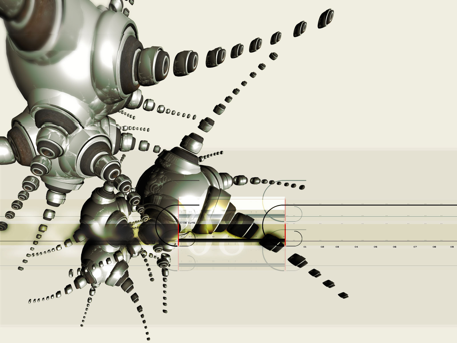
 iuneWind — processing capsule

Published: 2005-05-11 05:02:35 +0000 UTC; Views: 5378; Favourites: 31; Downloads: 1082
Redirect to original
Description
i.capsule 23d max, grebl, GI, raytrace, shop and many tech elements.... hours of rendring, and hours of detail work in photoshop, big final psd, as usual...
i sorry for big size, but maximal zooming is critical - is detail.. or very detail work
")
thxnks for ur comments and +favs
Related content


Comments: 19


 (Wink)")


Holy shit, I can see why you said about the quality and detail . ____ .;;
V-nice, it's more than worthy for my desktop -gives a fav star-
👍: 0 ⏩: 0


ochen` pohozhe na detali staryh lampovyh televizorov... ya tak lubil ih ob asfal`t razbivat`
priyatnoe vospominanie v tekno oblochke ... stranno i prikolno
👍: 0 ⏩: 0


very nice color and overal style but render is defenetly too complex... maybe you shouldn`t do so much greeble effect on each poly (?)
nice work anyway
")
👍: 0 ⏩: 1

maybe... but i like this result and stay on. in any case, greeble is not very important for this pic. i can make not badly effect without him, - displace in example... but why, if cant make it easy?
👍: 0 ⏩: 1
yup  (Smile)")
")
👍: 0 ⏩: 0


You know, the stripes are really disturbing in my eyes...really distracting. The idea and concept themselves are nice, I'd just make them more subtle. And the Greeble plugin is definitely awesome...
👍: 0 ⏩: 0


wow, really like this one coz its different to much others stuff !
awesome work, definitivly 
👍: 0 ⏩: 0

Наверно так могли бы выглядеть "пустышки" из "Пикника" Стругацких! Или так, я бы такую капсулу не проглотил ..) Отличная работа!
👍: 0 ⏩: 0

That's a lot of details right there. 
👍: 0 ⏩: 0

wow, pretty interesting concept. I think I like it much
You've earned my fav
👍: 0 ⏩: 0