HOME | DD
 Iwanttobeabox — Completed?

Published: 2007-08-11 21:45:11 +0000 UTC; Views: 708; Favourites: 19; Downloads: 12
Redirect to original
Description
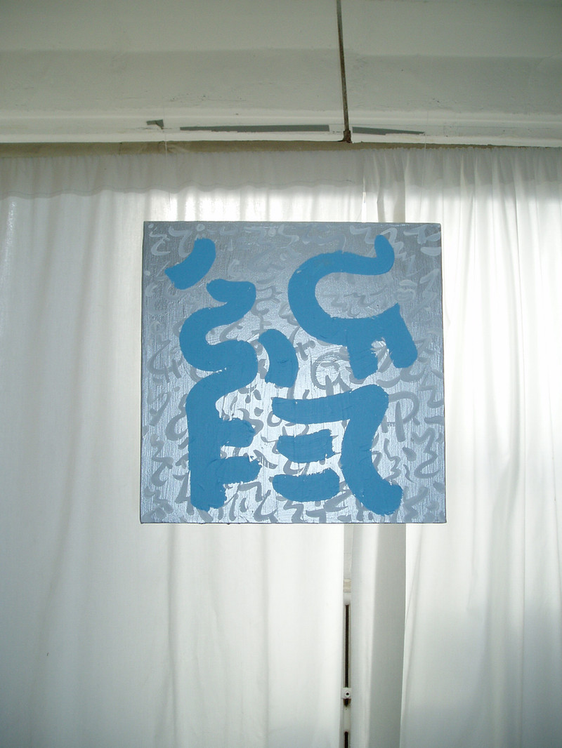
not sure if this is done but it's been really causing me grief so for the time being it is.I just got a bunch of canvases so I'll be putting some paintings up pretty soon.
Related content


Comments: 14


thanks. really appreciate the kind words, and the fav for that matter.
👍: 0 ⏩: 0


I am drawn to it.I think I like it as is......but could you hang it on your wall without going crazy?
Could you work into the background in a darker red and do a simple wall paper pattern? I would like that, it wouldn't take away from the image but it would give it a retro feel.
Send me a link if you do more work on it!!
👍: 0 ⏩: 1
wow, that's actually a really good suggestion. thank you so much.
yeah, I could have that on my wall without going crazy, don't know what that says about my character though.
👍: 0 ⏩: 1
I would be quite happy to put it on my wall
 (Smile)")
👍: 0 ⏩: 1


Love that contrast against the stark red and the grey outline just adds that subtle-something-extra. An amazing job, those eyes are truly killer.
Don't listen to those two, haha, I wouldn't change a thing.
👍: 0 ⏩: 2
oh, and thanks for noticing the eyes, I spent a lot of time on them.
👍: 0 ⏩: 0
glad you like it pope. yeah, the red-gray contrast turned out really nicely. I'm really happy with that gray, I mixed it myself for the painting here, [link] and I liked it so much that I saved it.
by the way, thanks for the fav man.
👍: 0 ⏩: 0

i love it but it does seem a bit too empty, maybe some stuff coming out behind him or somethin, can't really explain what i'm trying to say.
👍: 0 ⏩: 2
y'know I felt the same way but I couldn't figure out what I wanted and it was really giving me a headache so I didn't do anything. I'd rather have it look a little empty than ruin it.
👍: 0 ⏩: 0

i know i know.
Give him a cigarette.
👍: 0 ⏩: 0