HOME | DD
 j-hicks — Welcome to Paradise
Published: 2008-05-11 10:07:33 +0000 UTC; Views: 1274; Favourites: 7; Downloads: 21
Redirect to original
Description
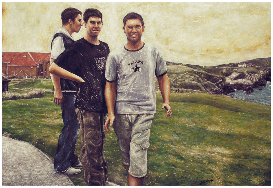
*full view please *using oil paints ,it is a picture of Tom , Mike and my dad in Cornwall! it Measures about 100cm by 75cm
") I decided to upload this again without the portraits of the people because it gives more emphasis on the landscape which i thought was done a lot better I did this more than a year ago but 'finished' it yesterday by putting a yellow / abstract sky and abstract elements on the t-shirts
I decided to upload this again without the portraits of the people because it gives more emphasis on the landscape which i thought was done a lot better I did this more than a year ago but 'finished' it yesterday by putting a yellow / abstract sky and abstract elements on the t-shirts  comments would be ace !
  This was the biggest learning experience i have ever had
  i think this piece has painting has lots of good parts and some bad parts. I set myself up to a challenge where i thought I wouldn't be able to do very well (because of the scale) and now i think I am a stronger artist because of it .
Related content


Comments: 33

Hey man, saw your work at Lyth the other day, was really impressed by your work, this one in perticular cought my eye(hard to miss it being so big ")
James
👍: 0 ⏩: 1

oh cool
good to hear from you
👍: 0 ⏩: 0

Yeah, when i saw it in the journal i thought it was a photo of what you saw when walking out of the exxhibition- apparently not!! You've a style i've never really seen before with the highlights especially, well done!
👍: 0 ⏩: 1

👍: 0 ⏩: 0

I really love your realistic drawings. You have your own style and I like it alot. I think your very talented.
👍: 0 ⏩: 1
👍: 0 ⏩: 0

why the middle person his hand on his jacket.. but what is that shown like square or something ?
👍: 0 ⏩: 1
That was just a little bit of abstractedness to cover up a badly twisted hand that looked nothing like a hand even in the photo i used
👍: 0 ⏩: 0

Wow! This is great!
👍: 0 ⏩: 1
Thanks
👍: 0 ⏩: 0

i thought it was a photo when I saw in ur journal!! - you can so tell its your dad and Mikey! hehehe!! go you again! -
👍: 0 ⏩: 1

👍: 0 ⏩: 0

")
👍: 0 ⏩: 0

The way you can't see their faces gives it a really sinister quality, like something bad is going to happen, It makes it a real intresting painting.
👍: 0 ⏩: 1


This is absolutely fantastic. I love the style and the composition.
Brilliantly done, I'd be chuffed to bits if I'd painted this!!!
You make me itchy to get out the oil paints again
👍: 0 ⏩: 1
am very happy with the way it came out though in hindsight i spent far too long doing it  (Wink)")
👍: 0 ⏩: 0


Wow, like the deatails you put into this piece, well done !!!
👍: 0 ⏩: 1


nice one. the landscape is done well, though the brown building looks a little dodgy
have you ever heard of "constable's snow"? john constable used to put little dots of white on his landscapes to make it look like there was dew etc. you've done something similar
👍: 0 ⏩: 1
I have heard of that effect constable used
👍: 0 ⏩: 1
yeah, we got a bit of a lecture about it in art (guess who part of my essay's about
👍: 0 ⏩: 0

Very nice stuff, as usual.  (Smile)")
Since you like the landscape portion the most, why not try painting a few more landscapes, and just omit figures from them?
Keep up the great work.
👍: 0 ⏩: 1

I really plan to do more landscapes... its one area of art i find fascinating and i love painters like turner etc .I will do some soon

👍: 0 ⏩: 1
I look forward to seeing them
👍: 0 ⏩: 0

Definately your most realistic piece so far. I really like it and all those small white highlights give it a special touch. How long did you work on it?
👍: 0 ⏩: 1
Thanks
👍: 0 ⏩: 0