HOME | DD
 j3concepts — Duke of Hoxton

Published: 2009-09-13 15:05:08 +0000 UTC; Views: 19393; Favourites: 216; Downloads: 644
Redirect to original
Description
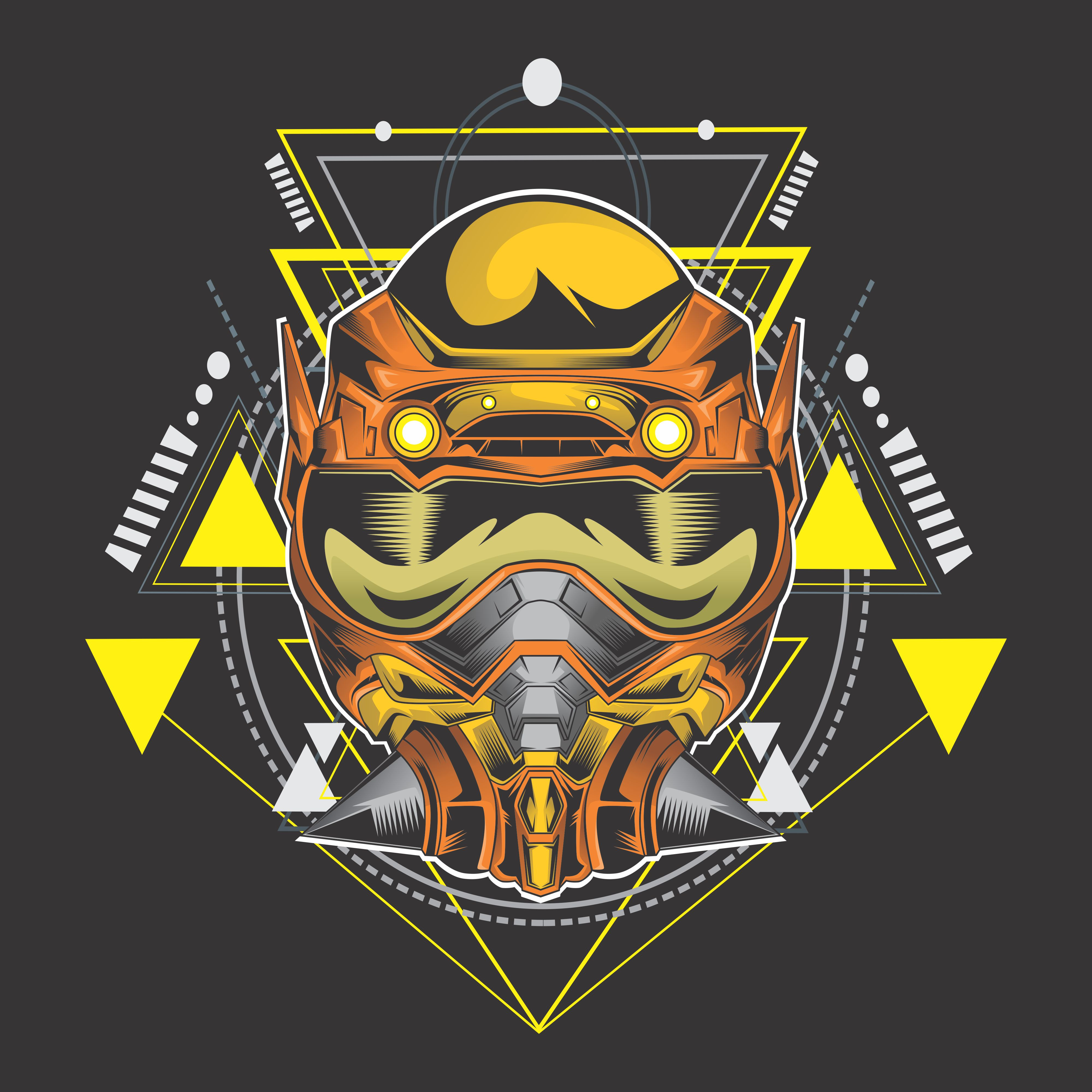
Branding for UK based clothing company, Duke of Hoxton (coming soon).The client's idea was to have the left side more traditional posh British and the right side to be more "street".
I haven't done a more classic crest style in years, so this was interesting to get back into.
Related content


Comments: 33


what program do you use for these awesome things?
👍: 0 ⏩: 1

cool! i am start to study it RIGHT NOW and hard!
👍: 0 ⏩: 0

Great work...love the concept.
Very well executed, I definitely find you brought posh & street together very nicely.
Also great gallery...
👍: 0 ⏩: 0

aaahhh so cooool ! very nice
i want the t-shirt...I can find somewhere ???
 (Wink)")
👍: 0 ⏩: 0

")


really nice man, love the style of it, very clean too. awsome work
well done
👍: 0 ⏩: 0


Love the bat wing and the belt/banner idea.
Great job.
👍: 0 ⏩: 0

Dear All,
We are a new London (UK) based urban clothing label hoping to bring something fresh and cool to the scene. We've worked very closely with our man Jared from J3Concepts, and needles to say we are thrilled with the outcome. The brand concept was to incorporate a contrast between old fashion/posh British values and edgy/street youth lifestyle in England these days. We therefore asked Jared to focus on a Coat of Arms design that would reflect both sides. The rest is history  (Smile)")
Zarko
👍: 0 ⏩: 0


very clever use of the tudor rose
i like how you've done the skull and crossbones too
👍: 0 ⏩: 0


