HOME | DD
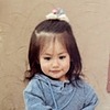
 JacksonChen — Cornucopia of Fruit (cropped version)

Published: 2014-07-01 08:50:23 +0000 UTC; Views: 797; Favourites: 30; Downloads: 1
Redirect to original
Description
Here is the cropped version of the original Cornucopia of Fruit, without the frame.fav.me/d7ls6p4
Comments and feedback are greatly appreciated!
")
The image above has a resolution of 1280 pixels. If you want the original file, which is 2076 x 1456 pixels, then you can download it for just 20 .
Related content


Comments: 17

Hey~ I'd like to give you some tips on improving your painting
Firstly, what looks especially good are the grapes. You got the colors right and even the 'material' the grapes are made of.
Be very careful on the shadows, you missed some of them. There is one single (or more, but here it's not the case) light source, in reality, that's usually the sun. Always think of the direction the light comes from. Here, the reflections on the grapes show the direction. Light hits an object and then creates a shadow on the opposing side. In your painting, the lemon, the tomatoes(?) and the pear don't clearly have that shadow side.
Now, you could improve on the overall colors. For example, on a fruit that has a warm color, you could add a cold color in its shadow. For example, that lemon could turn slightly blue on its shadow side. Mixing colors requires a bit of planning in advance, and this is exactly why the final piece will gain in artistic value - because you put a lot more effort in it
Also, the bottom of the basket could be colored darker, to suggest its depth.
The piece would look even better if you added a one-color background and a one-color table on which the basket is placed. From this perspective, the margin of the table should go just a little beyond half of the canvas, horizontally. The colors are up to you, however, I recommend a gold yellow tone OR brun (dark dark brown) for the background and Prussian blue for the table.  (Smile)")
I hope my comment was helpful~

👍: 0 ⏩: 1

First of all, thank you for the long and constructive comment!
I do realize the problems with shading that I have with this painting. However, the painting was not based on actual still fruit placed on a table; my teacher gave me a photograph with no background and I based my work off of that. That photograph had confusing lighting and shading, and I added most of the bright spots on the fruits myself. In addition, my phone's camera quality is not so great, and I don't have a scanner; the actual painting is much more realistic and contrasting.
Excuses aside, I truly do believe that I messed up the lemon and the basket. The shading was improper, and they seem quite out of place compared with the rest of the fruit. And as for the colors, the only fruit's colors I "mixed" properly was the large one on the very right, with maroon to slight orange and gradually turning black. It looks fine, but it took about ten tries to get it right. I understand that dedication leads to better quality, but my time in art class was very limited (only an hour per week), and I couldn't afford to keep working on this piece. (I later painted "The Girl and the Fish"; you might want to check it out here: fav.me/d7o1uy2)
Still, thank you for your comment and advice; I will keep the points you mentioned in mind next time.
👍: 0 ⏩: 1
Oh, I never thought I would meet someone with art classes like I had before high school. It's a pleasure to know there are other artists with beginnings like attending art class only once a week, more often for a short time, + in my case, it was in another city too and it was quite expensive, but those hours spent there were the only ones that mattered to me... and now I know myself, my true self, and enjoy my last year at the art high school I'd never had thought about to attend many years ago...
Ah, enough nostalgia
Yes, you're just like me, only that you aren't afraid of color... You see, I was afraid of color, I always chose pencils and markers and pens over anything color 
Once you get the objects right, fruits, flowers and so on, you will be set on the right path to paint flesh (like, skin, nudes, portraits)... humans... It is said that flesh is the most beautiful thing to draw there is, also the hardest one 
I guess this was a more personal/casual comment, but I hope you don't mind, sometimes my mind speaks before me xD

👍: 0 ⏩: 1
It's fine to bring up fond memories.
And yeah, drawing still life will lead to drawing actual life... XD Right now, I prefer still life because it's easier to grasp.
👍: 0 ⏩: 0

That's so precious looking. I love the simplicity of your artwork, and how you're able to give it this very delicate beauty.
👍: 0 ⏩: 1

")

Wow beautiful watercolor 

👍: 0 ⏩: 1

Yep!
Some people requested for a cropped version, so here it is.
👍: 0 ⏩: 0