HOME | DD
 jadeedge — ConnectiCon Cover -sketch-
by-nc-nd
jadeedge — ConnectiCon Cover -sketch-
by-nc-nd

Published: 2007-05-14 00:21:38 +0000 UTC; Views: 2450; Favourites: 44; Downloads: 58
Redirect to original
Description
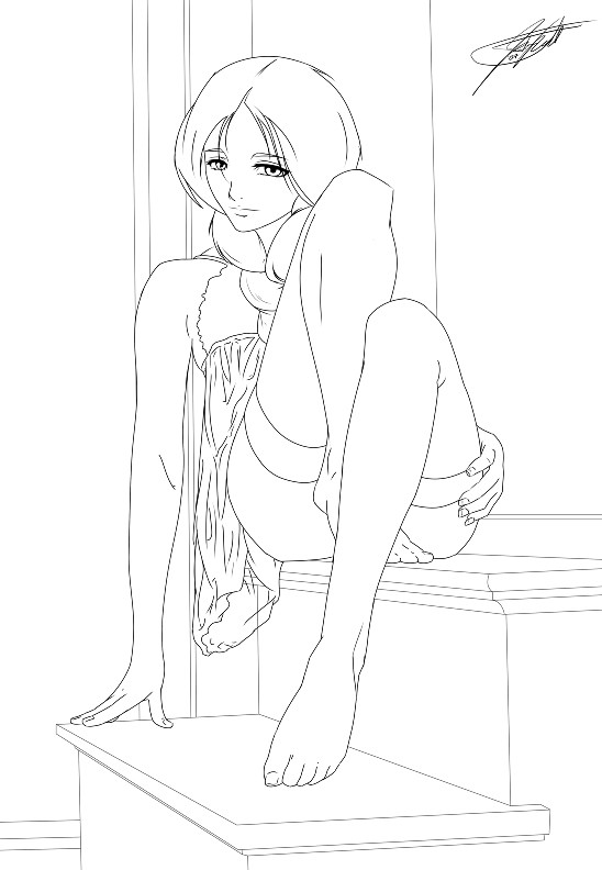
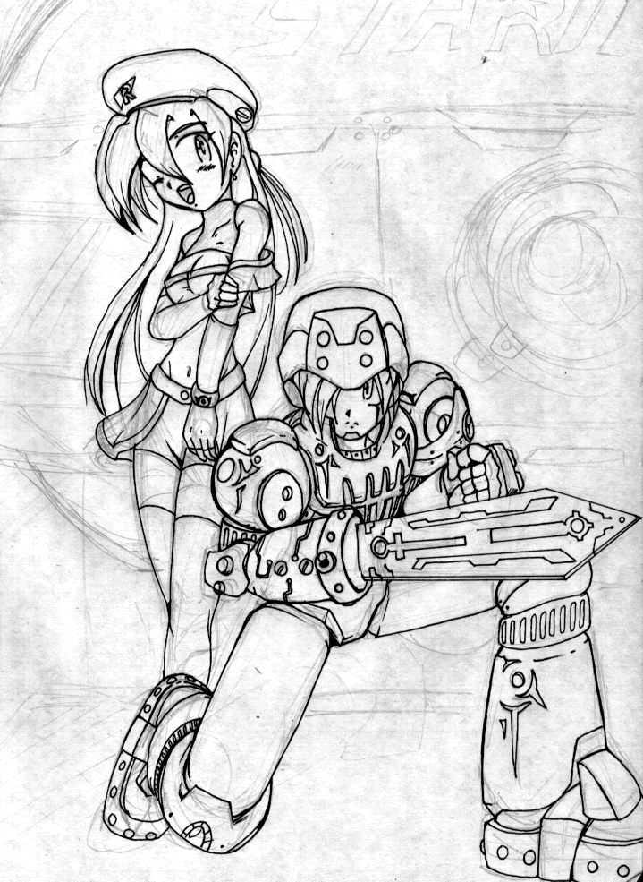
ok... i need some SERIOUS critiques!!Im going to ConnectiCon at the end of the summer and they dont have any art tables left. my ONLY chance to get one is to win the Art Cover or Tshirt Contest(s) the are running at the moment.
So... here's the mascot reference----> [link]
And I need everyone to tear it to pieces until i get the BEST chance to win!

My Idea: Bryanna and D23 on a roulette table (basically a play off of "bunny girl". get it? vegas? bunny girl?
") )
)anywho... i'm once again playing with perspective and trying to get the best possible angle.
Any help is appreciated and
 'ed
'ed
Related content


Comments: 28

Im crap at art = p but I promise I will be a bastard when you update this with a new drawn one.. presuming thats what you are going to do O.o
👍: 0 ⏩: 0


Hmm... Doing a little research, it looks like Connecticon's mascot bunny-girl is more bunny than human. All the pictures I've been seeing feature a white-furred humanoid critter...
The thing that sticks out most to me are the legs. You've made quite the nice set of human legs, indeed, and as has been said before, the foreshortening is beautiful-- But in all the pictures I've been able to find, her legs are more rabbit-like than human. That makes me read it much more as "playboy bunny" than as "Connecticon Mascot," and I'm not sure if that's quite what they'd want for a T-shirt or cover design.
I also understand that your approach to things tends to be less on the cartoony side. I'm not sure if more rabbit-type legs would work in this particular image at all. I don't know, maybe it's just a matter of tossing a few jagged edges along her to indicate fur and coloring her white in the end.
To my understanding, Connecticon's mascot is quite open to interpretation as it is drawn by a new artist every year.  (Smile)")
👍: 0 ⏩: 1

of course i
anywho... i agree that she should be more "bunnyish" but i think i'll have to rely on the color and texture to get me through on that department.
i also talked to Brianna (who the chara is based on) and she said that i should make it more "PG" rated. (she didn't mention anything about the legs... ) so i'm gonna add a "shirt top" to cover the boobage and add the tuxedo tie and cuffs. i'm prolly gonna put up a lined version later today. i'd love another crit when i'm finished with that
thanx again, Manda.


")

👍: 0 ⏩: 0

The shoulders do need work. They don't look right for the angle you have the body. You may want to extend the legs, because in the position they're in, it's difficult to see what you wanted to do with them. Also, some more attention to the hips wouldn't hurt.
Overall, nice composition.
Feel free to visit my gallery and critique on the works there.
👍: 0 ⏩: 0


I think most things have been said already really, just tighten up the girl's anatomy a bit. I'm no expert myself, but her forearm looks too short and therefore her upper arm seems a bit long. Also, I think her hand might be too big, and it doesn't look very feminine either.
👍: 0 ⏩: 0

I can't really say much that other people haven't. XD Maybe poof out the hair at the back of her head a bit. Looking straight at it the back of her head seems a bit flat at that angle. I tried studying it, but then it looked fine, so it's really up to how you feel like doing it, but the poof might not hurt. You draw test it both ways to see which you like better.
Also, I know people have mentioned the jet stream, but a good way to do that would be to make it very thin and transparent. You could accent it with highlights from any neon lights or whatever. I like the idea of transparent cards (maybe the edges could be lights?).
One thing I may request: Could you doodle a test color for it and show us? That way we can see a bit more of a solid plan for it. Wouldn't have to be a clean highly detailed color, but something to point out details we might miss from the sketch.
👍: 0 ⏩: 0

The bottom of the rib cage shows a little bit too much, and the thighs and upper arms should probably be fleshed out. The hands seem large, and the feet seem small. The robot should have a jet of smoke/steam/whatever holding him in the air, and it might be possible to make it a nude covered by the smoke if one did that. But people in the background would be good, and smoothing out the ears would probably fit a bit better. Overall, it's very good, and feel free to ignore the critiques if they've already been said or they're just plain wrong for what you want. It looks fantastic already, and it seems like a sure-fire win.
Also, just to be slightly nit-picky, the shoulders seem slightly unbalanced, the neck seeming to be placed much closer to the near shoulder than the far.
がんばって
Ganbatte!
👍: 0 ⏩: 0

It's possible to make a lot of little critiques, mostly relating to tweaking the body to be a bit more anime-ish, but those kinds of critiques are usually worthless because they tend to be a "change your style" comments in disguise. You don't need that and won't benefit from it. So, no little critiques from me.
All in all I really like this picture. It has an especially good layout and pose, and the robot is killer.
The part I don't like is the girl's head. It comes off as a strong amateur, which probably isn't enough to win. However, your style is built for coloring, and if I imagine with color, it looks much more solid.
Even with color, she still seems a little... bobble-headed in my mind. I think her head/face is just a few millimeters off from ideal, perhaps, but I wouldn't bet money on it. Off could mean in space or in size... I'm having a hard time nailing it down, but there's something awkward about it.
While I like her body, you should probably be careful about drawing from stock, because the proportions end up a little bit too realistic for anime. I don't mean bust and hips, which people generally adjust: I mean that anime characters have exceptionally short torsos, along with other such abnormalities.
Blah, I haven't exactly been helpful, I'm afraid, but good luck!
👍: 0 ⏩: 0

Only thing I can say is the background seems too busy.
👍: 0 ⏩: 0

Hooray! Critique Attack!!!
Well the girl herself is super cute and sexy.
The robot guy...well, most eyes will be drawn to th bunny girl, but fix his right hand and see if you can make him shiney when you color it. I don't know how much you're suppose to match the reference pic, but in that he looks more michevious while yours looks much friendly. Also, I don't know if you need to have some evidence of that air coming out of the rocket, though at the angle you've got now it would get in the way of the girl. The lines coming off of his arms, I can't tell what they're doing.
Okay, the background, of course, is a little sketchy; just make sure the lines are straight, but not too harsh. The cards are a nice touch, but they're at an odd angle. I can sort of tell you meant to have them coming up closer to the foreground, which is nice and makes it look like movement, but the current angle is wrong.
Dice?
The bunny girl: the focus: from how her eyes and eyebrows are positions, it makes it look like she's looking off to the right, and in a soft, aaallmost sad way; perhaps you could have her more focused on the viewer(I don't know the correct word for that...) with a slightly more beckoning, promising fun, maybe a little shy, ok.
From the reference, her hair is big and poofy and wavy, almost '80s style to me, but the straighter anime style might be more popular, though her hair could be a little thicker.
The ears are too scraggely; the hand is a little too big; the calf might be too short; I can't tell if you have the foot as human or rabbit-ish or if she's wearing slippers.
The bottom of her suit could be shifted to the left a little bit. On her suit, since I can see the outline of her stomach and all, it looks really tight, but also really thin, which means the top wouldn't stay up. Having a thin, silkly material is appealing, but try looking up the Bunny costume. This is the costume you're refering to right? [link] Oh, hey, try giving her a slightly longer neck so she can have a bowtie and collar...maybe the cuffs too...
Um, it would be cut to have a little bit of frill or lace, maybe not excately corset-y, since the character seems softer and more laid-back and a soft looking costume seems better than a stiffer one....
I think that's all my suggestions, I hope they help some; good luck!
👍: 0 ⏩: 0

The ears seem a bit fuzzy in contrast with her body. Also the lines under her lower lip and above her nose seem unnecessary.
The robot guy looks fine, but where did the number come from?
👍: 0 ⏩: 0


It looks really cool, honestly. I hope I'll see it on the program cover when I go to Connecticon this year.
👍: 0 ⏩: 0

Nice.
I'd suggest having the roullette ball under her left arm (picture right). Others are, having the persperctive looking down-a-little-to-the-right and D23 throwing chips up into the air.
As for cutting down this picture. The footware should be more like the reference, big three-toe slippers. She's not exactly sitting on her legs(semi-seiza). More like she's pushing off of her arms. Which katsumiyo pointed out that the shoulders should be pushed back and down from the front-furtherest part of her.
A women only style-seiza could bypass the complaints about the shoulders and (self-ish critic) provide the sitting style for the roulette under the arm and "V"-hand signal in the other.
But what I've suggested would dramaicly change the image from what you wanted/imageined in the first place. So if you don't think would want to change is too much, just ignore my Critique.
PS. Neon lights. But you haven't even gotten that far yet.
👍: 0 ⏩: 0

hope that helps a little, i get carried away when i get a vision of how it should look sorry if i got a little carried away
👍: 0 ⏩: 0
the cards kinda look out of place if u ask me, i would put like casino's behind the cards, make it look like the strip in las Vegas, u need some chips as well, the roulette wheel could use some work as well it doesn't seem round enough, use a real roulette wheel for reference, if i was drawing this i would have her standing as well, maybe winking
👍: 0 ⏩: 1
actually... she's on the board. not the wheel
and the cards are on the ceiling cause i kinda wanted the ceiling to be made of glass and the cards are semi-transparent. so you can see the night sky (mebbe planets and etc i.e. space).
anywho. thanx for the crit! every opinion helps
👍: 0 ⏩: 1
oh okay i see that know, i was thinking there for a minute she was in one of the well roulette tables not a flat one, id make the card light up like a neon light, and have space, and the outline in the distance of a sign like las vegas, that u can see faintly through the glass,pluss the stars, i would also add people in the background betting to make it seem like someone is betting her in the place of chips, thats all i got since this is a sketch, i hope i didnt miss the something like the cieling like last time, hope u have fun, cheers
Ross
👍: 0 ⏩: 0

I'm not good at giving critiques, but I can say that the final product of this will look great^^
👍: 0 ⏩: 1
thanx for the confidence
👍: 0 ⏩: 0

Alright, I'll do what I can.
The shoulders just seem too rounded--with a pose like that, there should be more tendons and shape showing. Her face is cute as hell, but maybe move the eye furthest from the audience even closer to the edge of her face. I'd also make the jawline a little less curved, and the thigh areas should be longer, too. (Damn, nice pose; forshortening of the calves and feet are hard to draw.) Her elbow seems a little low, and her hand is just too big.
Hope this helps?
👍: 0 ⏩: 1
it sure does!
thanx a bunch. i see what i can fix
👍: 0 ⏩: 1
No problem, dude.
👍: 0 ⏩: 0