HOME | DD
 jagged-r0cks — Exile

Published: 2006-02-07 23:18:20 +0000 UTC; Views: 3225; Favourites: 82; Downloads: 290
Redirect to original
Description
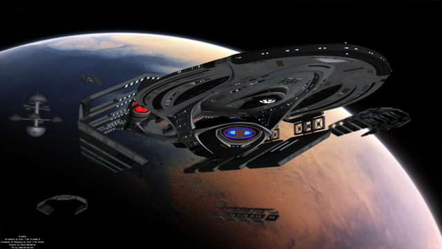
Well, for once i actually made a picture at the size it was going to be shown. It went by surprisingly fast, and i did this in just a little more than one day. Im slowely perfecting my nebulas.... I know they are significantly better. Overall, i hope you realize that this idea was practically 100% copied from [link] . Yes, go to him- [link] [link] He is a fantastic guy and his version of exile is much better than mine. No, i did not copy his colors, planet, or nebula, just the idea of how they all revolve around eachother. I guess if he doesnt want me to put this up ill deleate it from my gallery, but for now, enjoy!


His version: [link]


Thanks for viewing!
Related content
Comments: 30

#PRINT ! Now I know where the Quake logo came from 
👍: 0 ⏩: 0

amazing, great job, one thing i would suggest is to add a bit more bright stars here and there and try to interact them with other planets.. .that would be cool....
and also i have two questions, one how did you go about creating those "clouds" of star and things seen trailing to the bottom of the picture
and my second question is how did you do the "flare" sun on the large planet
👍: 0 ⏩: 0

Wow, I really like the feeling of this one. +fav! ^^
Have you thought about doing a tutorial about stuff like this? I would love one! ;D
👍: 0 ⏩: 0

Awesome job with this one - the composition and detail is superb!
👍: 0 ⏩: 0

Very good work. The starfield is good. Doesn't assault the eyes and gives enough to the image without taking away. The small planets add some nice detail to the piece as well. The planet is very well done (I love the couds). I also love the simplicity of it. Lots of people new to nebulas (myself included) usually throw in a BIG nebula with a BIG planet and it rarely works together, but you did an excellent job here. Neither ones too big or prounounced. The only thing I don't like about it is the lens flare... or what I think is a lens flare. You did a great job making it, however in my opinion its waaaaaay to bright. That's just my opinion. Overall I really like this piece and I think you did a spectacular job on it! Keep it up!
👍: 0 ⏩: 1

Wow! Thanks for the great comment! That was more of an article haha, yeah, i didnt realize it was so bright until i finished, but i had made everything around it, so yeah. Thanks
👍: 0 ⏩: 0

The thing that first caught my eye was the composition. Of course, credit for that goes to the inspiration. But I quite ilke what you've done with the idea! You have lots of light and LOTS of texture and that's what I think makes this piece so much fun to look at.
👍: 0 ⏩: 0

i think it would look good if cropped to the middle 3rdish area from the base of the planet to the bottom of the beamthing and make it a background...idea
👍: 0 ⏩: 0

wow! that's really cool!
i love the fact that it's so extremely long.
👍: 0 ⏩: 0

its something what we see very often! but hey it's great, nice planet,nice starfield!
so yea a great work
greetz
👍: 0 ⏩: 0

hehe, looks nice!
im fine with the situation, so theres no need to delete it
👍: 0 ⏩: 0

It's undoubtabely very nice, but what's wiyh the weird cutout?
👍: 0 ⏩: 0

awesome, but there is just this diagonal stripe where the stars are....bottom right
👍: 0 ⏩: 0


