HOME | DD
 JamesExcalibur — Overwatch - Widowmaker

#overwatch #portrait #widowmaker #overwatchgame #overwatchblizzard #widowmakeroverwatch #overwatchfanart #overwatchwidowmaker #widowmakerfanart
Published: 2016-05-19 00:23:26 +0000 UTC; Views: 1293; Favourites: 38; Downloads: 17
Redirect to original
Description
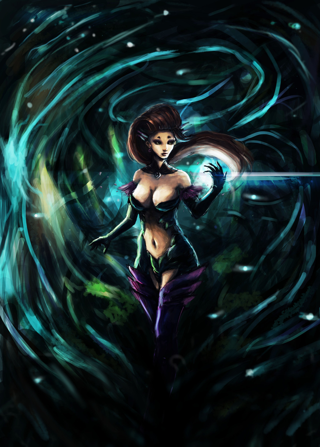
Recently looked into Overwatch and how much I regret not playing open-beta....Anyways here's Widowmaker, one of my fav char! I messed this painting up though, having to redo it several times and I'm still not happy with look. I now I'm doing something wrong with the lighting but not really sure what it is.
The weapon isn't the same as in the game, since I can't paint something like that xD
Here's the step by step process!
To : Would like to be corrected with mostly the lighting or how the shadows should havr been placed for atmosphere effect. Feel free to overpaint it.
Recent Works:
Related content


Comments: 6

Overall


Vision
Originality
Technique
Impact
The pose overall is pretty dynamic and nice looking .Use your highlights more sparingly. I assume that the light comes from the left top angle, but you used them everywhere on her body. Some part of left hand would be in shadow, also the left side of her face and neck.The weapon she's holding would cast a shadow on her chest area. also make the reflected lights less shiny, on her chest, pelvis and left hand area. The colors overall are washed out. You must control the values. Desaturate the image and you'll see what i mean. You must work on the perspective too. the most obvious issue is on this weapon. It looks like it's twisting. Also her right arm must be pushed forward. Her facial features are'n correct as well. her lips and nose are in different perspective and the eyes are a little further from each other. Also spent more time on rendering things.
I think these are the main issues with this painting.
👍: 0 ⏩: 1

Hey, thanks for the critque! That was really helpful, I would try to practice and improve of these mistakes. By the way, I tried to apply 2 different light sources instead, one directly toward her and the yellowish light from the right side of her, but it didn't go so well xD
👍: 0 ⏩: 1
NP ). in that case, u can ignore my critics about lighting, but honestly that's really not the perfect choice of lighting as u mentioned  (Smile)")
👍: 0 ⏩: 0

I agree with George. The lighting is throwing me off. I understand you tried to use 2 light sources but I did not get that from the image. I like the pose and colors. Thank you for sharing.
👍: 0 ⏩: 0