HOME | DD
 Jandruff — Good Souls Know No Rest
Published: 2007-07-03 06:46:53 +0000 UTC; Views: 8324; Favourites: 213; Downloads: 273
Redirect to original
Description
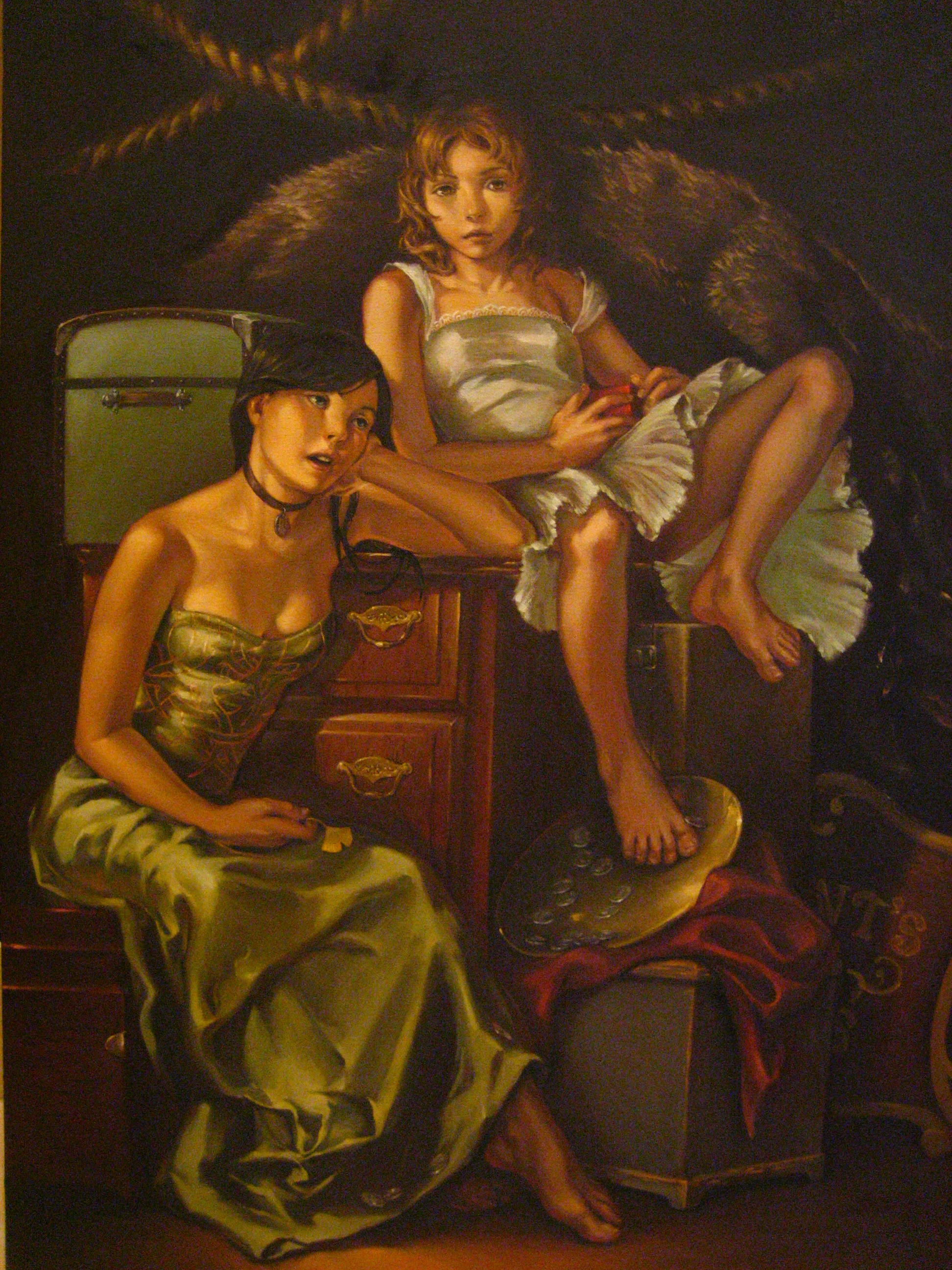
Please full view. I toiled over this oil painting for the past several weeks, so if you were someone that commissioned me, now you know why there was a delay. Sorry about that maties... This is a rather large one, but the camera wasn't able to capture a lot of the detail and added a lot of jpeg fuzz to it.I was really hesitant to put this up but I needed some critiques. SO PLEASE. CRITIQUE THIS PAINTING. These are two main characters for a story / comic book series me and have been working on for several years. We have put a lot of work and love and thought into it so far... and it keeps changing as we grow older. We want it to be perfected in our eyes when it is published. And when it gets published, I hope you all take the time to pick up a copy.. but don't expect for it to be out for a long time... like after we graduate college. I don't like oil painting.
PS... tell me if the file is too big fo youz... big like yo mama
Related content


Comments: 68

This is beautiful! Congratulations! This is something I would hang in my home. Regarding critique, I agree with the comment above, particularly on the girl in white's right foot/leg.
👍: 0 ⏩: 0

Lovely painting. If I had to give a critique, I would say the following:
Regarding the girl in the white: the shadow under her right eye does not really fit with the lighting of the rest of the piece. The ruffles are a bit unconvincing, especially the ones behind her exposed leg. Her right foot looks as if the box is not there.
The coins in the tray appear stuck to the tray.
The girl in green is WONDERFUL. Great job capturing the satiny texture of her dress and the sheen of the embroidery. Love the folds.
Good job on the skin tones overall, very life like, nice use of warm colors.
Good composition; nice choice of poses, you can the characters are long-time friends. Plenty of yummy details to feast the eye on.
Overall a great piece. Very charming.
👍: 0 ⏩: 0

This is such a beautiful painting. It's a shame that you couldn't take a bette rphoto of it. :/
👍: 0 ⏩: 0

critique????
I love it!!!! It's fantastic
critique! 


👍: 0 ⏩: 0

HOLY CRAP.... this is actually fantastic!!! Seriously impressive ...everything!
👍: 0 ⏩: 0

I love it.
The light, the mood... I wish I was as good as that....
👍: 0 ⏩: 0

I love the ginkgo leaf in her hand. Great little detail!
👍: 0 ⏩: 0

Great oil painting! Your talent doesn´t knob boundaries
👍: 0 ⏩: 1

sorry, I can't critique, it's a very beautiful painting
👍: 0 ⏩: 0

You want critique... but my goodness, what is there to critique? Everything you do is just about perfect.

👍: 0 ⏩: 0
Your painting skill is very impressive. I hope i'll get the hang of it someday. You inspire a lot of us. I love everything about this piece. The pose, the expression, the clothes, the painting...simply superb.I TOTALLY LOVE UR ART!!!!!!! Your stuff never ceases to amaze me.
👍: 0 ⏩: 0

There is something about this painting that reminds me of the following:
[link]
It's a shame old GK is not here to critique your work. He saw things no one else does.
I want to fave, but the server that registers favorites was just blocked on my end by my Mormon prude of an administrator, so all I can do is copy it and comment on it for now. So far he has been thwarted from blocking all the servers, but he has made using the site very difficult. Anyway, I won't bore you with any more details, I would fave if I could.
👍: 0 ⏩: 0

The fabric is beautiful, and I love the kind of victorian feel too it. The only thing that I would change would be to make their faces have just a little more personality (which is very hard to do I understand) and to make the dark-haired girls hair have a little more flow, and a little more contrast, some brighter highlights, more depth and definition if possible. Other than those things, beautiful painting!
👍: 0 ⏩: 0


Mmm. No critique at all from me. I bet it looks much better in reality.
 (Smile)")
👍: 0 ⏩: 0

I'm in love with this piece (love at first sight at the grad show). I just love their faces. Especially the girl on the left, her expression is so human, it doesn't look artificial at all.
I saw the real piece and I didn't see anything that bothered me. Loved the muted, but still bright colors. Lighting is great and their faces are capturing.


👍: 0 ⏩: 0


Oh sweet Jesus, that's amazing!! 
👍: 0 ⏩: 0

Trunks, a dresser, a lock-box, and a chest are all storage and traveling containers. In the distance a sign, a bear pelt and ropes. These suggest a lifestyle of performing, possibly theater or opera.
The scene is dark, filled with dark earth-tones and drab, cluttered conditions. This array suggests tradition, or age with many years of wear.
In wait are two young ladies, probably about 4-10 years apart. They have different personalities and different objectives but share similar conditions and likely a similar background. Neither cares much for wealth but only one is the support although she dreams of bigger things, more important to her, which may be out of reach. The lose hand holding onto a dream, the arm lazily supporting her head as she looks beyond her present condition.
The second girl guards a box, possibly containing memories, defying anyone to see. She lounges with a rude posture and does not seem to care to be a "proper lady". She stares ahead, concerned with the present, preparing to leap to her feet at any moment.
The responsibility of a life falls into and hangs on to the life of another, to one who is just as unconcerned, unwilling to recognize this condition, least it fall.
--
Concerning the issue with the girl on the right;
The dresser top is the eye-line (or horizon) where everything vanishes into the distance. Nothing atop this surface drops below this line, (you could argue that the box by the foot is more accurate, but then the dresser would certainly be off perspective).
From the rib-cage to the abdomen the direction changes, where the rib-cage is facing the viewer and the abdomen rotates to the right. Either leg is fine, they agree with the pose. Where it becomes obvious is that the abdomen sinks below the arm and loses considerable volume, upsetting the perception of space.
To maintain the pose I would have recommended that the stomach be raised to about the middle finger, especially towards the center of the image. You may notice a deficit of volume where her right arm is overlapped by the girls on the left. Filling it out and raising there arm may help considerably.
--
Wonderful texture and color and a relatively consistent approach to style and technique create a pleasantly congruent image with an intriguing story to be discovered.
👍: 0 ⏩: 1

Thank you for the technical critisue, it has been very helpful. And I loved your analysis on it, in accordance to the storyline there are obviously some things off, but of course I haven't revealed anything about it at all so far... and it's pretty cool that you've gotten a lot of things right with each of the girls. I'm really grateful that you would take the time to break this piece down like that, it has been one of the best comments I have received.
👍: 0 ⏩: 1
Everything in a work is a clue. I included the more questionable parts to illustrate just that. I decided not to omit them because I believe it can show how important the composition and content can be to one's personal interpretation. (It is of course my personal impression.)
My critique is my way of appreciating a good work, and my way of saying "thank you". I am glad that it was helpful to you.
Best of luck to you in your extensive project, and your future endeavors.
👍: 0 ⏩: 0


My gosh...
I really dropped my jaw when I full viewed this.
I wish i could be of any help with giving C&Cs but to be honest with you im so much blown away that I can't seem to find anything wrong with it. And the fact that this was done with natural media is nothing short of amazing!
👍: 0 ⏩: 0

this is so amazing! it looks really classical and realistic, the persons are very characteristic and i simply love how you colour different textures. respect!
👍: 0 ⏩: 0

absolutely beautiful. I only wish i was patient enough for detail like that.
👍: 0 ⏩: 0

I can't offer any real critique, but I would like you to know that I believe it is lovely and that your hard work shows. I am inspired.
👍: 0 ⏩: 0


being featured in the NEWS ARTICLE~
'WEDNESDAY'S WALL OF WOW'S' ~ 7/11/07!! [link]


👍: 0 ⏩: 0

This is indeed very well done. This looks astoundingly beautiful. The sense of realism is great.
Unfortunately, I am in no position to critique a work of such high caliber (mostly because the critiques were already mentioned to you by other people before me). Perhaps I must turn to this again at a later time.
👍: 0 ⏩: 0

it's beautiful. i love all the different textures your work on the fabric on their dresses is particularly impressive. i'd love to see a picture of it minus the fuzz. keep it up
👍: 0 ⏩: 0

I LOVE IT! Its soooo amazing and beautiful...see, I suck serious ass painting with real media, but I'm getting better in Photoshop... This is truly beautiful
👍: 0 ⏩: 0


The girl in white's face isn't working (which destroys the excruciatingly high potential of the piece because your eye is drawn right towards it and can't get away.)
👍: 0 ⏩: 1
How can I make it work? Is it because it is too centered? I would love to take advice from a great artist such as yourself.
👍: 0 ⏩: 1
Both her eyes are floating up and away. Try horizontally flipping the image if you can't see it.
👍: 0 ⏩: 1

Thought it needed a bit more explanation than that.
Quick fix:
[link]
Try flipping between that and the original.
👍: 0 ⏩: 0

duuuude the file is gigantic. i clicked on it and all i saw was like, rope.... but it's fucking fabuous even small sized.
👍: 0 ⏩: 0

ILOVEITJANEETSOMUCH.
you're too awesome.
you've got enough critique.
not that i can say anything anyway. ):
👍: 0 ⏩: 0

this is amazing, i am a super super messy painter & i admire your precision - i can't even see the brush strokes.
everything i was going to say has already been pointed out
except i didn't know those things falling on the plate and the right girl's foot were coins. i figured for the date of the piece [or the time it seems to be set in according to the bkg + wardrobe] money would be gold or bronze and not silver. they looked like glass disks to me, i couldn't make much sense of it until someone else said it was money.
the feet look perfectly fine to me, some of us are not blessed with "pretty-ish" feet.
i really love the color pallet, the warm colors - beautiful!!!
👍: 0 ⏩: 1
Thanks galy, I think I see what you mean with the coins.
👍: 0 ⏩: 0

I like it, especially the fabric textures. Aside from what's already been said, the only thing that really stood out to me was the shading on the big toes. At the joints, they kind of look like... broken or something. Moreso on the light haired girl than the dark haired one.
👍: 0 ⏩: 1
I didn't notice that until you pointed it out, thanks!!
👍: 0 ⏩: 0

holy JEsus
this is amazing, i love the warm undertone of the whole piece as well as the composition...
anatomically, i can't really tell if there are any problems (it's too big so i end up having to scroll sideways xD) but it looks absolutely gorgeous regardless
👍: 0 ⏩: 0

Very wonderful job as usaul Janet. The dark-haired girl's leg & foot look a bit short.
👍: 0 ⏩: 0

It's too big! The fuzz on it doesn't look so much like jpeg fuzz as camera gain fuzz, digital cameras crank up the ISO when there is low light. Best way to fix that is shoot outside in the shade. Sunlight (even in the shade) is x1000 brighter than any kind of indoor lighting you can provide and should fix the fuzziness.
👍: 0 ⏩: 1
Cool, I need this info. I am so bad with the camera... Thank you!
👍: 0 ⏩: 0

Oh my goodness this is ABSOLUTELY AWESOME ")
It looks like it's by a master~!
It looks specifically like one famous painters .... Can't think of ... the nammmeeee... B:
👍: 0 ⏩: 0

i'm afraid i don't have much in terms of critique to say.... i like the structure of the composition and the figures are both beautifully rendered. the color palette is really nice too, and oil painting is really hard, i know from experience.
i do agree with a couple of people up there that the darkhaired girl's visible leg looks a bit short compared to her torso, and i feel like something might be slightly off about the other girl's right leg, though that could just be due to tricky foreshortening. but this is awesome nonetheless. :]
👍: 0 ⏩: 1
| Next =>