HOME | DD
 janvanlysebettens — Editorial Design: Scriptie
Published: 2009-05-20 09:59:56 +0000 UTC; Views: 16262; Favourites: 46; Downloads: 6077
Redirect to original
Description
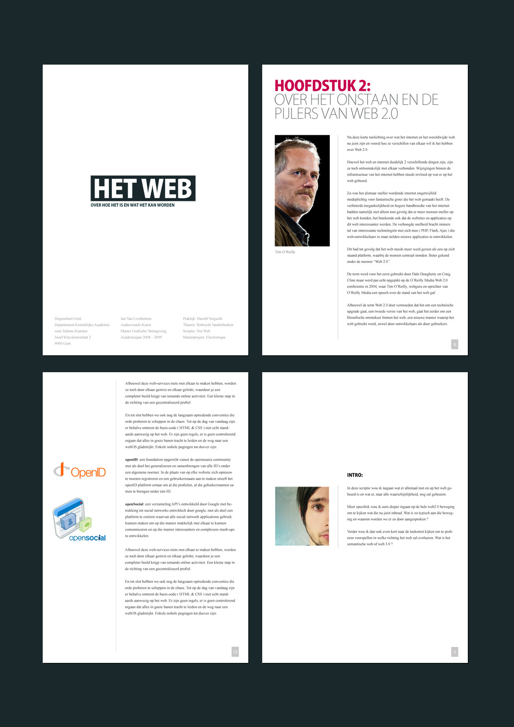
Editorial Design: Scriptie_______________________
Just to showcase the design of my thesis.
Very simple and straightforward, but since I don't do editorial design very often, I figured I might use this as a portfolio case.
Fonts used: Kozuka Gothic Pro and Times New Roman
Images copyrighted by their original owners, used for educational purposes.
Related content


Comments: 17


Love the minimal style, the headings look nice against the white. Good stuff!
👍: 0 ⏩: 0

 (Smile)")

Wow dat ziet er strak uit man!!! Ik zie echt super goed in hoe zo'n super gave opmaak als deze je scriptie een stuk overtuigender kan maken!
👍: 0 ⏩: 0


Looks pretty solid. Cept for that double divider line on picture 3 (bottom left) - doesn't fit to the rest of the layout imo..
👍: 0 ⏩: 1

woh, you've got a sharp eye
fixed it.
👍: 0 ⏩: 1
Well, I whore myself.. err.. work in graphics design too, so..
")
👍: 0 ⏩: 0

")
mja, 'k moet der nog wa fouten uithalen
de rest, dunno.. mss da ik ne pdf online zet op mijn site
( die ik nog niet heb ")
👍: 0 ⏩: 1


