HOME | DD
 jasonbeam — The Coming of Cthulhu
Published: 2005-02-23 18:15:18 +0000 UTC; Views: 2782; Favourites: 27; Downloads: 101
Redirect to original
Description
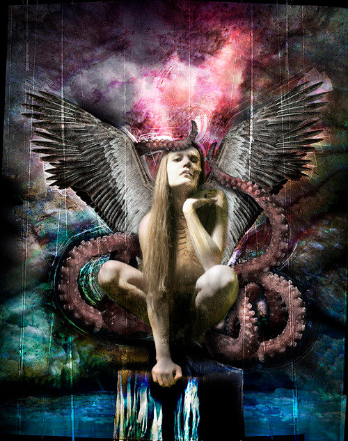
Magazine cover illustration for Cthulhu Sex (Issue 22)Related content


Comments: 8

Is that a real magazine title....? ")
")
👍: 0 ⏩: 1

Sounds horribly disturbing, yet incredibly intriguing xD
👍: 0 ⏩: 1

I might actually end up looking it up someday lol.
👍: 0 ⏩: 1

im not as picture perfect as these two, but I agree with DigitalHatred in the fact that the colors sorta of draw away from the idol a little. but still, fab piece of work.
*hands you a favorite* keep it up!
👍: 0 ⏩: 0

aha... that's very good.
nice use of colours and textures for the background. it's very dense yet it blends so nicely with the figure.
now the figure ... her extended hand bugs me a little. i would shadowed it a bit so it would match the lighting of the bg.
the ribcage picture i think it's out of anatomy, but since this is not meant to be a realistic image but a surreal one i'll leave it here.
her face looks good, except for that little part that the deviant above me referred to. but it's nothing, really.
it's good, yes it is. keep on making inspiring, innovative art.
 (Smile)")
👍: 0 ⏩: 0

very well done work
but since you asked for advanced critique ,
here's my opinion about a few details which could be enhanced :
first thing that catch my eye is the real abundance of color, it gives a nice sureal effect and i'm sure it will looks totally great when printed on a glossy paper but its also hard to focus on the center of the image, my eyes are more attracted by the color variations of the background than by the central subject. It could also apply to the rock where the model stands, it looks like you applyed the layer using the color difference overlay and fibnally it looks a bit synthetic.
second, a more little detail is those vertical lines you applied (im not talking about the lines surrounding the model, this part rules  (Wink)")
and last thing , the merging of the visage and the skull is perhaps too abrupt, for instance her upper lip seems to be cut when the skull side begin
👍: 0 ⏩: 0