HOME | DD
 javierocasio — iTunes X Icon Replacement
Published: 2010-09-02 20:33:37 +0000 UTC; Views: 76396; Favourites: 323; Downloads: 21653
Redirect to original
Description
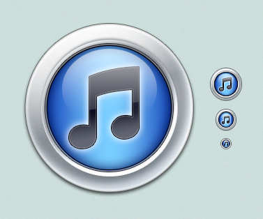
Here's my iTunes 10 icon replacement for Mac OS X and Windows. iContainer included. Hope you like it. (Smile)")
Terms of Use:
These icons are free for personal use. Distributing these icons commercially or with any intent for monetary gains is prohibited.
NO MODIFICATIONS OR REDISTRIBUTION WITHOUT PERMISSION.
Copyright © 2010 StudioTwentyEight - www.studiotwentyeight.com. All rights reserved.
Related content


Comments: 65

👍: 0 ⏩: 0

Overall

Originality
Technique
Impact
Me encanta el concepto, el unico detalle que podría agregarle es que el brillo superior izquierdo me hubiese gustado más difuminado e intenso, lo mismo que el inferior derecho que se ve pequeño pero no hace lucir al icono de manera esplendida. También un brillo esférico inferior muy minimo se hubiese visto genial (bueno todas estas opiniones son de lo más personal no quiere decir que este mal sino como me hubiese gustado verlo jeje).
Los colores me encantan hacen semejanza al Apple TV. De todos los conceptos que he visto de iconos desde ayer este es el que más me gusta.
Excelente trabajo querido amigo.
👍: 0 ⏩: 0


Vision
Originality
I love you. These icons are awesome. You've done the icon well with details so much as the lower right corner of the icon. Beautiful colors too. I really like them.
I really have no complaints the icon is great. Not a ton of originality and I would've liked to see some deviation from the iTunes icon but that's alright.
The quality of these icons are very high. And you can see that just from looking at them. No blurry edges. Everything is crisp and clean.
I really wouldn't mind looking at the PSD's for these icons and see how you did it. A tutorial would be even better.
👍: 0 ⏩: 0


Thank you, great [timeconsuming]work for us to enjoy
👍: 0 ⏩: 0


Wow, they are so much prettier than the normal ones
")
👍: 0 ⏩: 0


Very Clean & Neat looking sleek icons, well done
👍: 0 ⏩: 0

It would be better if the colors were more "lighty", from violet to white... not gray; with some lil reduction on saturation.
But it's very great this way , too.
👍: 0 ⏩: 0


Could you explain to me how to get this to replace the icon, i can't get it to work.
👍: 0 ⏩: 1

go to the itunes directory and on itunes exe right click and make shortcut,now it should be able to put an icon
👍: 0 ⏩: 0


well, its a huge improvement on the iTunes 10 icon
love it, thanks for the replacement
")
👍: 0 ⏩: 0


i saw these on a screen shot this morning and totally wanted them. So glad I checked my watch msgs tonight! Wasn't able to find them before! LOVE THEM!
👍: 0 ⏩: 0

Epic! The details on thee icons is mind boggling. Awesome stuff my friend.
👍: 0 ⏩: 0


Love it, especially the round one. I nearly used it, but the note exhibited not enough contrast against the background.
👍: 0 ⏩: 0

Wow, very nice! It's beautiful with those purple tones and that metal border (i like the round)
Thanks!
👍: 0 ⏩: 0


I really adore these icons because they have such a clean, modern look to them. I think these are flexible enough to look good using any colour. Great job!
👍: 0 ⏩: 0


For some reason, iTunes won't let me change the icon...
👍: 0 ⏩: 0

I think the round icon is too dark at smaller sizes, otherwise they're much better than the default one.
👍: 0 ⏩: 0

Someone forward these to Steve Jobs and show him how a real professional iTunes logo should look
👍: 0 ⏩: 1


good icon. really well made. just wish there was a nice replacement in this bunch that show cased the 3-D nature of OS X's dock.
👍: 0 ⏩: 0


Apple's game has slipped. this is much better then what they came up with.
👍: 0 ⏩: 0


great work mate, looks so much better as the original icon
👍: 0 ⏩: 0

Thanks. I'm going to use this rather than the new iTunes icon. Yours are much more polished, IMO.
👍: 0 ⏩: 0

Great icons man
You've been featured on iconpaper
👍: 0 ⏩: 1

| Next =>