HOME | DD
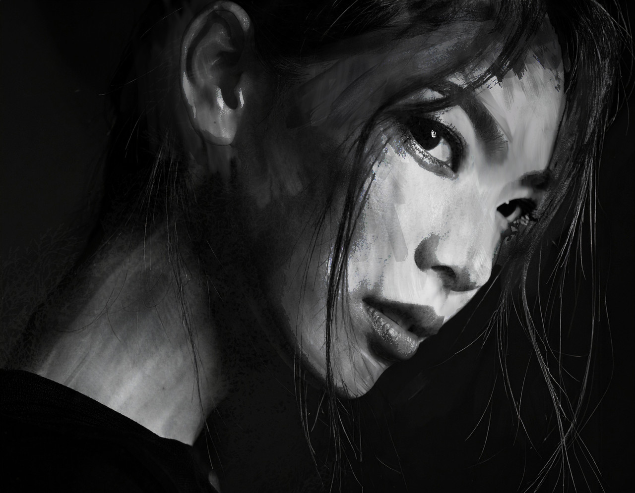
 jayhorner — DREDD Cycle Of Violence Pg 2

#hallofjustice #ukcomics #2000ad #bullies #comicart #comicartist #comics #dredd #gore #judgedredd #megacityone #swirly #ultraviolence #megacity1 #judgedreddfanart #2000adsubmission #2000adsubmissions
Published: 2017-09-18 22:03:16 +0000 UTC; Views: 727; Favourites: 14; Downloads: 3
Redirect to original
Description
oh boy, this is shaping up to be the most violent, gory comic I've ever drawn! (So far, that is) had some fun with this and based my Academy of Law building on my old Uni Building.Made with Wacom intuos pro in Sketchbook/Mangastudio/Photoshop
Related content


Comments: 2

Overall


Originality
Technique
Impact
Nice work.
Frame 1.
I like the left-hand figure, very cool. Again, I question the wallpaper, I think it's over-powering the picture. Maybe try a lighter grey? I'm wondering if it'd be better to get rid of the black diagonal in the top right of the picture? Or is it the other side of a doorway? Anyway, I think it detracts from Dredd's (?) shadow. It makes it harder to 'read'.
Frame 2.
Perspective, perspective, perspective. The building has multiple vanishing points. It's another one of those things where it'll look 'off' to a reader without them being too sure why it feels a bit strange. It's jarring and it'll pull them out of the story. Also, remember that most windows, architectural features tend to be the same height, width etc. I know that this is a kind of throwaway/transition element within the story but it still needs a little love. Maybe next time use a reference photo to help set up your vanishing points?
Frame 3.
The background texture should be rotated a little to align with the walls/rear desk top. The rear screen, guys and desk top should all align to the same vanishing point that's coming from the right of the frame. If you drew a line from the same vanishing point as the desk across the shoulders of the guy on the right, the left guy's shoulders should more-or-less be on the same line. Check out books by Andrew Loomis on perspective. They're old, but the information contained within is gold.
Paste this into Google: Proportion and Horizon from Figure Drawing For All It’s Worth by Andrew Loomis
The guy in the foreground. What he's doing with his left arm is physically impossible. Also, his desk top is higher than the one behind him. If he's there, trying to type, it's going to be difficult. Sounds picky, I know.
Also, how high off the ground is the desk in the background? It looks like it's almost 2 metres off the floor. Plus, take into account ergonomics. The guy in the background (with his arms on the table) would have his knees jammed right against the front of the desk. The desk top needs to be wider so he has some leg room.
Frame 4.
Is this supposed to be a loo or a wash basin? Usually it's a loo in these types of story isn't it? When there's hazing of some kind? He looks kinda scared as they're pushing him towards it. Would he be THAT scared of a bowl of water? I'm not too sure of what's happening in the background. It just like random decoration? They could be anywhere. Are they in a dorm, in a bathroom? Outside? Is that a bird bath they're going to dunk him in? If you imagine this being published without captions and word balloons would readers know what was going on? This is no different than the shot of the building earlier. You've changed the scene, you're establishing where people are. You have to indicate that it's somewhere different.
Frame 5.
I don't think you needed shadow in the bowl and background. I feel like you're just filling
up space for the sake of it.
Frame 6.
I'm not sure what the black arc is across the top of the frame? It's kinda like someone's shining a spotlight on them? Also, why is there an odd (grey) shadow around the doorway at the end of the corridor? The door frame isn't a regular shape. it'd be a consistent width all the way around. I like how you've made the guys in the background grey. It's an interesting effect. I think tonally the blokes are more or less the same shade of grey as the doorway in the background? If you squint at the image you'll see that most of it blurs into one. In fact the guy in the foreground has elements the same shade of grey too. I think if you'd put a heavier/thicker outline on him it would have punched him out of the picture more? Is the guy on the left stumbling or sitting on the floor? If he's supposed to be on the floor his bum is more-or-less level with the attackers knee/shin area, so he's floating off the ground.
Sorry for the character assassination. But, I do think you have a solid style and your storytelling is quite good. At the moment you're over-decorating your backgrounds with 'stuff' that doesn't particularly relate to anything. You don't always have to put things in there just for the sake of it. Take a look at your favourite artists and see how they fill their backgrounds. Sometimes they'll just put in a hint of detail. But it's enough to give the reader an idea of place.
Good stuff! e.deviantart.net/emoticons/s/s… " width="15" height="15" alt="
 (Smile)")
👍: 0 ⏩: 1

thanks, again I'll take it on board, but I do have to defend panel 2 because it's fully referenced and I never changed the windows positioning from the original photo, but other than that a fair critique
👍: 0 ⏩: 0