HOME | DD
 JCoelho — Quick Tutorial

Published: 2011-03-03 16:59:28 +0000 UTC; Views: 1732; Favourites: 30; Downloads: 30
Redirect to original
Description
Hey peeps,here's a small and quick tuturial to contribute to the cause.
Hope you guys like it!
This illustration was comissioned by Penthouse Portugal, for an article titled "Survive The End Of The World".
The image is quite self-explanatory, but I'll develop a bit further here:
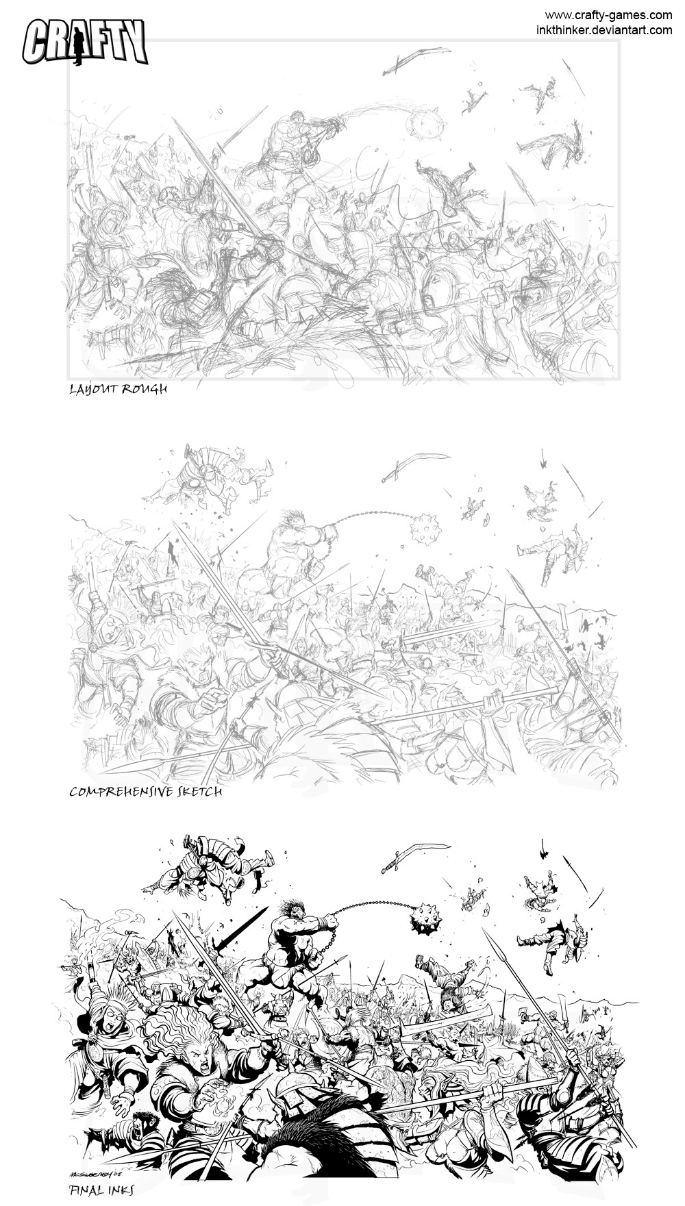
Step 1 - Thumbnails
Usually we do a small thumbnail to visually, quicker and effectivelly convey the idea, for us & the client, so that we're on the same page. After the idea is approved, it's all good...
Step 2 - Pencils
On this stage, we already nkew we wanted a big debris pile, so it was more a question of making sense of the space than details. Then the idea of a first plane with a tree and a third with the wighway came, because it looked good - but also to convey the article's theme "Survive The End Of The World" simbolizing the death of both nature and civilization.
Step 3 - Inks
Since the idea of a big debris pile arose, automatically the question of too much elements would clutter and damage the piece flow & readability, so we imagined it in shades AND at the same time, fully recognizable hence, in negative.
So the poin here was to streamline the whole detaile area, and not modeling by shadows (because of further inversion) we ended using brushes (Pentel Pocket Brush) mainly on the first plane silhouette and human figure, to add an organic feel and stroke thickness. The rest was done mainly with a Pilot G-Tec 0,4 pen.
Step 4 - Negative Shades in CS
Ok, this step is quite simple as long as one can catch up with Photoshop terminology...
- Add a new layer set in "Difference" mode.
- Paint on it with a white pencil brush, it will paint in negative, erase, and so on...
- Add a new layer set in "Normal" mode and paint with a black and a white pencil brush to correct those minor glitches resulting of making the negative shades...
Once finished, flatten image, and yes, SAVE.
Cheers!

Related content


Comments: 20

Até "o lixo" que desenhas fica espetacularmente bom, e detalhado, consegue-se notar o que lá está O_O
Quanto tempo demorou?
👍: 0 ⏩: 1

demorou um dia inteiro, provavelmente de 10h...
👍: 0 ⏩: 0

Thanks for putting this up. You're a good citizen. 👍: 0 ⏩: 1
 (Wink)")


Desenho fantástico - parabéns!
Já agora há uma parte que não percebi bem, relativamente ao passo 4.
- porquê Diference e não colorir directamente a negro?
- como se separam as linhas para ficarem a branco (diference com mascara?)
👍: 0 ⏩: 1
Obrigado Alexa
- o Diference provoca o negativo, basta apenas pintar com branco - é muito rápido e com a borracha (ou pencil negro) pode corrigir-se instantaneamente.
Devem haver mais maneiras de fazer a coisa, no Photoshop é normal acontecer, esta é apenas a que costumo usar...
qqr coisa, apita
👍: 0 ⏩: 0


You're more than welcome, Noble Squire

👍: 0 ⏩: 1


bemmmmm, grande trabalhão....Geof Darraste um bocadinho  (Smile)")
👍: 0 ⏩: 1
essa mesmo, e deu sim, um trabalhão mas acabou por valer a pena. As cores tb ficaram giras, ajudaram a simplificar e dar ambiência à peça. Depois publico-as aqui... Thanks!
👍: 0 ⏩: 0

")
Thank you so much Elena!
👍: 0 ⏩: 0

Tinha que escolher uma "kitada"...
👍: 0 ⏩: 0
