HOME | DD
 Jdan-S — Mandy Type C
Published: 2005-05-03 16:25:26 +0000 UTC; Views: 4169; Favourites: 90; Downloads: 243
Redirect to original
Description
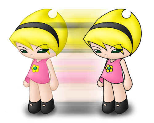
Bleh, crappy layout again! ><I call it "Type C" for two reasons. First, this is the third way I know how to draw Mandy (the two others being the original toon and the anime version). Second, the "C" stands for "Critter", which is exactly what this is: Mandy in my Critters style! I can't decide which version looks better: "lineartless" or original, so I posted both side-by-side!
In my opinion, this is the most accurate way for me to draw an anime Mandy without straying too far from the original version! Her head's still round, she still has no nose, and she still uses the same proportions, more or less!
")
Related content


Comments: 22

the one on the left definitely looks 'softer' and therefore a little more 3D, but the one on the right contrasts more with the black border (especially as it is fairly thick)
i presonally like both, i think it really depends on the effect you are trying to accomplish
 (Smile)")
👍: 0 ⏩: 0

The one on the left looks way better. While their are lines, the lines seem to blend in much better than the lines on the right.
👍: 0 ⏩: 0

I saw something of yours while browsing and I looove the cute style you use!!! Also, I love the Grim Adventures show. Anyway, I like it both ways too, but it looks more anime-ish with the dark lines; so, for this style, I'd go with the one on the left.
P.S. Is your icon supposed to look like it has hearts coming from its butt? lol
👍: 0 ⏩: 1

"Hearts from butt" LOL
Well, it just happened that that was the only empty place left to place that heart! But I never thought about it that way before! It does kinda look like it!

👍: 0 ⏩: 1
It's kinda like "ooh, look at me! i'm so cute that when I fart, it doesn't even stink! hearts just come out of my butt! teehee!!"
hahah
👍: 0 ⏩: 0


hm they both look cool, with and without the colored lines. i think the colored lines makes it look softer. and this way of drawing her looks great, too! she still looks like she could kick my butt....
")
👍: 0 ⏩: 0

Ah, adorable! She looks great ^_^ What a wonderful blend of the styles!
I prefer the lineart-less style, myself, but both look swell.
👍: 0 ⏩: 1
Thanks!
I couldn't decide between the two myself! They both look great!
👍: 0 ⏩: 0

i think the dark outline looks better... its more defined and it suits the toony style. hehe i like how you added the blur effect there. it makes it seem tranformed. and i guess that what you wanted to show! hehe. mandy is very cute
👍: 0 ⏩: 1
I really couldn't decide between the two! They both look equally good so I posted both of them!
Initially, the blur wasn't supposed to be there, but I added it in at the last moment just to give the deviation a bit of special effects to avoid making it look too plain and dull! Looks like it works for the pic!
👍: 0 ⏩: 0

awesome.. you gotta love the effects.
👍: 0 ⏩: 1
I'm thinking if I should make a tutorial for making colored lineart like what I did with the Mandy on the left. But that'll have to wait until I've really perfected the method!
As for the blurry thing, it was just a third mandy in the middle given a strong "motion blur" filter in PS!
👍: 0 ⏩: 1
ooh.. thanks for the tips. i'll try it sometime.
👍: 0 ⏩: 0


i like the version without the black outline ^^ also.. i think her dress is just a tad bit too short

👍: 0 ⏩: 1
Hmm.. Yeah maybe, but since it's a still picture, I can control the skirt's flow so I don't show something... er, offensive!
No matter how short skirts get, it's really up to the artist to avoid showing certain things!
👍: 0 ⏩: 0


