HOME | DD
 JE3 — Not yet Raining
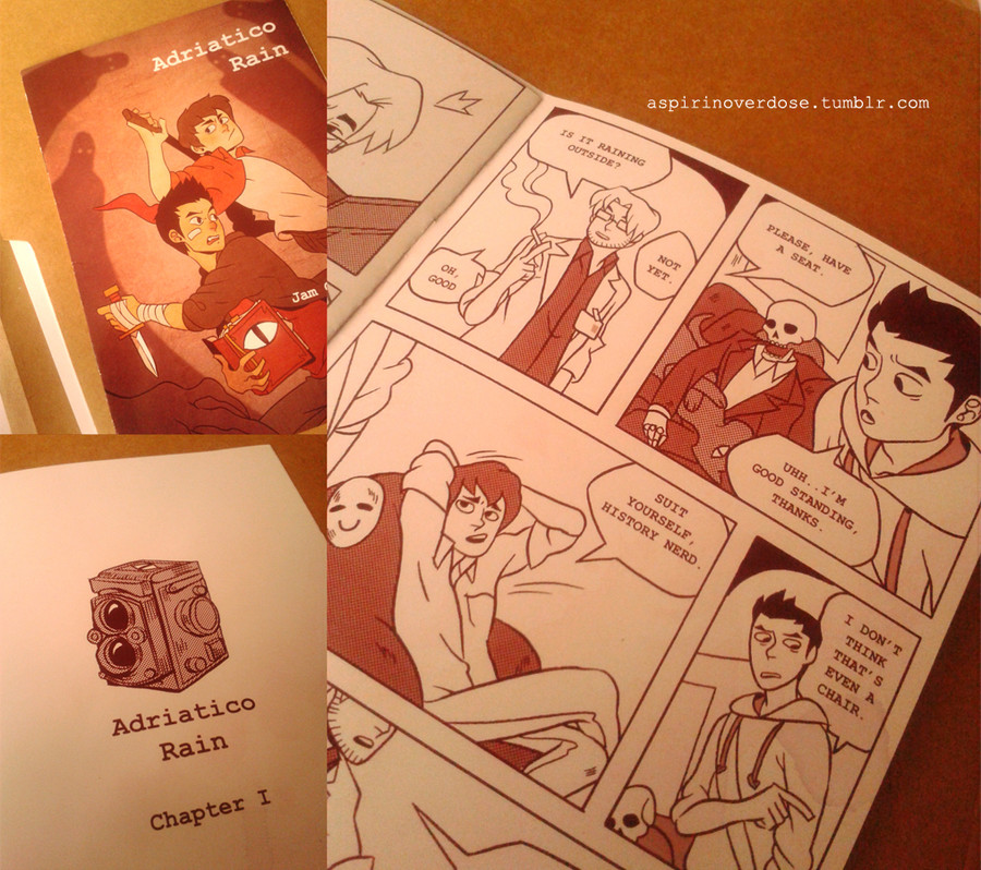
Published: 2014-04-26 12:31:09 +0000 UTC; Views: 1689; Favourites: 65; Downloads: 14
Redirect to original
Description
Adriatico Rain preliminary prints. My editor asked me to change some fonts and I’m not entirely satisfied with the idea of a printed version. Still considering if I should stick to black and white or try muted colors for the webcomic heh.
Adriatico Rain © JE3
Related content


Comments: 22

This looks incredibly nice! I love simple styles with lots of emotion in them! xD my favorite stuff! Wish you the best of luck with your webcomic and future works!
👍: 0 ⏩: 0


sooo cute i love this like is there a way i can buy this later
👍: 0 ⏩: 1

Thanks. I haven't ironed out the details, but I'll be sure to keep everyone posted
 (Smile)")
👍: 0 ⏩: 0

I mean, it's a bit late commenting on this thing now but I still think it's pretty rad! I have pretty little experience with printing, so I think it's cool that you're doing this? (although I'm asking myself, is it still a webcomic then?).
However I think a change of font might be a good idea, although this one is nice and kinda fits the vibe of the story (it's kinda like typewriter font), it's still a bit hard to read. And considering your thoughts about black and white or muted colours, that's a hard one. I've never worked with muted colours before, but I always think they look pretty beautiful and it nearly always makes me wanna read the comic instantly ")
Still, I'm looking foward to this in any case. Hope I wasn't being too critiquing, I mean, in the end, I'm super exited for this and I really like your style, you know that
👍: 0 ⏩: 1
I just wanted to see how it would look as a print. Colors are a priority in printing though, unlike in a webcomic, you could go all out with colors. Yeah, I guess I could use the courier font (type writer) for sub chapters. And yes, I was trying to achieve a muted sepia-ish feel for the story.
I really appreciate the input! Thanks
👍: 0 ⏩: 1


waaaaaaaaaaahhhh kuya jamil way to go~! I want a copy huhu <3
👍: 0 ⏩: 0

I really like the muted colors you have now. I think it would tie together with the cover a lot better than going directly to black and white. It gives it a nice touch . Can't wait to see it finished!!
👍: 0 ⏩: 0

This looks amazing! I'd totally support a printed release~
👍: 0 ⏩: 0


dududeuduedeyesseyeysyesy where can i buy this whereeee
👍: 0 ⏩: 0

If you're releasing it in print, I'd totally buy it btdubs. From what I see of it, I like the limited color pallet.
👍: 0 ⏩: 0


where are you releasing this?! so excited! keep it up!
👍: 0 ⏩: 0

