HOME | DD

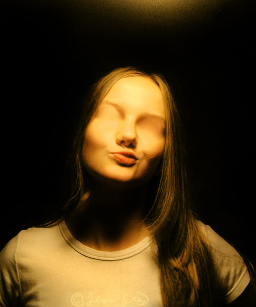
JeanGrey — Keep smiling

Published: 2005-04-10 14:05:48 +0000 UTC; Views: 562; Favourites: 23; Downloads: 73
Redirect to original
Description 
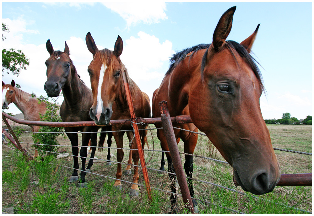
I took it last summer.This horse has name Jessica and she is really nice...
Related content
Comments: 14

ShivaLD [2006-07-11 17:28:41 +0000 UTC]

Fantastic Picture!!! It's great!

👍: 0 ⏩: 1

JeanGrey In reply to ShivaLD [2006-07-11 17:31:19 +0000 UTC]

Flagged as Spam

👍: 0 ⏩: 1

ShivaLD In reply to JeanGrey [2006-07-11 17:36:45 +0000 UTC]

You're welcome!

👍: 0 ⏩: 0

xkachnax [2006-03-02 14:47:43 +0000 UTC]

omg...its absolutely gorgeus.... he/she looks like eating this cloud

sorry for my english

👍: 0 ⏩: 0

NieblaYLuz [2005-10-15 20:17:36 +0000 UTC]

It made me laugh.
Nice pic, taken right on time. Well done !

👍: 0 ⏩: 0

Yousry-Aref [2005-05-30 08:46:01 +0000 UTC]

i'm crazy with that photo my dear

👍: 0 ⏩: 0

acidshadow [2005-04-10 20:02:13 +0000 UTC]

nice job on the capture!

👍: 0 ⏩: 0

LeSoldatMort [2005-04-10 19:51:16 +0000 UTC]

hehehe moc pekny

👍: 0 ⏩: 0

paul1964 [2005-04-10 18:44:40 +0000 UTC]

great picture, taken at the right moment! very funny!!


-----
beware of what you want, it might want you more!

👍: 0 ⏩: 0

floCha [2005-04-10 16:14:39 +0000 UTC]

funny pic

👍: 0 ⏩: 0

a-l-e-x- [2005-04-10 15:24:52 +0000 UTC]

I decided to try to make it look better...
[link]

What I did (tips on photomanipulating)...
Cropped to center on subject and remove distracting thing on the left
Removed bush on the right of horse
Changed copyright thing so it is nicer looking and less noticeable (but still there)
Lowered saturation on horse and lowered saturation on sky more. It makes it look more professional (the "washed out" look).
Added white border with black outline. This makes the color on the inside look better, and also makes it look more professional.
Added a blurred, soft light layer. What that does is A) Increase contrast B) Enriches color and C) Adds a "glow" to it.

👍: 0 ⏩: 0

a-l-e-x- [2005-04-10 15:24:50 +0000 UTC]

I decided to try to make it look better...
[link]

What I did (tips on photomanipulating)...
Cropped to center on subject and remove distracting thing on the left
Removed bush on the right of horse
Changed copyright thing so it is nicer looking and less noticeable (but still there)
Lowered saturation on horse and lowered saturation on sky more. It makes it look more professional (the "washed out" look).
Added white border with black outline. This makes the color on the inside look better, and also makes it look more professional.
Added a blurred, soft light layer. What that does is A) Increase contrast B) Enriches color and C) Adds a "glow" to it.

👍: 0 ⏩: 0

Kelie [2005-04-10 15:16:59 +0000 UTC]

I love how the cloud behind it looks like the horse. Very cool ^_^

👍: 0 ⏩: 0

vanilliacoke [2005-04-10 14:54:47 +0000 UTC]

Heehee^_____^It is a good advice!I really like the picture,you were lucky to take sych a shot!

👍: 0 ⏩: 0

a-l-e-x- [2005-04-10 14:15:06 +0000 UTC]

This is an awesome picture, but you should manipulate it a bit to make it look a bit better (at least a border and better font, comic sans looks horrible, no offence).

👍: 0 ⏩: 0