HOME | DD
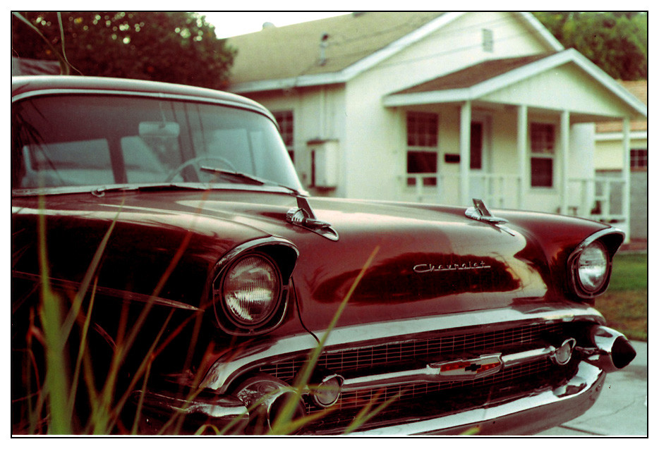
 jeccmatrix — New Speed Demon
Published: 2005-09-15 19:52:46 +0000 UTC; Views: 107; Favourites: 1; Downloads: 14
Redirect to original
Description
1 of 2. a different feel to both, and i like them both.Related content


Comments: 3

nice!
i think i prefer this one for the extra colour saturation....the colours look a little too strong which (to me) fits with the 50's style look - it looks like an imperfectly controlled print....just like it should be
for both of them though, great composition and focus - it looks so advert/movie/album art....just great
gotta be a fav!
 (Smile)")
👍: 0 ⏩: 1

thanks for the thoughtful critique.
yeah, i think the other one was more focus on its dilapidation and its anachronism, thus the desaturated look (it was actually very dull in real life).
👍: 0 ⏩: 1
hehe...i see...!
i guess when I prefer this one...that's not to say that the other is wrong...just this one feels right!
but anyhoo...great work, keep it up
👍: 0 ⏩: 0