HOME | DD
 jedeye459 — Element 2

Published: 2001-10-30 05:09:18 +0000 UTC; Views: 1450; Favourites: 10; Downloads: 319
Redirect to original
Description
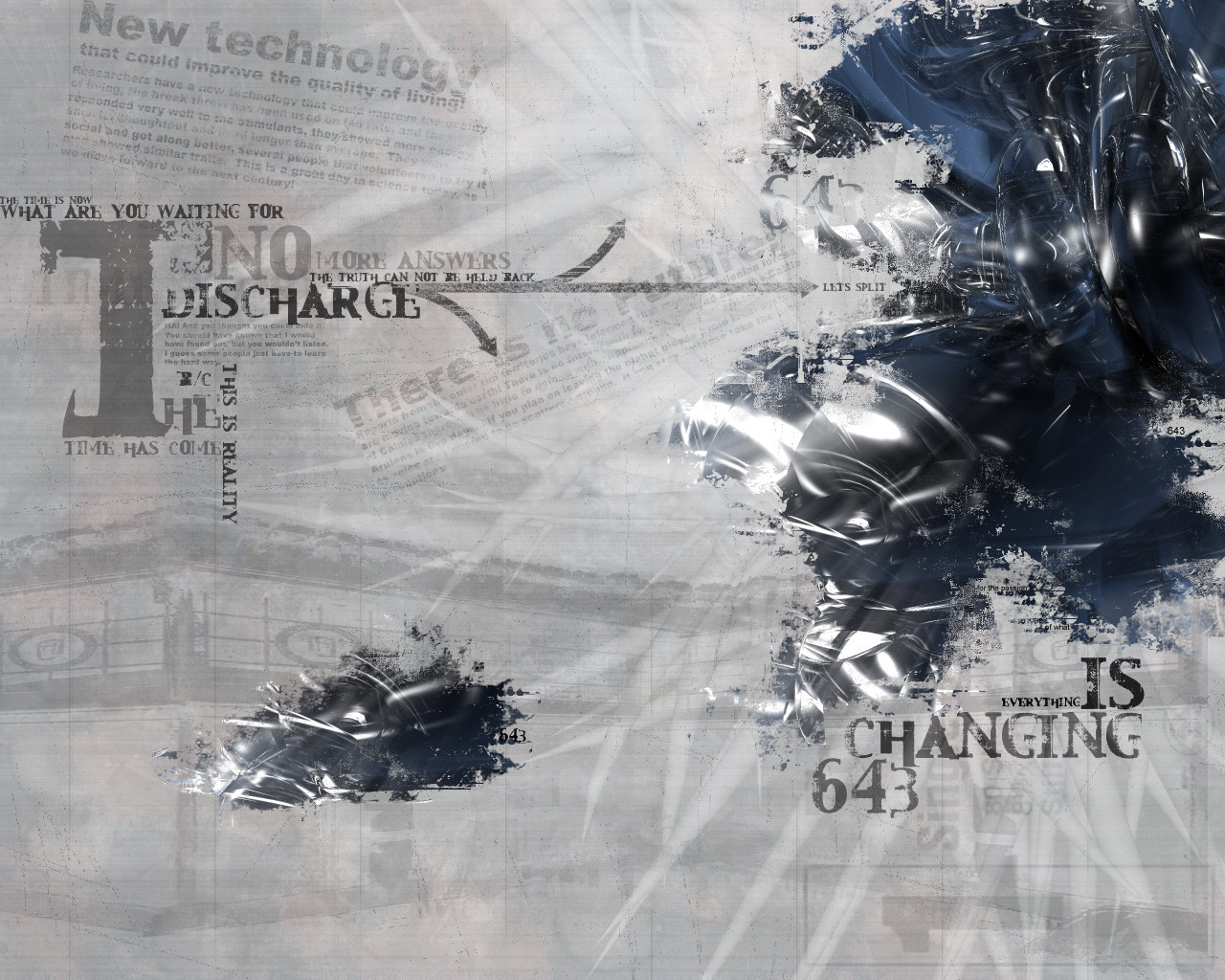
This is Element 2 it will sparkle for youRelated content


Comments: 20

I keep coming back to this wallpaper time and time again over the years. It was great in the 4:3 era and it'd be very cool to refresh it to the 16:9 or 16:10 era!
")
👍: 0 ⏩: 0


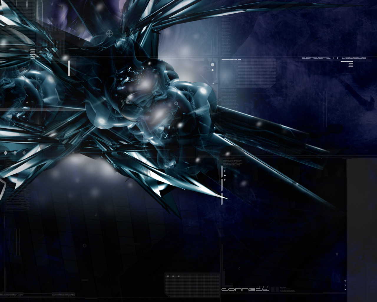
Very nice! i really like those glacial spikes... makes me think about that Linkin Park Crawling video
I learned my alphabet to spell dad
How quickly dad turned to sad
In my preschool days
And the rest of my life
-MaTiX-
👍: 0 ⏩: 0


this is dope...the background is really great. overall this wall kicks ass.
//looks around
I dont see a trendwhore here.
👍: 0 ⏩: 0

Incredible
hmm.... What program did you use?
You got awesome skills.
Eyes Of Jade : http://members.tripod.com/michael_evelyn
👍: 0 ⏩: 0

Beautiful work my friend. This is great. I mean top notch quality all the way. While I don't really think it has that 7shadows look, i think it is awesome. Hey, I heard that if you stand in front of a mirror and say "7shadows" 3 times that he'll come out of nowhere and kill you. . . . . Er uh, was that Candyman? Oh well, amazing job> !
((--:::00101001001110010100100:::---))
👍: 0 ⏩: 0

This is incredibly nice. One of the few times I like the way text is displayed in a wall. That says something coming from me
_________________
I owe it all to Rachel :: https://sanguru.deviantart.com
👍: 0 ⏩: 0

pooness!! that's awesome! love the sparkly stuff.... gotta tell me how ya do that.. and i like the backgroundish stuffish tooish... fun!
--
TheWill
http://www.aoe2.com ~ AOE2.com
http://www.focstudents.com ~ FOC Students
👍: 0 ⏩: 0

hella sweet..love the cleaness of it..sorta has a 7shadows look to it...very awesome..the contrast of it is great and the "ray" of beams coming out of the middle side is sweet..excellent job
.·:·.shr00m.latest. https://www.deviantart.com/deviation.php? id=90818.·:·.
👍: 0 ⏩: 0

*quickly awed* gasp, DONT BOTHER ME, im still STARING at this...
👍: 0 ⏩: 0


I much prefer this to your DD
Yes, it does look a little simple, but it more than makes up for it in style.
Nice colours, and dark, how I like it.
👍: 0 ⏩: 0

Oh, yeah! This is gorgeous! Man, I hate how the word "trendwhore" keeps cropping up, its just so stoopid. This is one awesome piece, and I can tell a lot of work has gone into it. Love the blue/grey.
==========
Save the seas
.... a
....
==========
👍: 0 ⏩: 0

Nice work, but i see you use that blur look and the lights on almost every wallpaper. Maby you should try something else? perheps?
👍: 0 ⏩: 0

Ignore matanza. There is nothing more trendwhorish than using the label on someone else.
One DEFINATELY needs to view the full shot of this. The detail work in the background is amazing, and really dark and ominous, which contrasts nicely with the light. The text is well placed, and I love how you have the two behind the word.
Now for my suggesstions, one, the motion blur seems just a tiny tiny bit too much, or I would suggest gaussian blurring it a little. Or, to give it some more symmetry, I would suggest motion blurring it at 90 degrees, but with less strength.
All in all, and awesome job. Keep it coming.
::nate..
I used to be indecisive, but now Im not so sure.
👍: 0 ⏩: 0

bleh... trendwhore. and way the hell to centered and symeytrical...
👍: 0 ⏩: 0

Not most impressive? RIIGHHHHHTTTT! Themes are meant to change!! lol! the blurry lights, or glares...man thats awsome, makes it look chaotic. Definately a tight ass wall!!! you never ceasee to amaze me!!
Genus Carchardon
Species carcharias
-=[Nitsuj-EX]=-
👍: 0 ⏩: 0

seems a little too simple. nice color choices but an overall nice style. add some more detail next time!
👍: 0 ⏩: 0

hmm...not your most impressive work, but its still pretty good. the shards of light are pretty cool and, i like the way its blurred/faded. the contrast and different shades are pretty nice. overall, its a pretty good piece, but it doesnt really seem to have the theme im used to seeing in your work. not that it all should be that way, itd get a bit tired if everything did, but its just a nice average sort of wp.
https://keine-eier.deviantart.com/
👍: 0 ⏩: 0