HOME | DD
 jedeye459 — Fooled me

Published: 2001-11-26 21:41:30 +0000 UTC; Views: 1772; Favourites: 16; Downloads: 352
Redirect to original
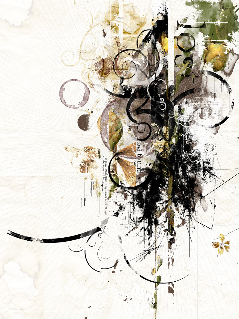
Description
Ok, here is Fooled me, I was messin around with some grungy looking brushes I got at [link] and it started turning out kinda cool looking... descided to turn it into my wallpaper. hope you like it, and comments welcomeRelated content


Comments: 38

...holy god.... that's the sweetest typography i've ever seen (i think ^^:... pretty sure...)
👍: 0 ⏩: 0

nice, i love it, it remember me the Underwold front cd cover of Second Thougeest In the Infants... or something like that.
👍: 0 ⏩: 0

Good job man but I don't like it (not my style)
please wisit in my gallery....
 (Smile)")
👍: 0 ⏩: 0


Nice use of experimentation jedeye....damn.
Todd Cook
The Junglist demands a rewind....
👍: 0 ⏩: 0

oh man.. with this kinda stuff, no wonder you got more popular these days neat stuff! I really the purple colors and the wind-ish effect you gave it. It kinda made me wonder how it'd look with a different bg color btw..
Thorgal. // https://thorgal.deviantart.com/
👍: 0 ⏩: 0

I always like this style of stuff.. things going onto white.. you know.. thingys and such.. and so on.. and whatsits..
Dear god.. to many metasyntastic variables!
👍: 0 ⏩: 0

I really like it, its kinda different from your other submission. Change is always good , Very well done. Keep it up!
I learned my alphabet to spell dad
How quickly dad turned to sad
In my preschool days
And the rest of my life
-MaTiX- |l|l|l|
>
=
👍: 0 ⏩: 0

Yep.. Grunge kicks ass.. and so does this wp also ... Nice job!
👍: 0 ⏩: 0

Excellant Grunge yet again!! great colors.. Likes this one alot!!
👍: 0 ⏩: 0

Another excellent job. Grunge is always a winner.
----------------
Kieran Hall
just a guy who likes art
👍: 0 ⏩: 0

awesome i love it
grungy brushes are way cool
i am getting ready to use some i have in something too, but i really do like this piece color is great too love white backgrounds
web - http://www.bowmanz.com/rebecca
👍: 0 ⏩: 0

Oh yes I love that style, not seen very much grungy stuff that I like as much as this. And the blurred stuff is s nice touch, gives it a bit of motion if you ask me.
-Smaken är som baken, den är delad-
👍: 0 ⏩: 0

like each time , i like this wall but it may be a little too bright (it will kill my screen!!!) nevermind... excellent work. How many time did you spend on it 3weeks... 3 months... 3years.... i need 3 lifes nights and days!
👍: 0 ⏩: 0

Sweeeeeet!
I like the sharp contrast, yet smooth transitions. Nise work laying the type in.
👍: 0 ⏩: 0

AAAAAHHHHHHHH!!!!!!! THAT'S HOT!!!! What a wonderful peice. Nobody ever seems to use different brushes. Well, at least not the way you have here. Your experimentation with new techniques is really helping you to kick the most ass! Keep up the great work.
((--:::00101001001110010100100:::---))
👍: 0 ⏩: 0

Ver ygood use of mixed media, as it were. The kind of techy feel with the grucge, very well done. The purple seems almost wrong for this, but it also seems perfect (?) But yeah. All in all the design is extremely effective. I really love the small text down inside, and I really love how you put the title text in a bright spot.
I really really dig this, and your amount of consistently great out put is awesome. Once again, another awesome piece
::nate..
digi||ob/v.x http://www.digitalobscurity.com
Get:
-Fonts/Brushes/Textures/Enlightenment
!!And plenty of free cheese to the first 100 people who donate a rare and profitable organ!!!
👍: 0 ⏩: 0

Simply love grungy stuff!! D
sweet work jedeye!
Man, I wish I got so many comments to
--------------------------------
Something wonderful https://www.deviantart.com/deviation.php? id=105425
👍: 0 ⏩: 0

i like i like!
mine looks like stick figures compared to this.
::tips a hat::
👍: 0 ⏩: 0

Great work as always! I think this is one of your more original ones. I like the more non-angular feel of this one, it looks more natural and brutal than your other stuff.
👍: 0 ⏩: 0

Very nice work, I like how it doesnt follow trendwhore fashion with the minitext etc..
Nice job on this one.
Born on third base, thinking you hit a triple.
👍: 0 ⏩: 0

hmmm...fairly simple and its nice to see something out of the ordinary...it doesnt look like a lot of pics submitted to devart, and it still looks really kewl. nice job man
All matter is merely energy condensed into a slow vibration, we are all one consciousness experiencing itself subjectively. There is no such thing as death, life is merely a dream and we are the imagination of ourselves.
-Bill Hicks
👍: 0 ⏩: 0

love it but cannot put in my desktop because the white color.. anyway it so nice expecially the grunge looks.. the color blends well.. although it is not my kind of fav art but still
BAD HABIT DIE HARD!!
..seni itu juga satu kebaktian..
👍: 0 ⏩: 0

this is awomse. i love this sorta grunge style. the rips and textures are great. wonderful job
👍: 0 ⏩: 0

very sweet..i love the way it looks ripped and theres like a tear or opening in the wp..awesome grunge effect and excellent color scheme used..very nice brushes..looks great..excellent work
*i have a headache,sorry for short comment*
.·:·.shr00m.latest. https://www.deviantart.com/deviation.php? id=105987.·:·.
👍: 0 ⏩: 0

Pretty sweet stuff ! The colour and grunge is very good. The only suggestion I would make, would be to remove the radially blurred layer, and just leave the straight stuff.
The typography is also very well done.
Great work !
_________________
see me in a polar bear suit ?
http://spots.flatland.com/mikehealy/pola r/pics.html
👍: 0 ⏩: 0

LOL keen... yeah its great!
Genus Carchardon
Species carcharias
-=[Nitsuj-EX]=-
👍: 0 ⏩: 0

that's it. i've had it.
INTO MY WATCHLIST WITH YOU, YOU MISCREANT!!!
step into the slipstream:
https://www.deviantart.com/deviation.php? id=99040
-flow-
👍: 0 ⏩: 0

Another great pic.
Keep it up
Eyes Of Jade : http://members.tripod.com/michael_evelyn
👍: 0 ⏩: 0


Niiiice! This looks great. IMO, it would look better in blue. Dark blue with a black background. Anyways, good job!
--
TheWill
http://www.aoe2.com ~ AOE2.com
http://www.focstudents.com ~ FOC Students
https://www.deviantart.com/deviation.php? id=97652 ~ Dancing (Poem)
👍: 0 ⏩: 0

i really like how this turned out. the coloring and the overall design is just absolutely beautiful. very simple, which is what makes this even better! very nicely done!
👍: 0 ⏩: 0

oh now this is the dogs ballox!! i think that this shoulf be the Daily Deviation. i love the fragmented look
it is not that to the world you are a person, but the person that you are the world
==> http://www.determinereality.cjb.com
👍: 0 ⏩: 0

now thats better the colors made it a good touch.
[Me Against Me|Head Against Kore]
https://headkore.deviantart.com/
👍: 0 ⏩: 0


Very bright picture! it lights my room! I like this grunge style...pretty unusual. Those pictures blend well. Nice work with the brush.
Created a relaxing wall.
Gotta love the typography
I LOVE DESTROY --> https://destroy.deviantart.com
👍: 0 ⏩: 0

awesome...the style and texture of it all is very cool
.8b
[eu·pho·ri·a (yoo-fôr-ë-a) n. : a feeling of great happiness or well-being.]
[coming soon]
👍: 0 ⏩: 0