HOME | DD
 jedeye459 — Portfolio Postcard v2
Published: 2002-02-21 05:48:18 +0000 UTC; Views: 3236; Favourites: 5; Downloads: 430
Redirect to original
Description
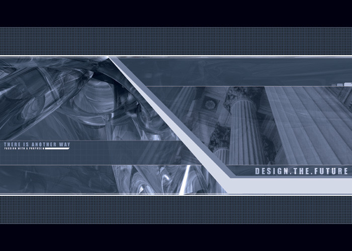
this is my second version of my postcard, I really appreciate all the feed back and I cam up with this, I scaled it down a lot so you can get a better feel of how it will look on a postcard and tried to give it more my style, let me know what you think as this is reall important to meRelated content


Comments: 53

I like the overall idea and concept but it could be improved.
👍: 0 ⏩: 0

hmm, i heard that "future" words so much.. its ok the colors are nice. but not excellence
👍: 0 ⏩: 0


Looks very nice! Just what are they black borders top/bottom of the card for? I would crop it and remove that black or make the blue grid effect cover that area.
Looks good though! Nice colours too.
👍: 0 ⏩: 0

looks far too much [link]
good execution...but I thought it was a 2advanced design. That's potentially confusing.
👍: 0 ⏩: 0

I havent seen the first one, but this one is beautiful and clean very nice work. I've been doing a lot of wallz, maybe ill try something like what u made. The postcard idea is kewl.
👍: 0 ⏩: 0


I agree with some others that it does seem very 2advanced like. but those designs rock. i did something almost like this a while back and i had someone call me a 2 advanced whore. [link] oh well. i love the style and am proud to say that i am influenced by them. great work!
👍: 0 ⏩: 0


looks very "in-depth" work, hence might i add excellent job bruh
-----
:// fear what you dont understand >
~higgs aka jon
👍: 0 ⏩: 0

Wow!! That is one hell of an eye catcher. I'd buy something like that, frame it, put it on my wall, show it to all my friends, then I would sell it for $400,000. (Copy --> Paste --> Print). LOL
-----
---Caution: May explode or go berserk and cause serious injury if recharged, disposed of in fire, or dissassembled.---
👍: 0 ⏩: 0


wow.. I would want something that cool to come to my mailbox
-----
-mage
👍: 0 ⏩: 0

I like this more then the last one. You own at design as well. It's a flawless job. Im impressed
-----
CrazysunART
http://crazysunart.narod.ru/
--------------------------
Bargad is a state of mind
👍: 0 ⏩: 0

damn, it's beautiful
-----
×!] ch0o
×!] rawr. i am reptar. ph34r m3.
👍: 0 ⏩: 0

Awesome work. I still feel this is too 2advanced though. It's almost 100%their style. You don't work for them do you?
But as a piece, it rocks.
-----
:: sekt ::
++ Project Digital Coming Soon ++
👍: 0 ⏩: 0

I was gonna suggest filling in that blanl space, but you already did it and it looks great!
-----
:::::::Todd Cook::::::::
Drum N Bass for a fucked up place...
👍: 0 ⏩: 0

yes a lot better....but stick with the blue and cut the black off and maybe put like a black 1px width boreder around it. and i'm sorry but now that you put your own style into it chuck the columns man your graphic is a lot more eye appealing and kinda puts a meaning to "design the future" quote, 'cuase your not designing the past ya know what i mean? anyways this A LOT better from the last. great job!!
👍: 0 ⏩: 0

cool
-----
-------------------------------------
up..
👍: 0 ⏩: 0

Very professional looking, but still smooth and cool as hell. I love it!
-----
-amphex (Dan)
👍: 0 ⏩: 0

The classy contrast between the stately columns and the revolutionary 3d elements creates an excellent fusion of old and new... it's great!
-----
http://wwdesignco.com ~ WWDesign
http://aoe2.com ~ AOE2.com
http://3d-gaming.com ~ 3D-G.com
Latest Wall - Memory of War - https://www.deviantart.com/deviation.php? id=190198
👍: 0 ⏩: 0

yeahie! this looks awesome! great improvements!
are you keeping those dark parts on top and on the bottom this way?
oh and thx for scaling it down! hm ..will try it as a wall!
👍: 0 ⏩: 0

Amazing color theme, really reminds me of the 2advanced theme.
Great use of minimalism and text, but I preferred the chainmail from v1 than the grid in this version..
Also by saying "Design the future" you're tackling many current events (genetical manipulation, plastic surgery etc.)
-----
¤-[Kwan Studios Finland]- http://www.kwanstudios.com
👍: 0 ⏩: 0

I think a combination of both now I really liked the typography in the first one , but now i'm liking the image you added!! sigh... waits on 3!!
-----
👍: 0 ⏩: 0

its..its just hot man. *humps monitor*
-----
Genus Carchardon
Species carcharias
-=[Nitsuj-EX]=-
👍: 0 ⏩: 0

hehe i know it wasn´t ur idea but i don´know if the render overlayed to the photo is thaaaat good (dunno only my 2 cent)
👍: 0 ⏩: 0
maybe some gradients or stuff would help where u have the black/grid areas.
looks really good though
👍: 0 ⏩: 0

better than first piece.
weeeeeeeee, this is awesome, mate!
-----
-tHra N-
👍: 0 ⏩: 0


damn looking good man looking good
-----
Just Another Jackass
.42920.789321.109322
https://mantra.deviantart.com/
http://haloeight.net/
👍: 0 ⏩: 0

No offence but the right side totally clashes with the left in my opinion; you merged a 3d fluid structure with pillars...and it just doesn't look right. Maybe if you started making the progression into a 3d solid on the right without actually doing so it may look better.
-----
oh
👍: 0 ⏩: 0
sorry have not that much time but i see that it´s getting really good
👍: 0 ⏩: 0

i like this one too, even better than before
-----
___________
I eated the purple berries!! uhh, owww. They taste like... BURNING!!! -Ralph
👍: 0 ⏩: 0

something about this design catchs my eye more, i like this version best, but don't get me wrong the other is fabo also
-----
w00t click this - http://12.24.88.28/rebecca
👍: 0 ⏩: 0

this looks GREAT ..
really nice work jedeye .
its alot better than the previous ...
gooood job
👍: 0 ⏩: 0

I don't think you need much more advice, you will arrive at the perfect solution... hell, I would keep it as it is!
👍: 0 ⏩: 0

very smooth and professional looking totally digging the card. you are da man!
-----
https://www.deviantart.com/help/faq.php http://www.jarkolicious.com
👍: 0 ⏩: 0

Way cool, somewhat reminds me of the 2advanced stuff.
-----
-Smaken är som baken, den är delad-
👍: 0 ⏩: 0

The typo is definitely much improved this time. This has a very nice flow to it.
-----
👍: 0 ⏩: 0

A++
-----
001.0008
002.6302
004.0195
001.2706
003.9125
002.0060
000.8103
006.0520
009.9608
001.0247
000 https://frail.deviantart.com/gallery
👍: 0 ⏩: 0

i like the addition of the second side of the picture...the last version didn't seem wrong, but this has much more balance...something that i hadn't noticed before with the other one...
-----
.:spunj13:.
editor, asylumpublications http://ionscribe.rmes.andrews.edu/~cmalo ney
toaa: https://www.deviantart.com/packs/details. php?id=1643
.: abduct a deviant?
:.
👍: 0 ⏩: 0

Yeah! This is great, I like this a lot.
-----
you dont need eyes to see
you need vision
cyber|crash
abstract thought - visualised --> http://www.cybercrash.be
👍: 0 ⏩: 0


Alright, forget my previous suggestions, I like this just as much
-----
Thorgal. // https://thorgal.deviantart.com/
👍: 0 ⏩: 0

oooooooooh...
as cool as the other side of the pillow.
👍: 0 ⏩: 0

I love it. maybe add some very alphaish elements but other than that it rawks my world. i love how the 2 images blend into eachother
-----
**wasted time we enjoy is not wasted time http://www.edwinfx.com **
👍: 0 ⏩: 0


Nice color scheme, I love the textures and the typography...however, the white space in the bottom right, seems distant from the rest of the photo...just an idea
-----
---I know not what weapons WWIII will be fought with, but I DO know that WWIV will be fought with sticks and stones. -Albert E.---
👍: 0 ⏩: 0

i think this looks alot better then the first one....the only thing i could duggest is to add some texture and depth...maybe to the white area that seperates the right the left
-----
::the new state of design::
are you ready? https://tdawg.deviantart.com
👍: 0 ⏩: 0

doh i just commented but u deleted it =[ its lookin good..i like the 3d image and photo used..the only suggestion is that to do something to the top/bottom borders..nothing to fancy..just to jazz it up a bit..looks great so far though..nice job
-----
+dfektion
👍: 0 ⏩: 0
| Next =>