HOME | DD
 Jeff1966 — Hitler in a 3 Ring Circus B-W
Published: 2008-03-14 11:36:19 +0000 UTC; Views: 774; Favourites: 15; Downloads: 27
Redirect to original
Description
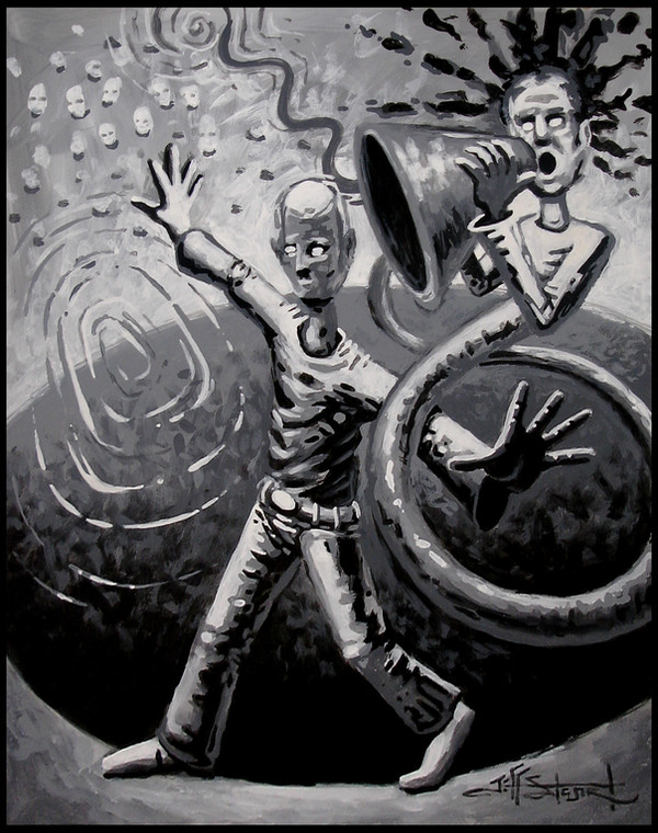
Acrylic on hardboard (12"x18")This is a new one. Loosened up, at least this time. I love black & white, so here's another one.
The finished painting can be found here: [link]
Related content


Comments: 33

Wow! This works quite well as a black and white piece. In fact, I think I like it a bit better than the colored version.
I'm intrigued by the title, however--it seems to say, "Yes, I know what this means, and it should be obvious to you, so you're a moron if you don't nod your head and agree with me..."

 (Wink)")
👍: 0 ⏩: 1

Thanks Jeff. As always, I love your comments. Always insightful. The title, I wish I could tell you there was some deeper meaning behind it, but as I was painting it, and the guy's face just looked like Hitler to me. I thought, wouldn't THAT be a strange circus attraction. LOL Especially, if it was really him, hiding out after WWII, in a circus.
👍: 0 ⏩: 1

👍: 0 ⏩: 0

interesting title. what made you choose it.
love the rendering.
love black and white paintings. you have an exceptionally gifted knack for it.
👍: 0 ⏩: 1
I love working in b&w. Seems to be relaxing for me. Anyway, as the painting progress, the guy in it, just looked like Hitler to me. Purely by accident.
👍: 0 ⏩: 0

Very cool Jeff, great to see you getting back on track
 (Smile)")
👍: 0 ⏩: 1
Thanks Bill, it's a re-learning process, but that's always fun.
👍: 0 ⏩: 0

Thank you very much, and thanks for the fav as well.
👍: 0 ⏩: 0

WOW!
I love the effective values, works really really good.
👍: 0 ⏩: 1
Thanks Orinoko. And thanks for the fav too.
👍: 0 ⏩: 0


LOL Thanks! And thanks for the fav.
👍: 0 ⏩: 0

Thanks Jay, I appreciate it. And thanks for the fav too.
👍: 0 ⏩: 0

Nice! Great contrast! I really dig the ripple effect. Good job man.
👍: 0 ⏩: 1
Thanks. I'm glad you liked it.
👍: 0 ⏩: 0

Aww, poor guy, getting all the loud noise from the megaphone... and such an idea you created here, Jeff
👍: 0 ⏩: 1
Eh, he gets what he deserves. LOL Thanks JJ.
👍: 0 ⏩: 1

👍: 0 ⏩: 0
")

I like it to! The Black and white is really quite cool.
👍: 0 ⏩: 1
Thanks KJ. Black and white is very relaxing for me to work in.
👍: 0 ⏩: 1
I'd imagine, it's cooling colors.... and there isn't the stress of color mixing.
👍: 0 ⏩: 1
Yeah, cause you only have to think about going 2 directions, instead of 7.
👍: 0 ⏩: 1
That's my biggest stress with paint.
👍: 0 ⏩: 1
You could try painting in black and white acrylics, then coloring with transparent oils. That way you can tackle two different aspects of painting separately. Not to mention, it gives a real depth of color doing that.
👍: 0 ⏩: 1
That's a good idea.I never thought about doing it that way....
👍: 0 ⏩: 1
I do that alot, well, alot more often now than I used to. "The Hollow" [link] on my front page is probably the most extensive under painting I've ever done. There's a link under the painting to the grisaille under the painting.
👍: 0 ⏩: 1